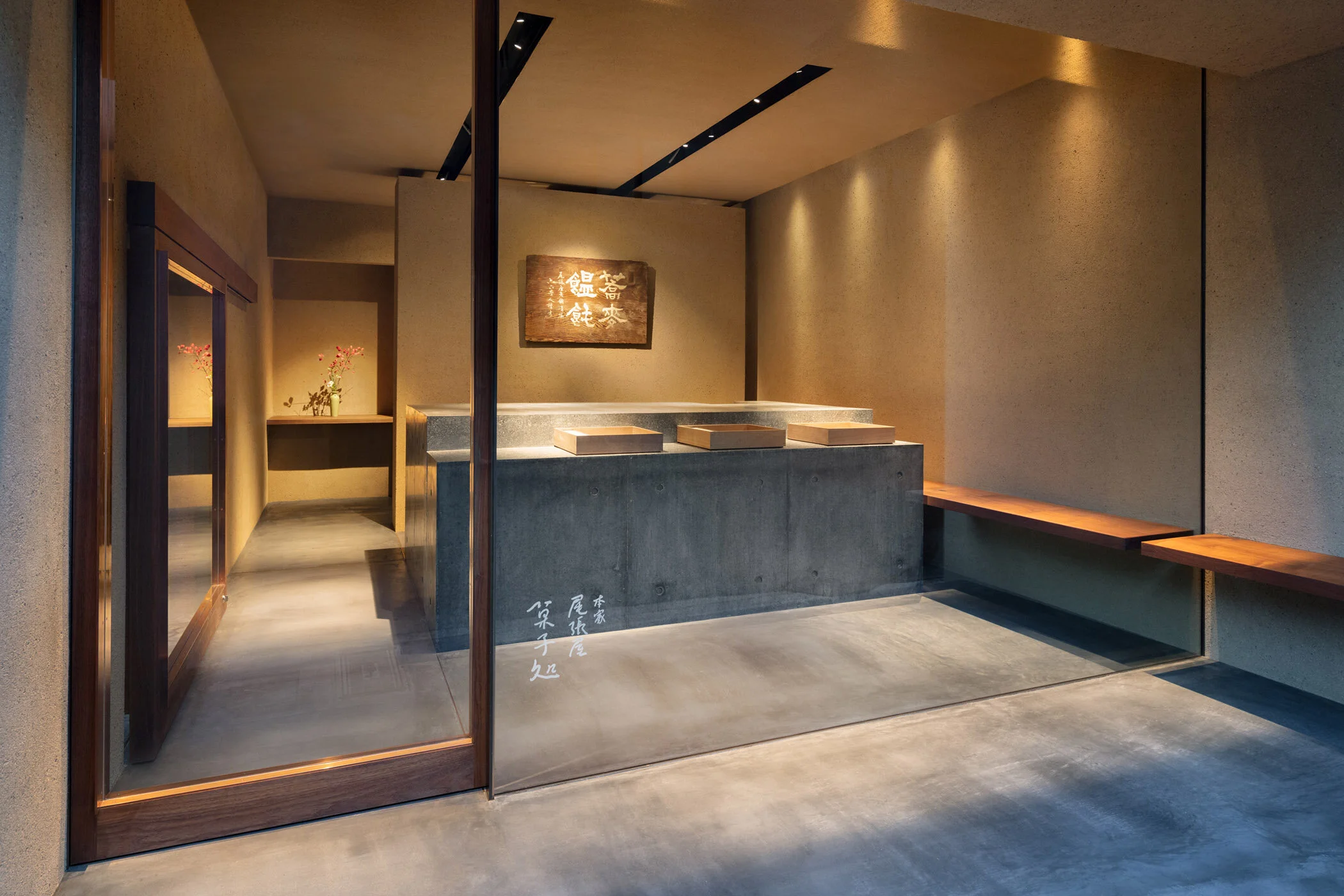
HONKE OWARIYA by TERUHIRO YANAGIHARA STUDIO
Confectionery | Kyoto, Japan
HONKE OWARIYA | TERUHIRO YANAGIHARA STUDIO | photography : Takumi Ota
DESIGN NOTE
A long-established confectionery with 550 years of history
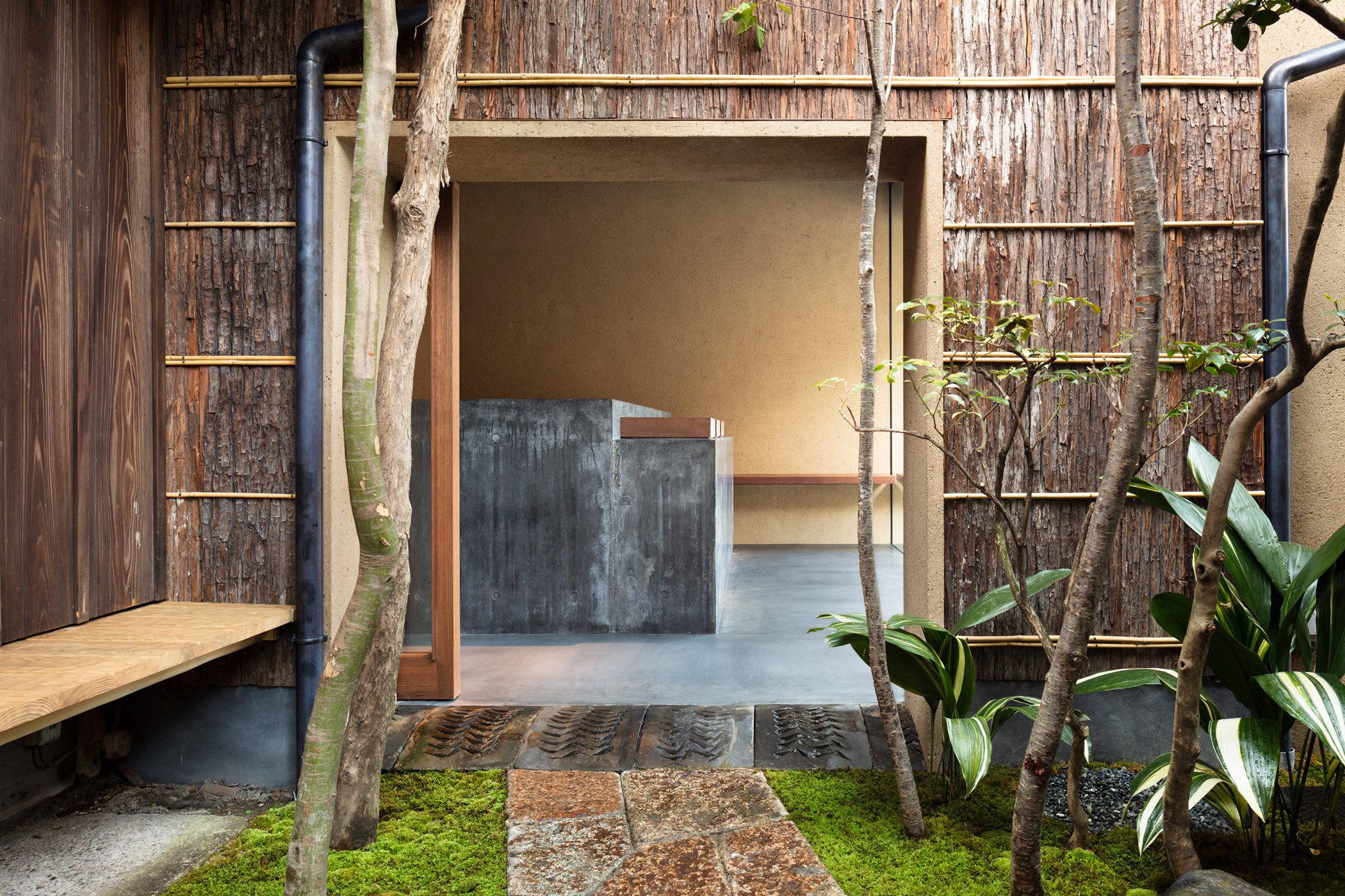
MINIMAL Polished concrete counter
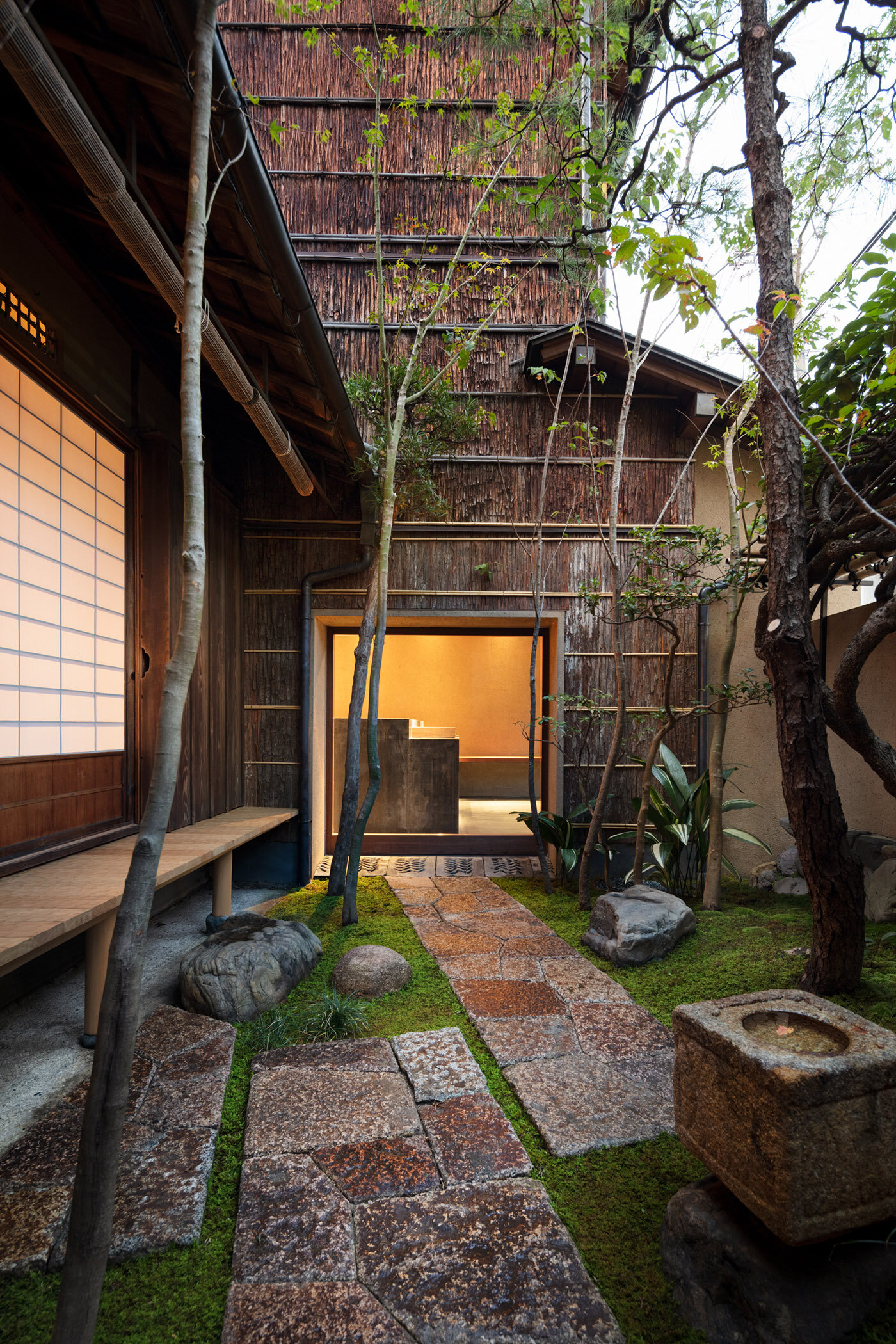
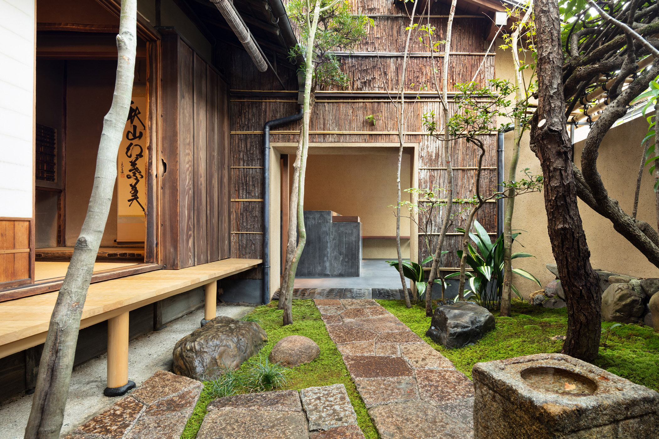
Japanese Garden Connecting the Confectionery and the Restaurant
photography : Takumi Ota
words : Reiji Yamakura translation: Kazuko Sakamoto
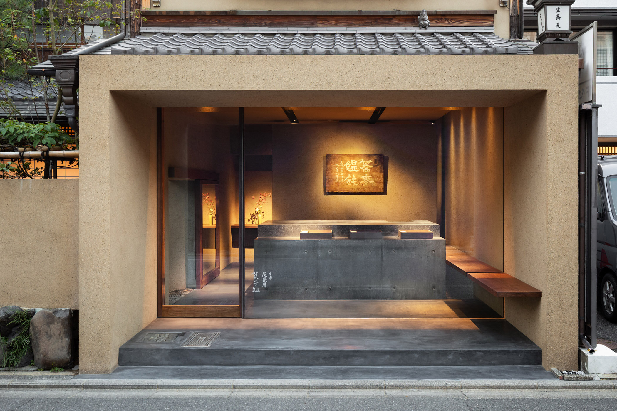
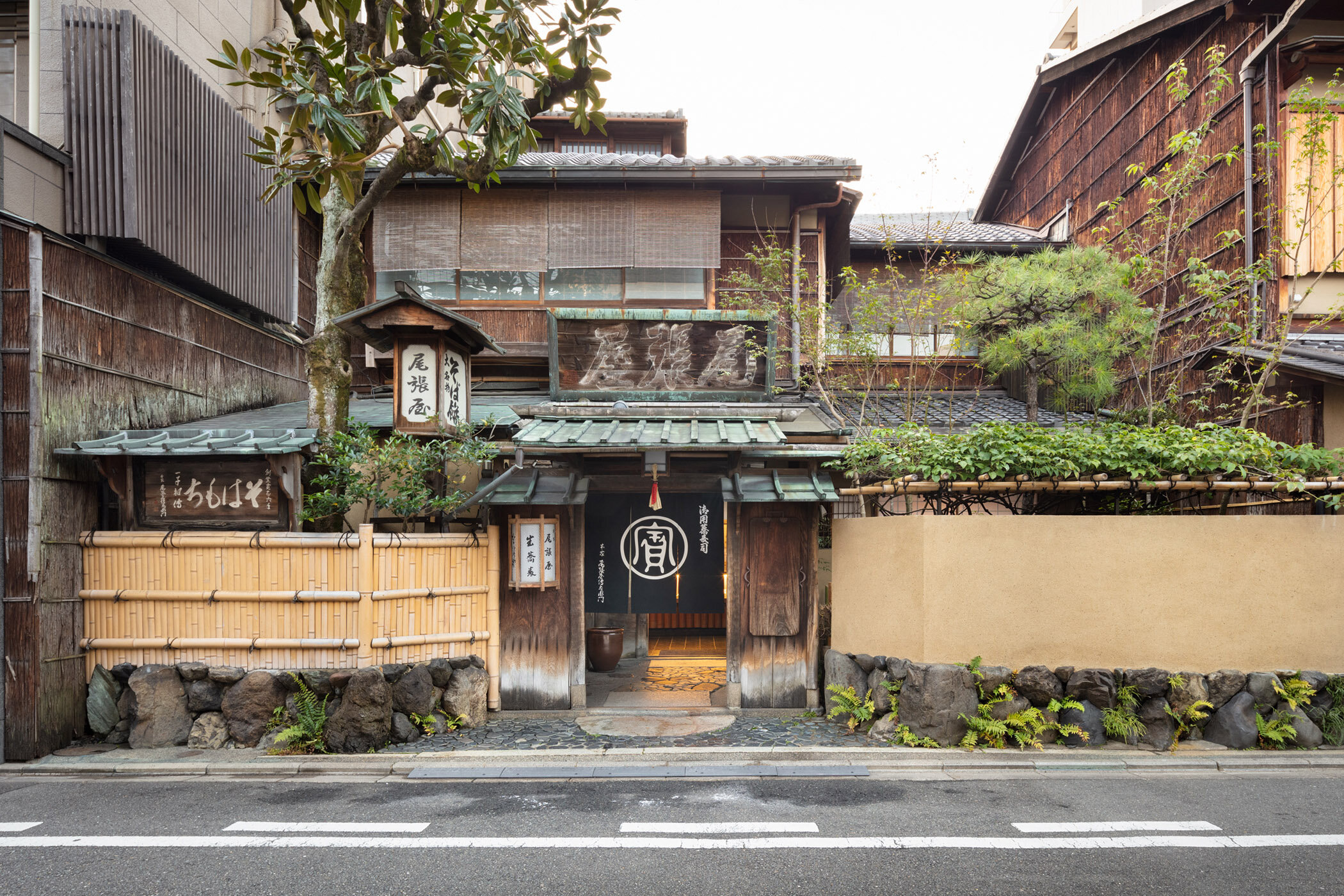
Honke Owariya, originally founded in Kyoto about 550 years ago as a confectionery shop and later started operating as a soba noodle restaurant around 1700, opened a confectionery specialty shop next to the main shop. The new shop was designed by Teruhiro Yanagihara Studio, which has been offering consulting services for the company's visual identity.
In response to our question about how he came up with the concept for the new shop, he replied, "Honke Owariya, well-known as a long-established soba noodle restaurant, used to sell confectionery in a corner of the noodle restaurant and in department stores. The current owner, who is the 16th generation, wished to create a place where she could properly convey the appeal of the sweets they have been making since its establishment, and decided to build a confectionery specialty shop in the space formerly used as bicycle parking for the main shop. As for the design, given the fact that the shop originally had many customers from overseas, we decided to create something that would renew the image of the traditional long-established shop while maintaining elements that are uniquely Japanese."
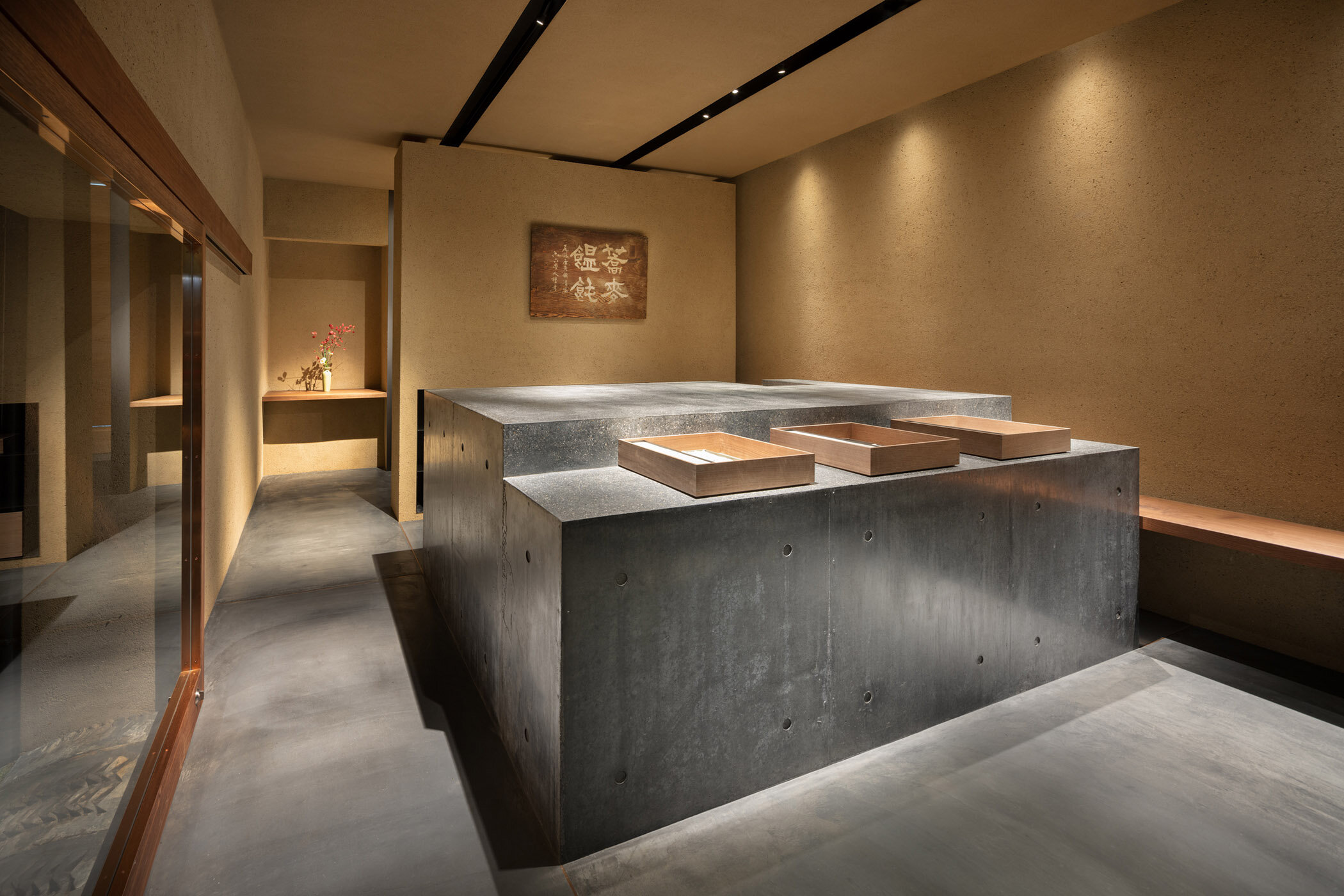
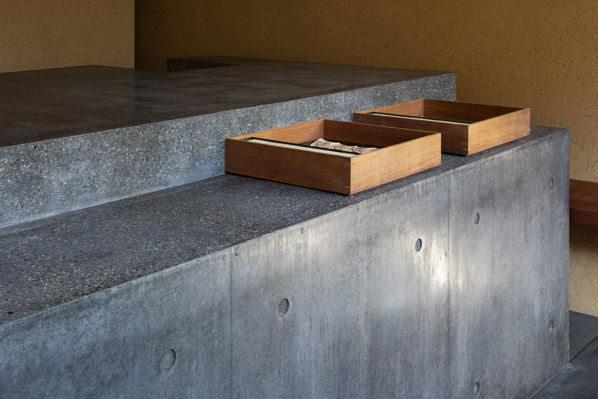
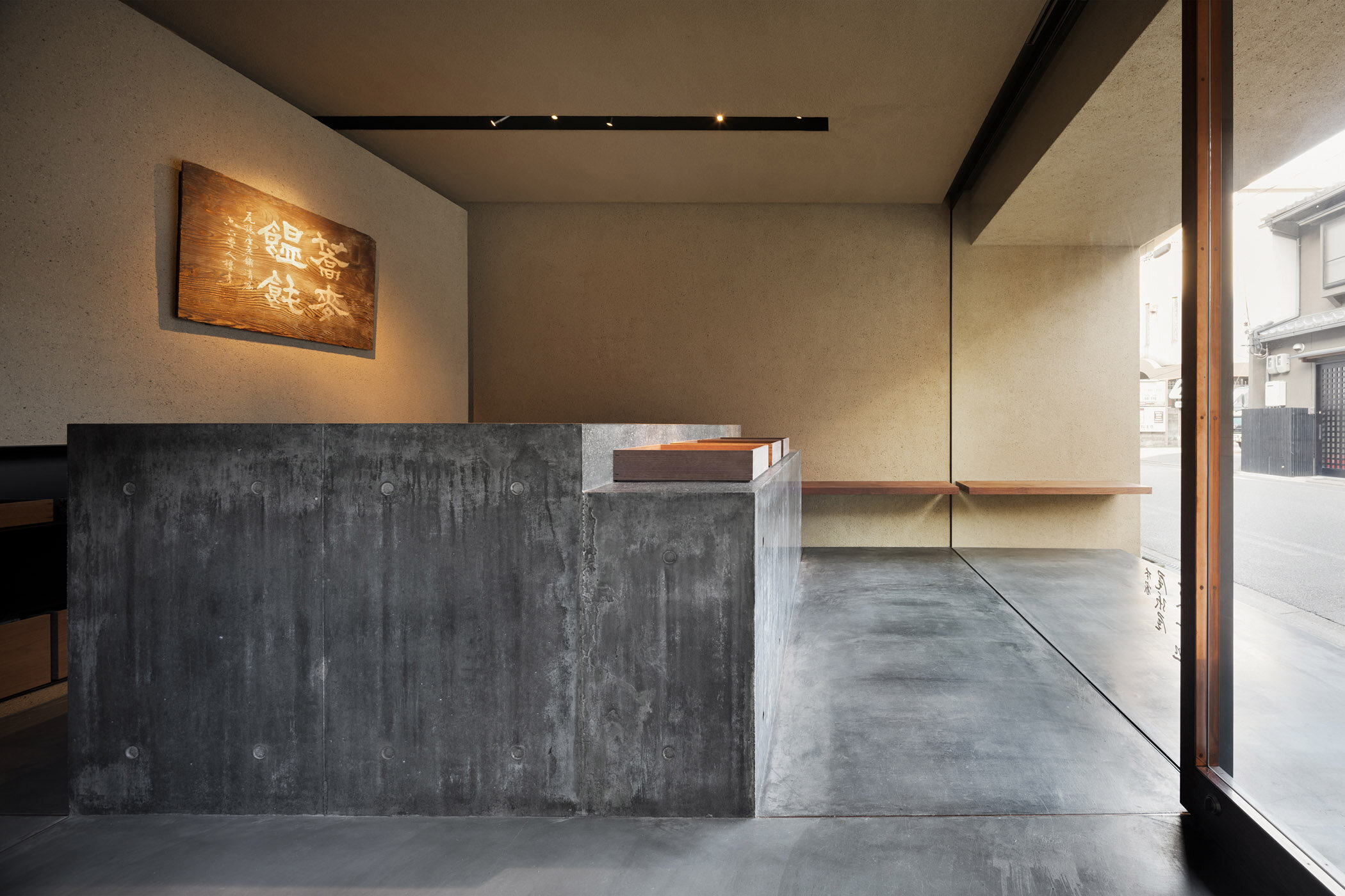
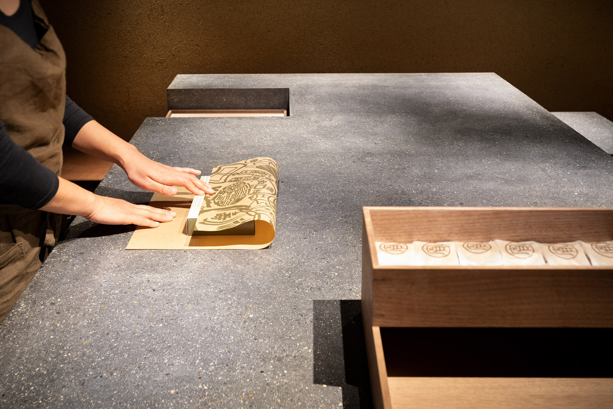
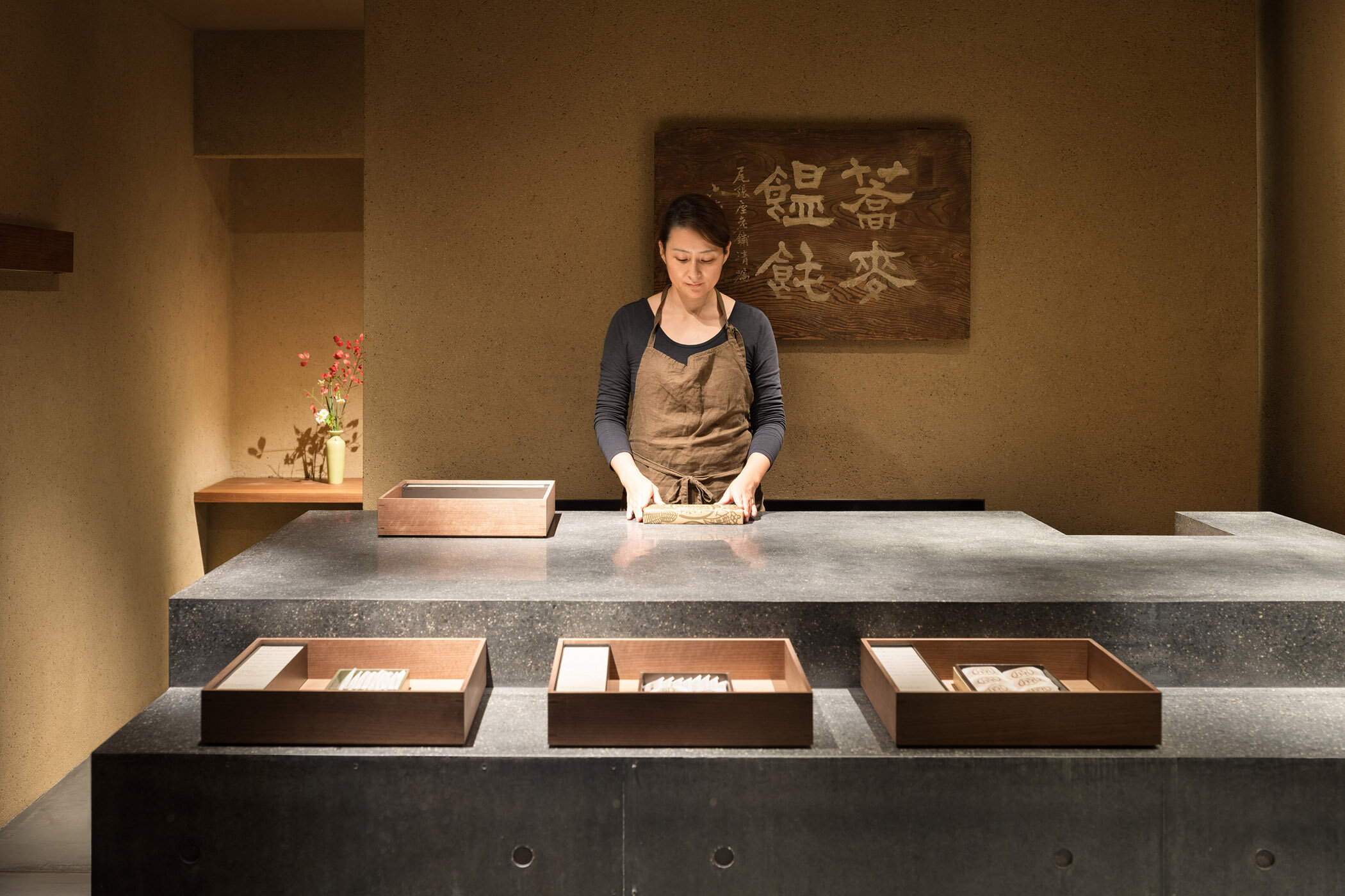
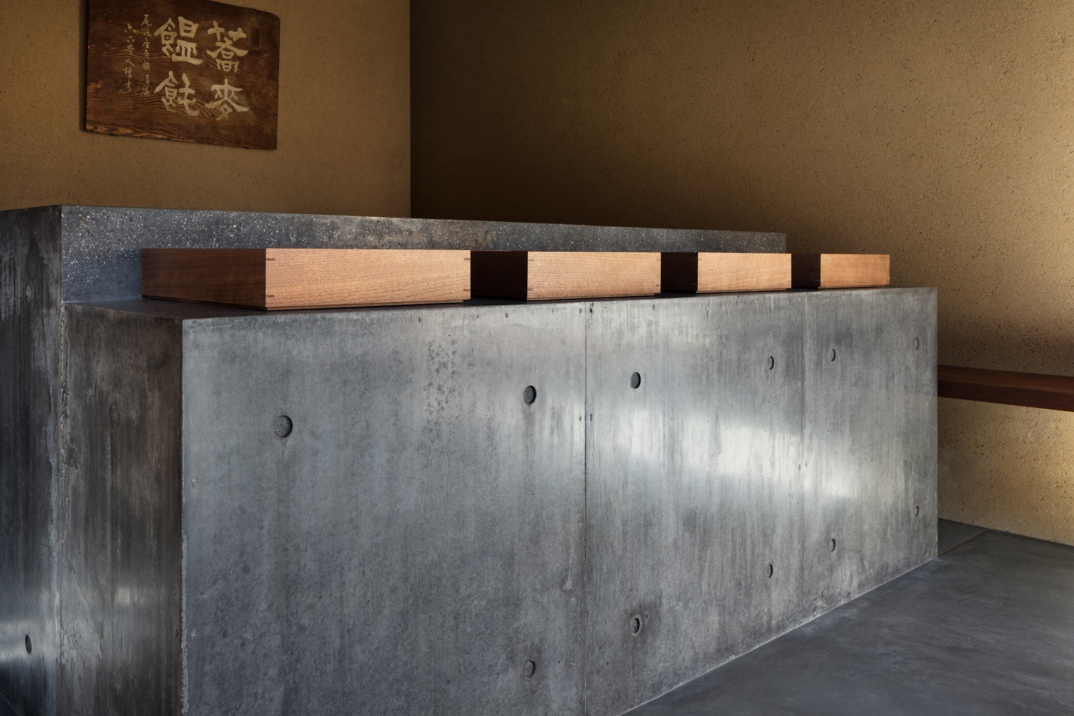
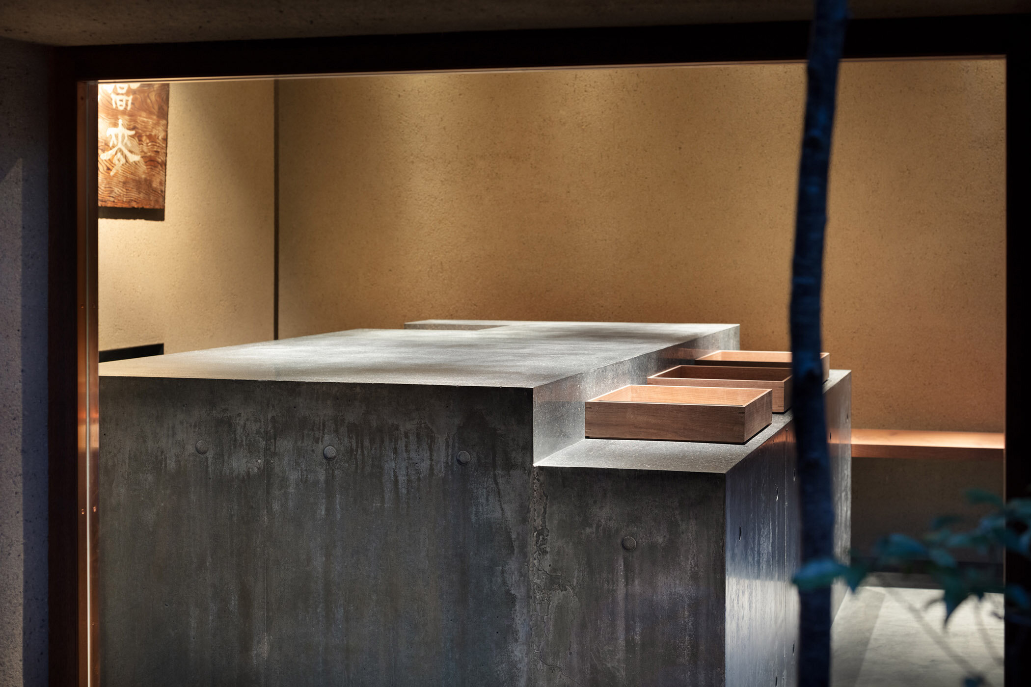
We asked him about the intention behind the concrete counter, and he said, "Instead of a standard glass case, we installed a counter where customers can choose sweets as they interact with the staff so that the story behind the confectionery making can be well conveyed. It is made of custom-mixed concrete containing Japanese ink and river gravel from Kyoto, with fair-faced concrete sides and a polished top. The production process was challenging due to the seamless design and the stepped top, but we managed to achieve it with the help of a plastering craftsman we had previously collaborated with. We also made wooden boxes called "banju" to display the products. In order to create a subtle sense of incongruity in the otherwise pure Japanese-style design of this shop selling traditional confectionery, we used black walnut for the banju, which is not a common material in Japanese architecture. "
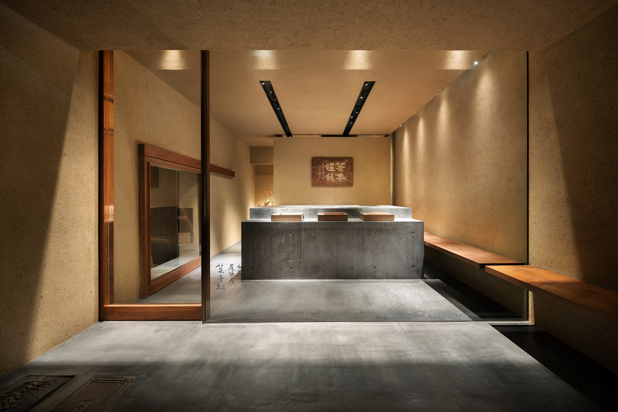
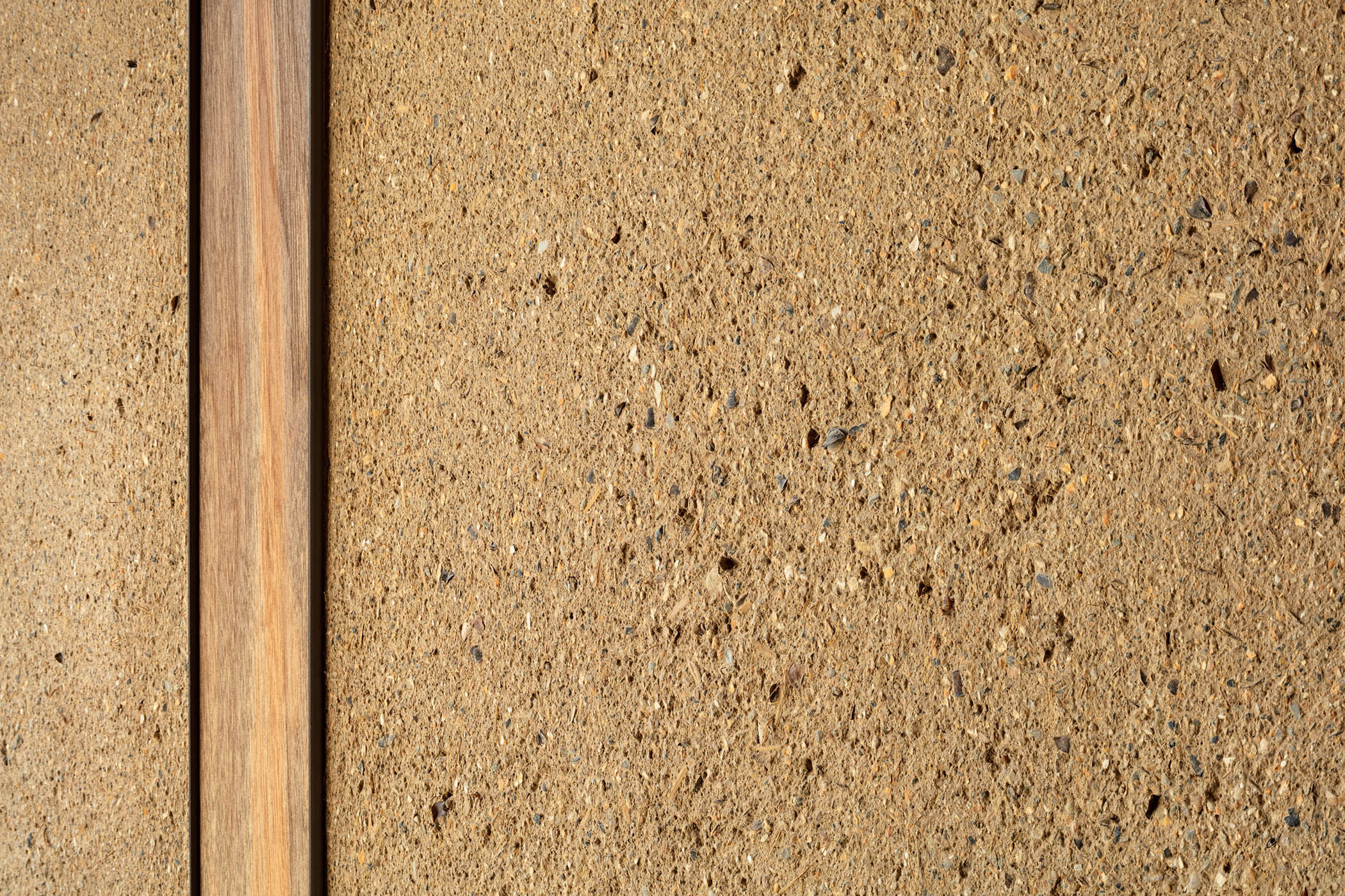
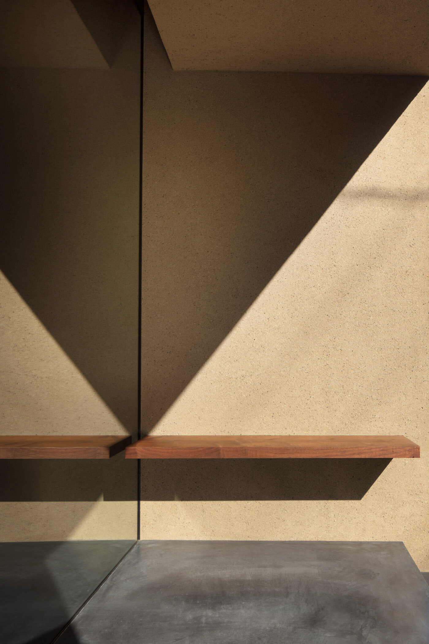
Black walnut was used not only for the banju, but also for benches and fittings. In order to subdue the presence of the door frame, they embedded steel frames serving as wall trim and inserted walnut timber between the steel frames after finishing the wall to create a column-like doorstop. This unique detail, in which the wood is set further back than the mud wall, does not follow the common practice of traditional Japanese architecture.
A detail of black walnut timber for door fittings installed in custom-made mud wall.
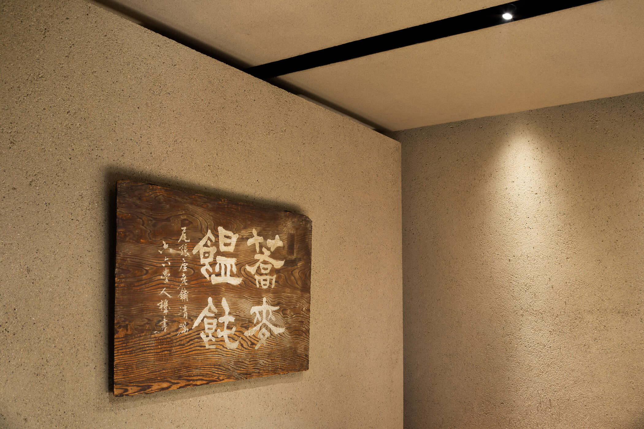
Yanagihara's attention to design is evident in every detail, from the frame attached around the entire perimeter of the glass so that it does not appear to be a door handle, to hanging hardware for lighting fixtures and sliding doors that are concealed within slits in the ceiling. For the walls finished with original plastering mixed with buckwheat hulls, different blends were used for outdoor and indoor use. In order to match the texture of the inside and outside, many adjustments were made and a finish that resembled the texture of their sweets was selected from nearly thirty samples.
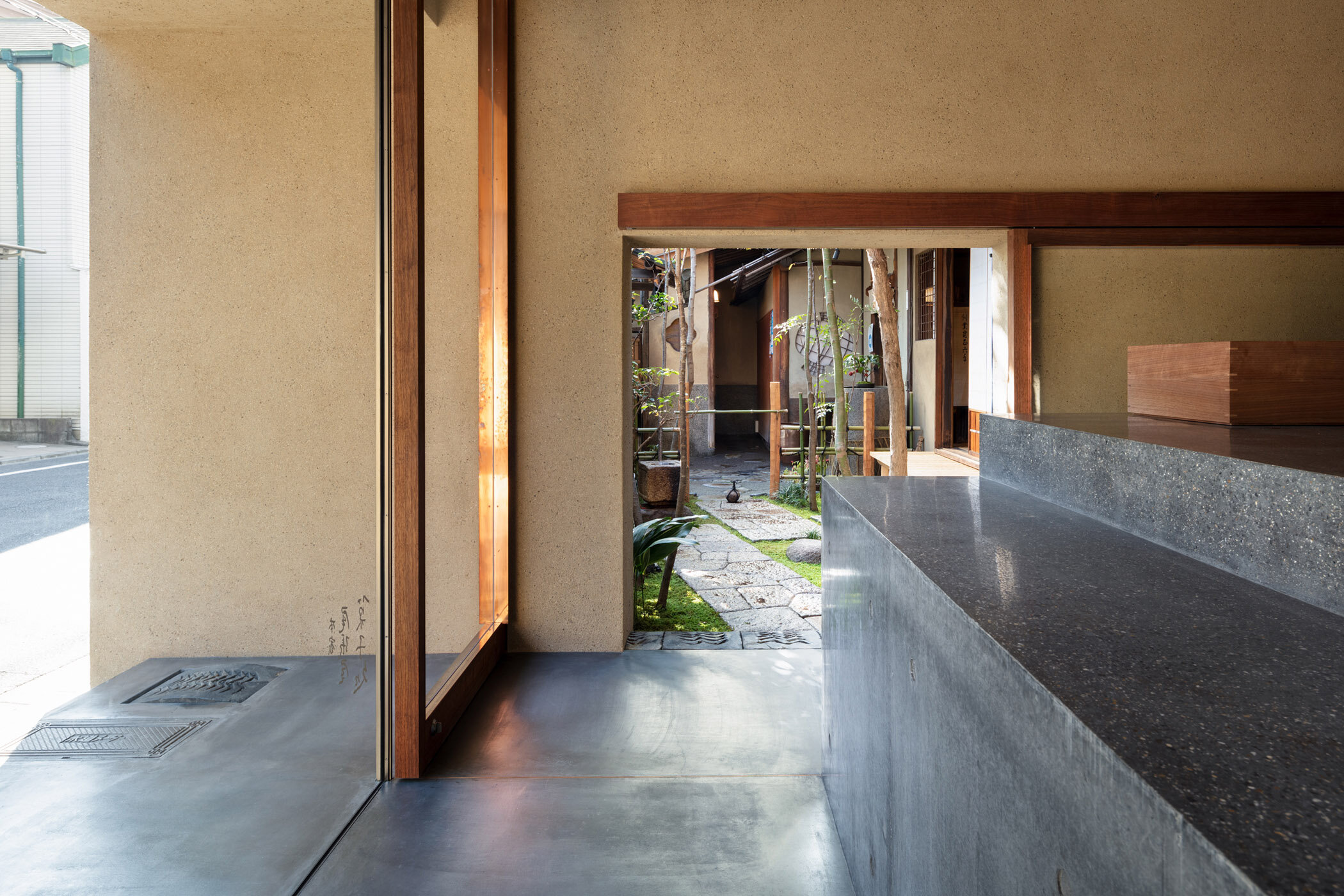
The small garden was designed by a gardener, Yosuke Yamaguchi. The back entrance to the confectionery on the garden side is designed at a height of 1500mm.
The garden between the approach to the soba noodle restaurant and the confectionery shop was rearranged in line with this renovation. Yanagihara explained his idea of creating a garden that considers the coming and going of people as follows: "I asked gardener Yosuke Yamaguchi to create the garden. The overall composition is his own interpretation of the style of traditional Kyoto gardens, including the use of native trees and wild plants, and consideration to provide an unobstructed view from the adjacent tearoom and the pathway."
This renovation project, with a floor area of only 20 square metres, was carried out through extensive discussions with the builder and the gardener. By adding unique twists to the traditional methods, a contemporary update of the long-established shop has been successfully realised.
DETAIL
The concrete counter, mixed with local river gravel, has a polished top and fair-faced sides. The wooden boxes used to display the sweets were made of black walnut.
The spotlight is hidden in a slit in the ceiling to keep it out of sight.
The designer created a minimalist bench with no legs by designing the seat to be supported only from the wall side.
A beautiful frameless window made of high-transparency glass. For the sliding door, instead of a handle, a copper frame is attached around the glass and it acts as a handle.
The existing tiles, which had a characteristic zigzag pattern, were reused for the approach.
CREDIT + INFO
Name : HONKE OWARIYA
Design: Teruhiro Yanagihara, Hansheng Hsu / TERUHIRO YANAGIHARA STUDIO
Lighting Design: NEW LIGHT POTTERY
Fixture: Shiro Aoki
Plasterwork: Sato Sakan
Wood Materials: Harada-Meiboku-ten + Matuda kikaku
Garden Design: Yosuke Yamaguchi / Saikai engei
Construction: RAKU Inc.
Location: 322 Niomontsukinukecho, Nakagyo-ku Kyoto-shi, Kyoto, Japan
Owner: Ariko Inaoka
Main use: Confectionery Shop
Open: March 2020
Floor area: shop/20 sqm, garden/13sqm
Material
floor: mortar with charcoal surfacing by steel trowel
wall: mixed plaster with buckwheat chaff
ceiling: plaster scrap off finish
Furniture: black walnut wood
Fixture: concrete exposed surface (top/plaster grinding finish)
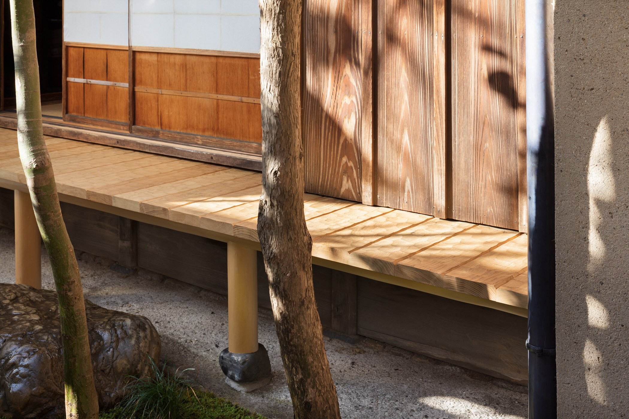
verandah: textured chestnut


