URA by Insideout
Concept Shop
URA | Insideout| photography : Kozo Takayama
DESIGN NOTE
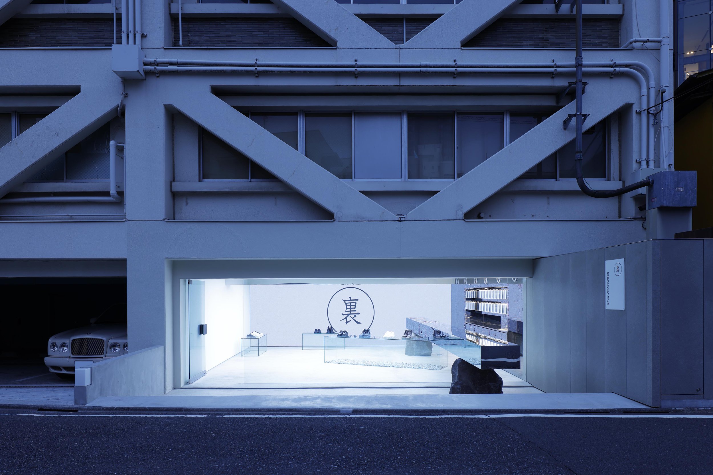
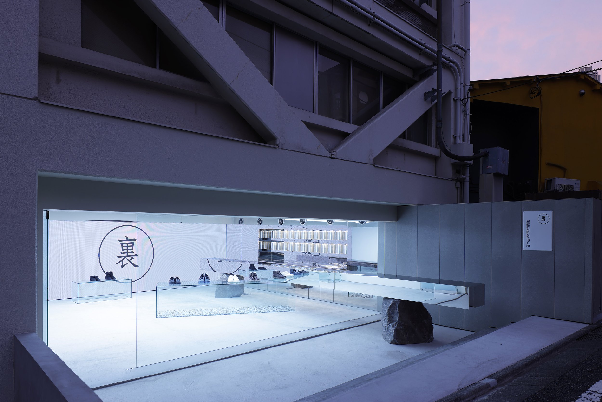
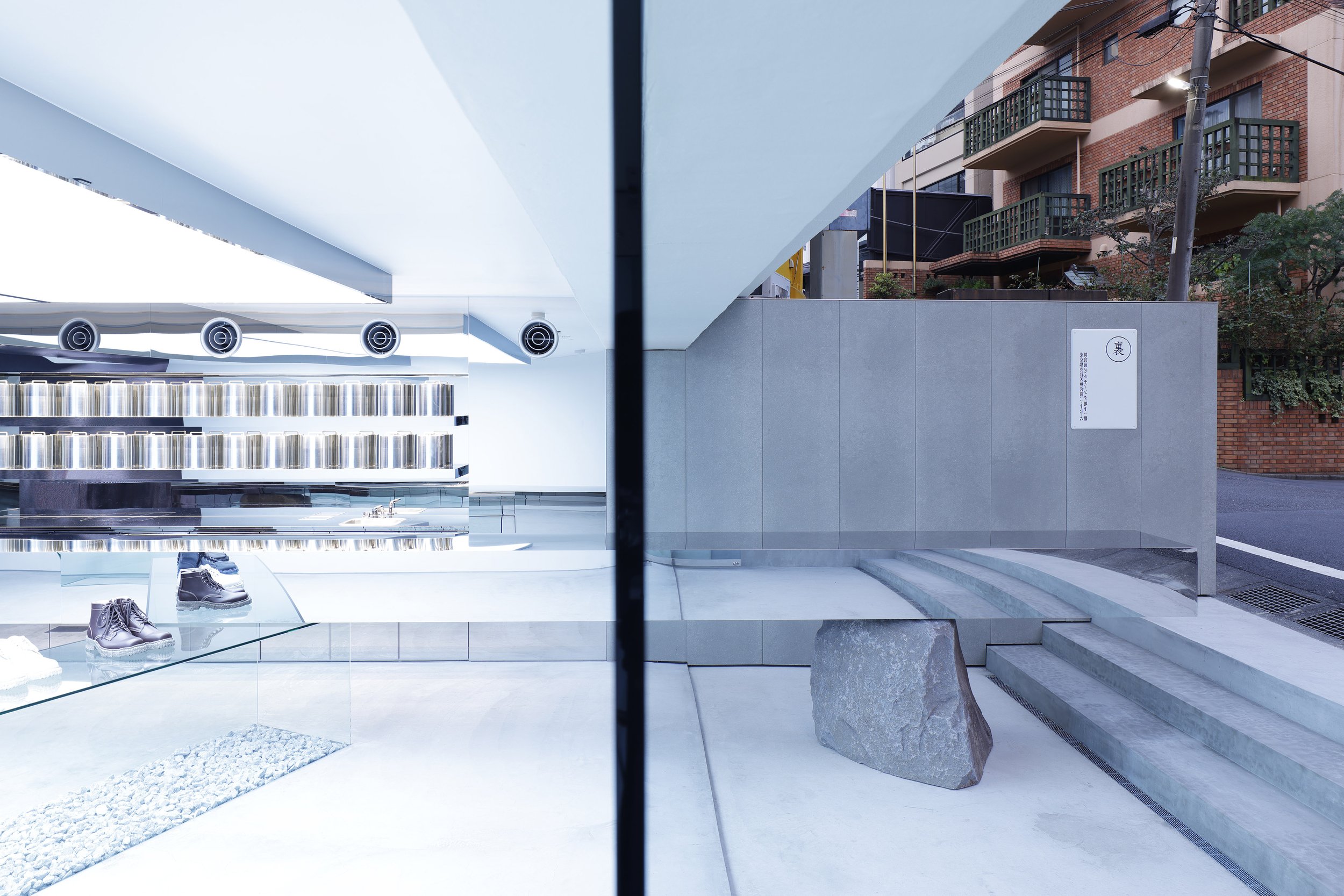
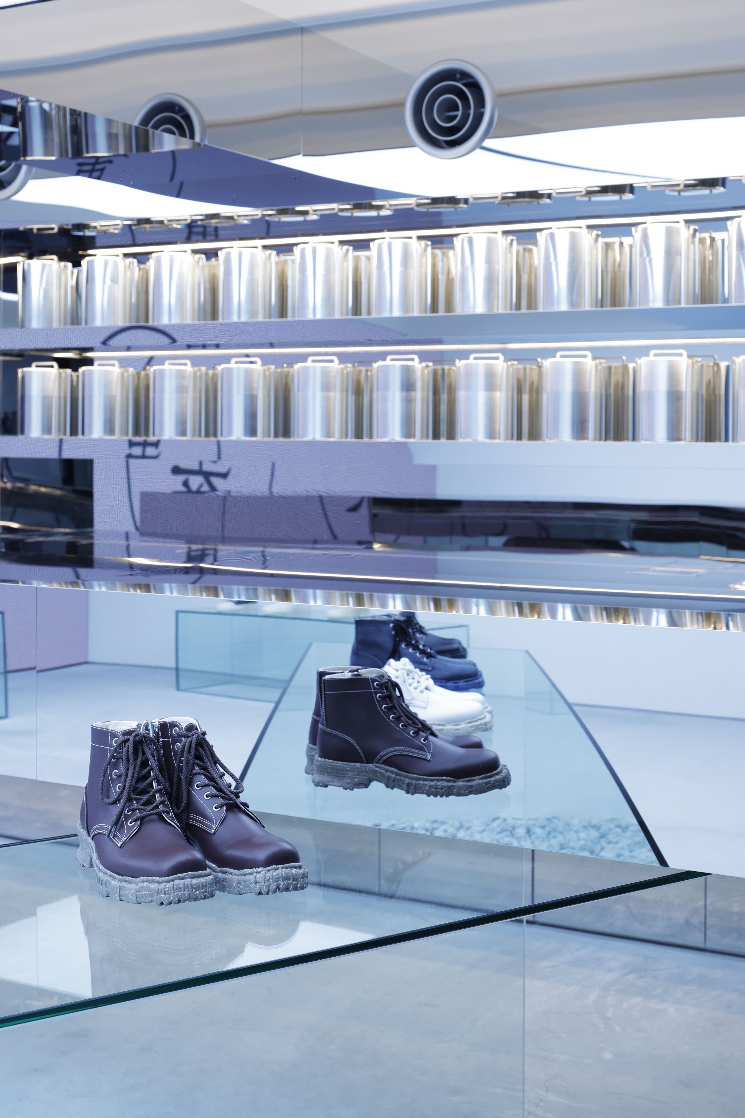
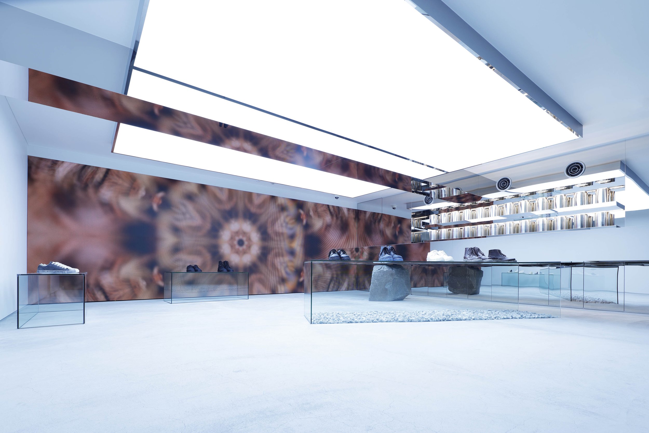
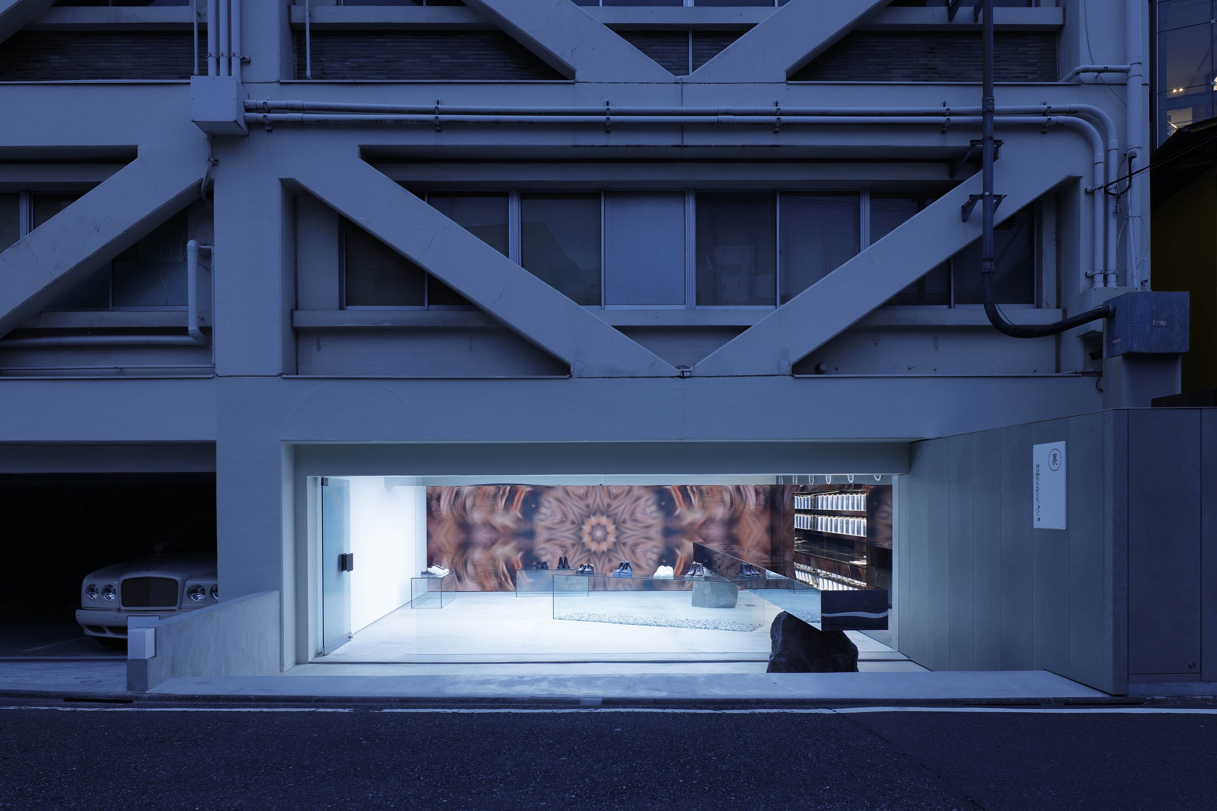
A Mirrored counter penetrating window glass
Experimental shop formed by abstract elements
Sophisticated fitout by renowned constructors Ishimaru and Mihoya Glass



photography : Kozo Takayama
words : Reiji Yamakura/IDREIT
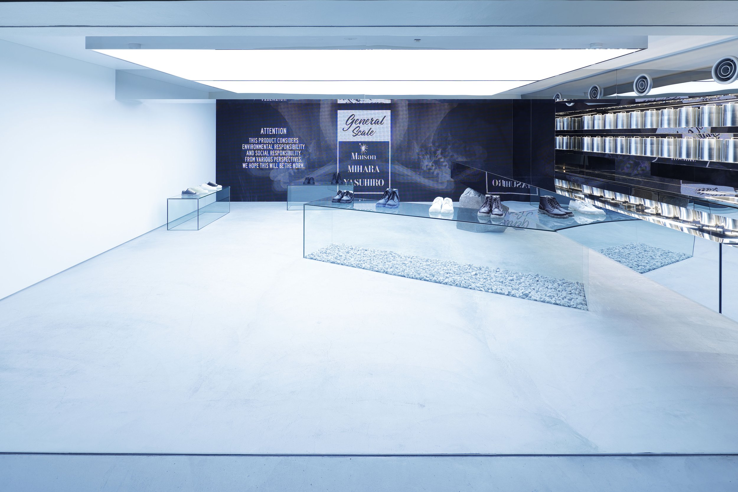
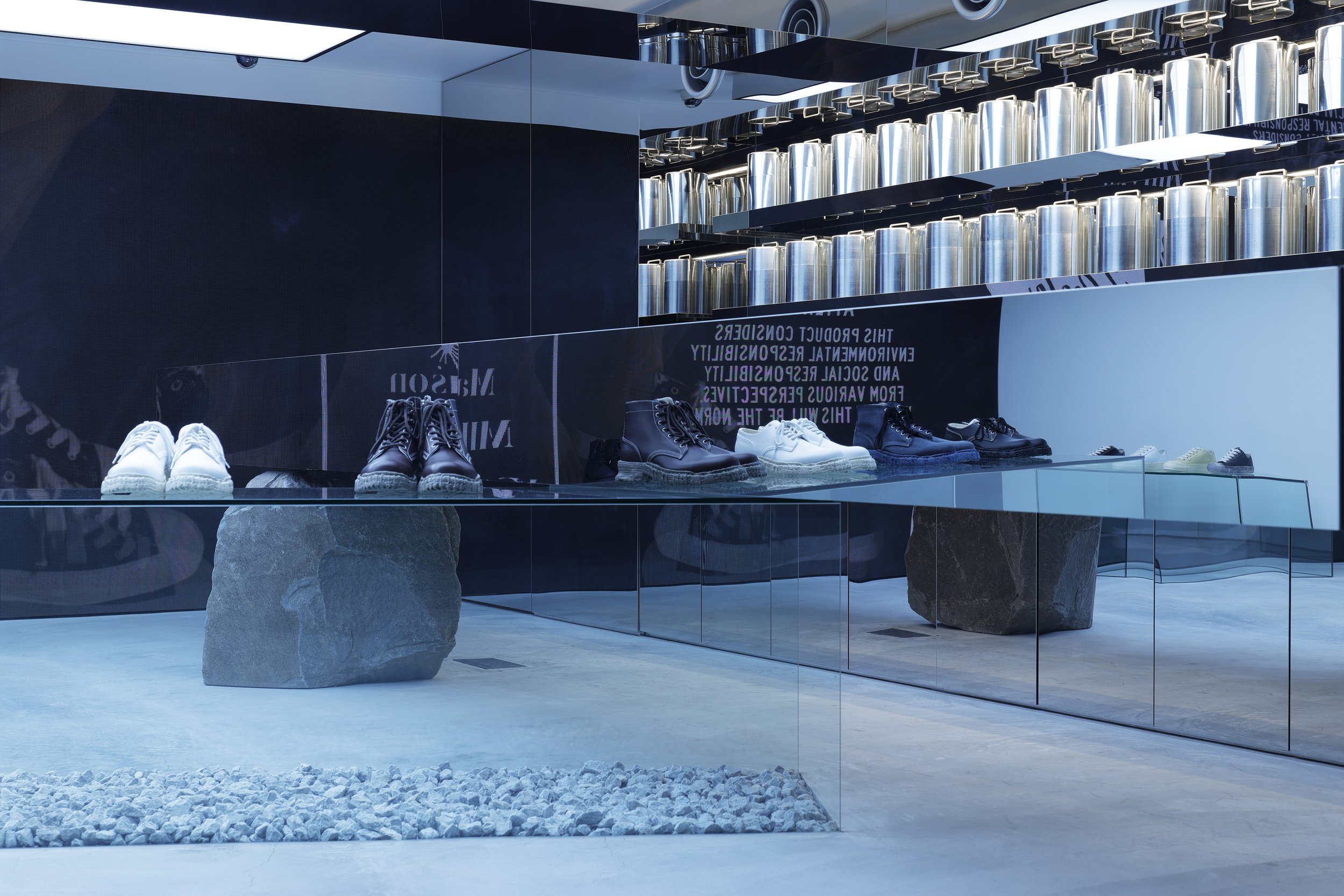
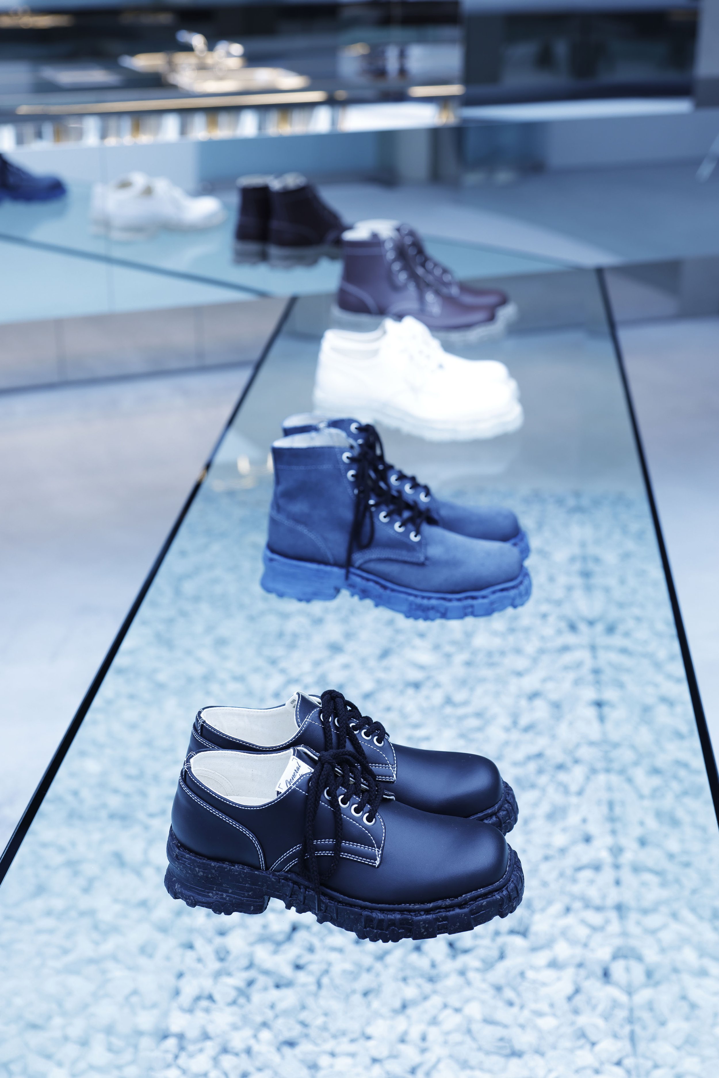
Tokyo-based design studio Insideout, led by Hiroto Kubo, has designed Sosu’s concept shop ‘Ura’ (The word Ura means backside in Japanese) in Jingumae, Tokyo. Sosu is a fashion company that operates brands such as Maison MIHARA YASUHIRO. The shop currently features shoes from General Scale, considered by Yasuhiro Mihara to be environmentally friendly and socially responsible, and shortly, Sosu plans to launch herbal teas in spring 2024. The shop’s logo and art direction were conducted by Ryosuke Uehara from KIGI.
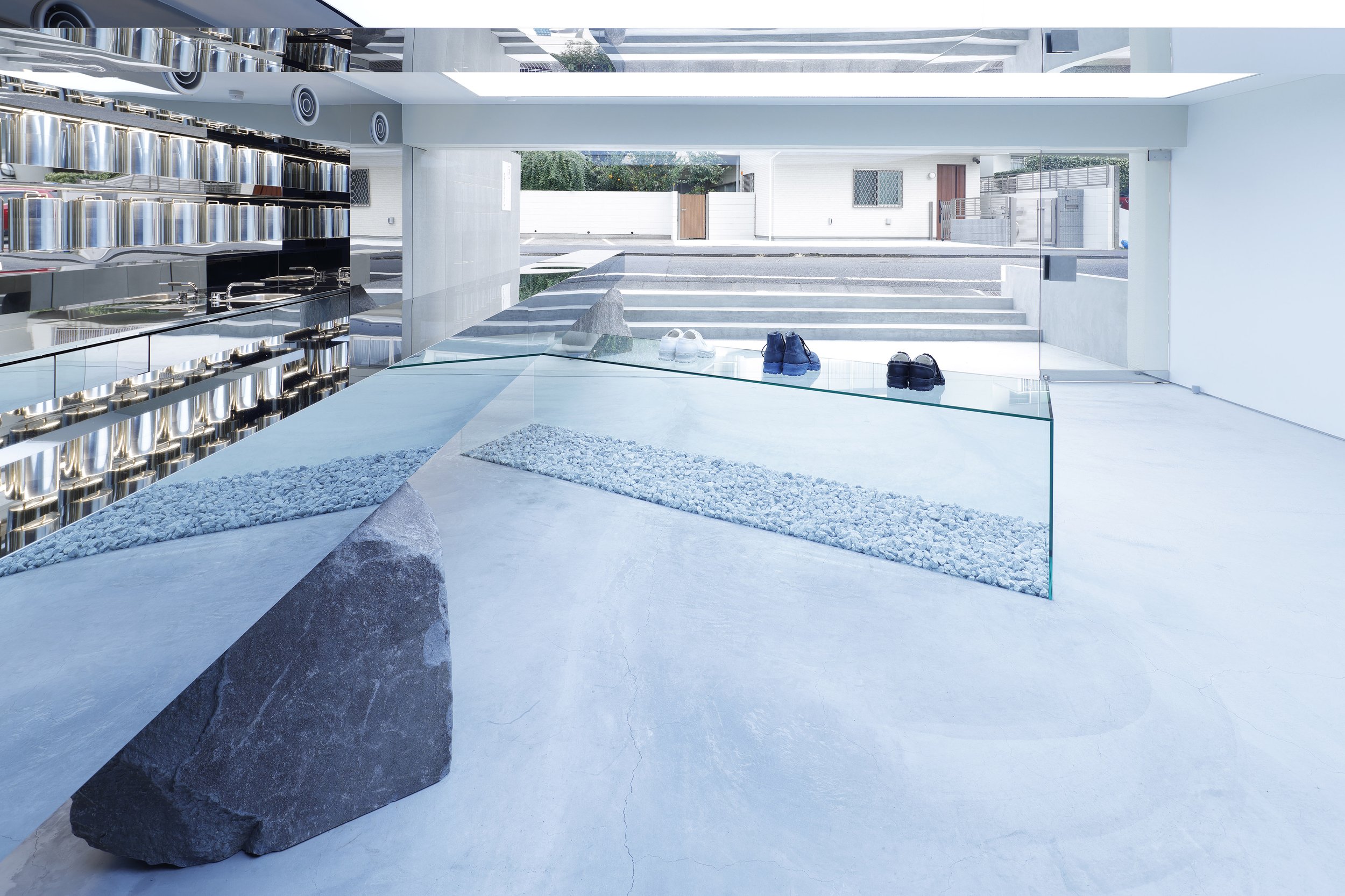
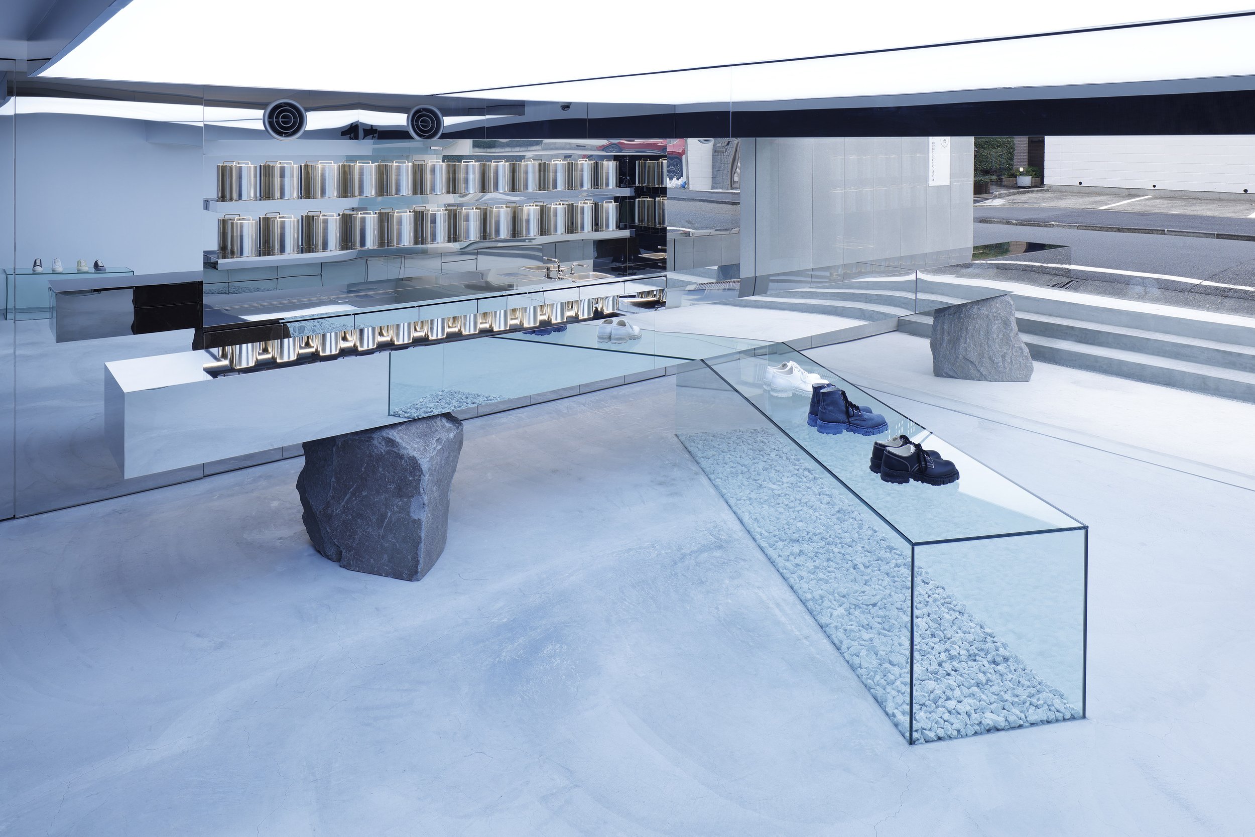
We asked Kubo how he came up with the idea for the provocative design, with mirrored display tables penetrating the glass facade. “First of all, the client wanted to create an experimental shop different from the existing ones. It means trying to do something new without being bound by the usual theories of retail outlets. It was decided that the shop would display General Scale’s shoes made of sustainable materials that return to the soil. The owner, Yasuhiro Mihara, told us that, as a company, they make environmentally considerate decisions on a daily basis but that they wanted to be creative and make things interesting rather than over-promoting their corporate philosophy by using eco-friendly materials.”
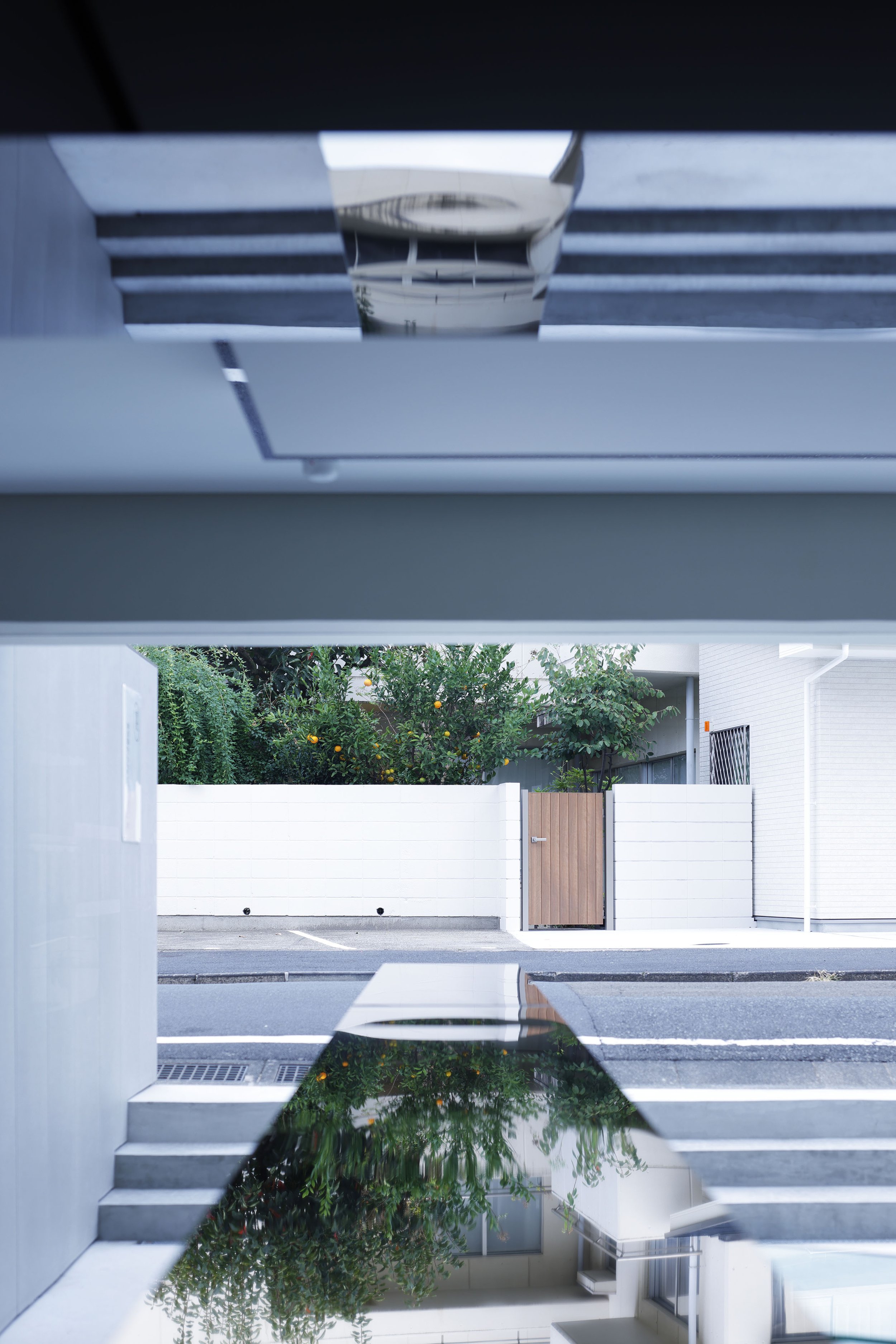
Kubo explains the design process: “As it is a back street, we thought about how we could surprise passers-by. Then, the idea of a minor incident happening here led to the design of a counter penetrating the glass. Also, since the merchandise is not fixed, I wanted the space to showcase public art, not to be filled with shelves for limited use.
In addition, as the shop only has 50 square metres, including the storage area, they regarded the roads and car parks as part of the shop’s territory and explored ways to connect the inside and outside.
The natural rough stones, gravel and lots of white space gave us the impression of a Japanese style, so we asked the designers if they were aiming for a Japanese aesthetic.
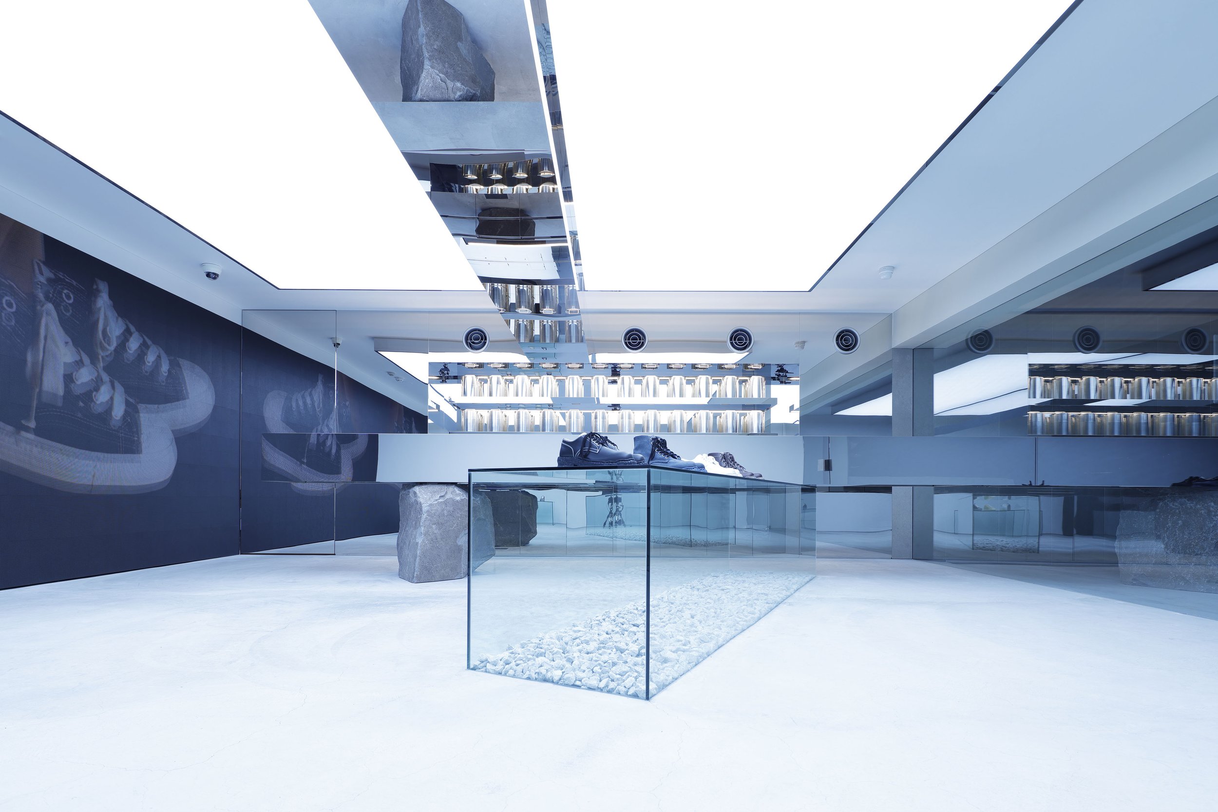
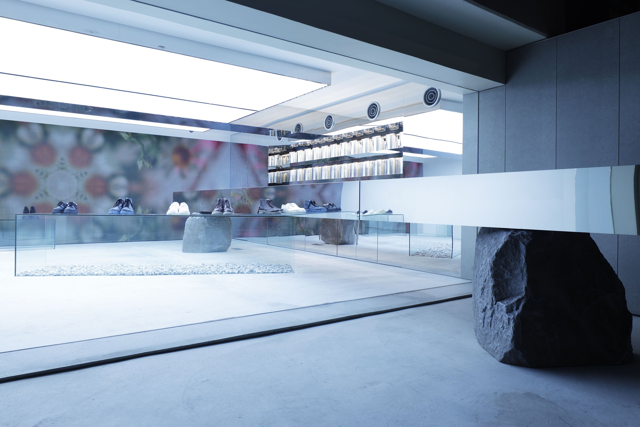
“The design was not intended to be Japanese style. We always want to express the contrast caused by two things, like natural and manufactured objects, the combination of thought and light materials. Here, we chose mirrors, glass and natural stone to make the products stand out.
In hindsight, this design resulted from our approach, which was more like creating a landscape here than designing a fashion shop.
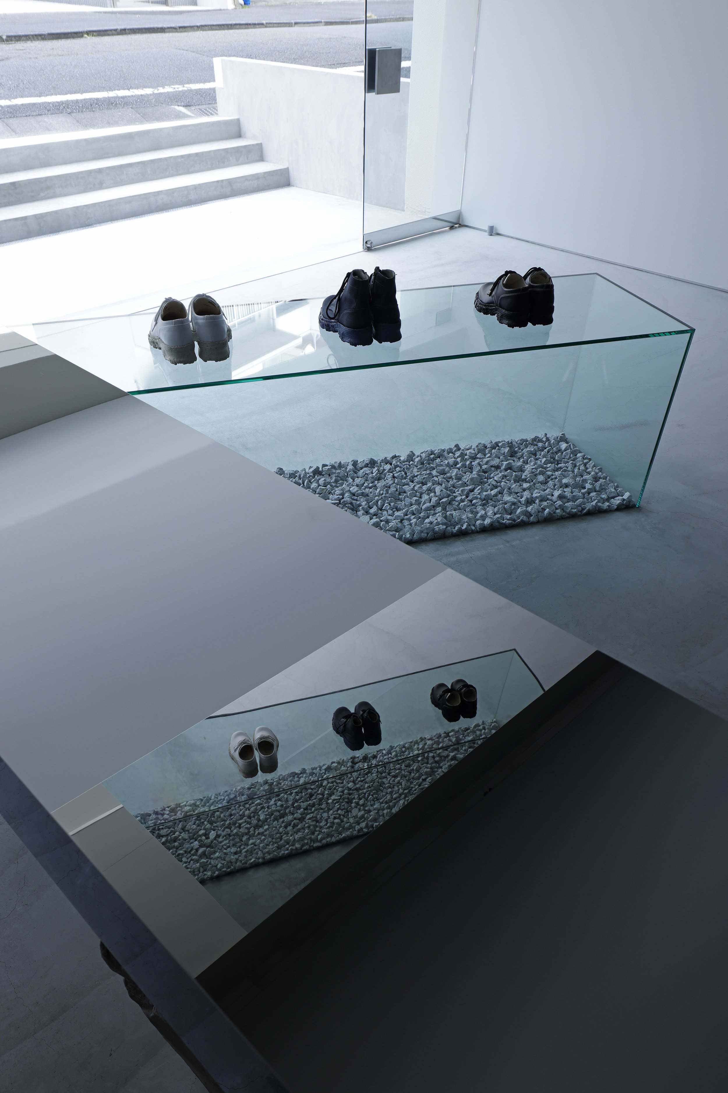
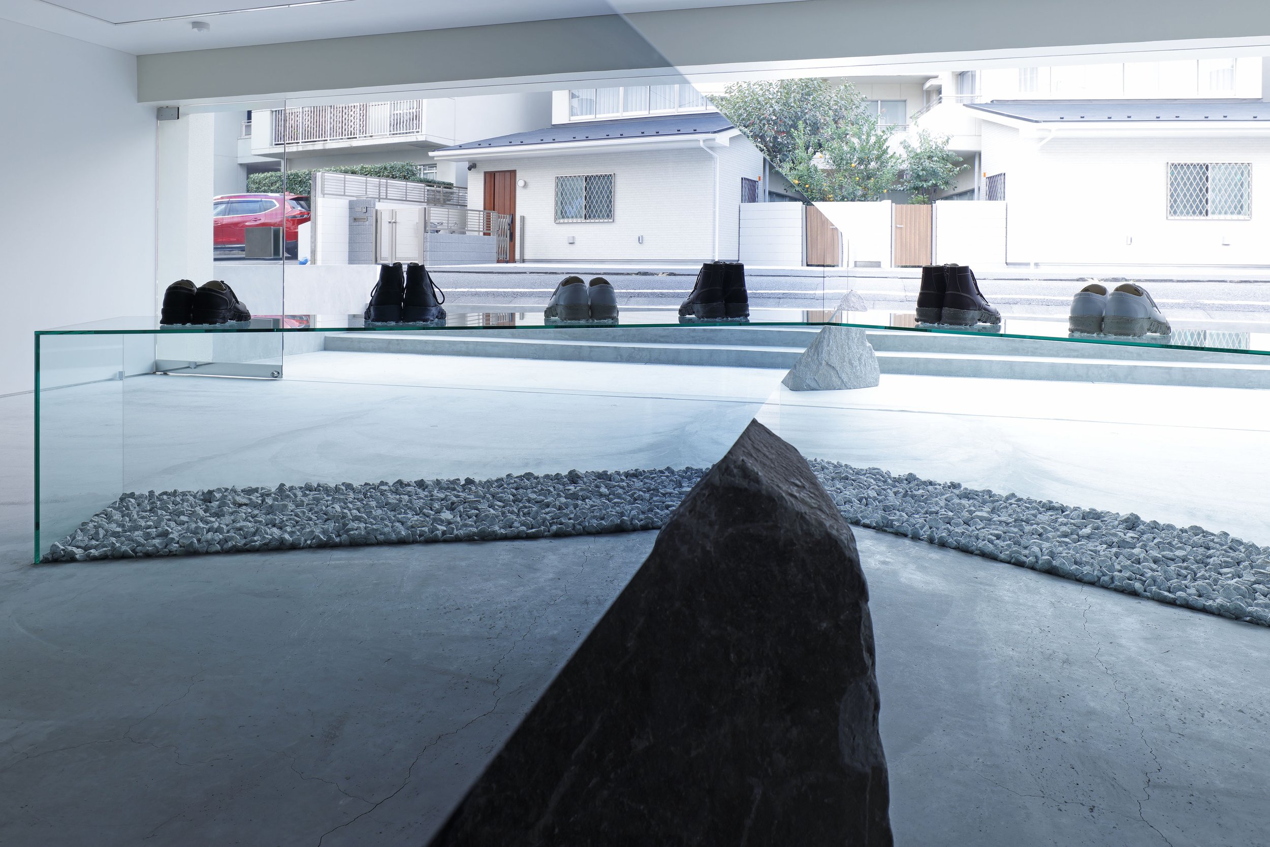
Mirrored display tables were positioned outdoors and indoors, as if penetrating the glass.
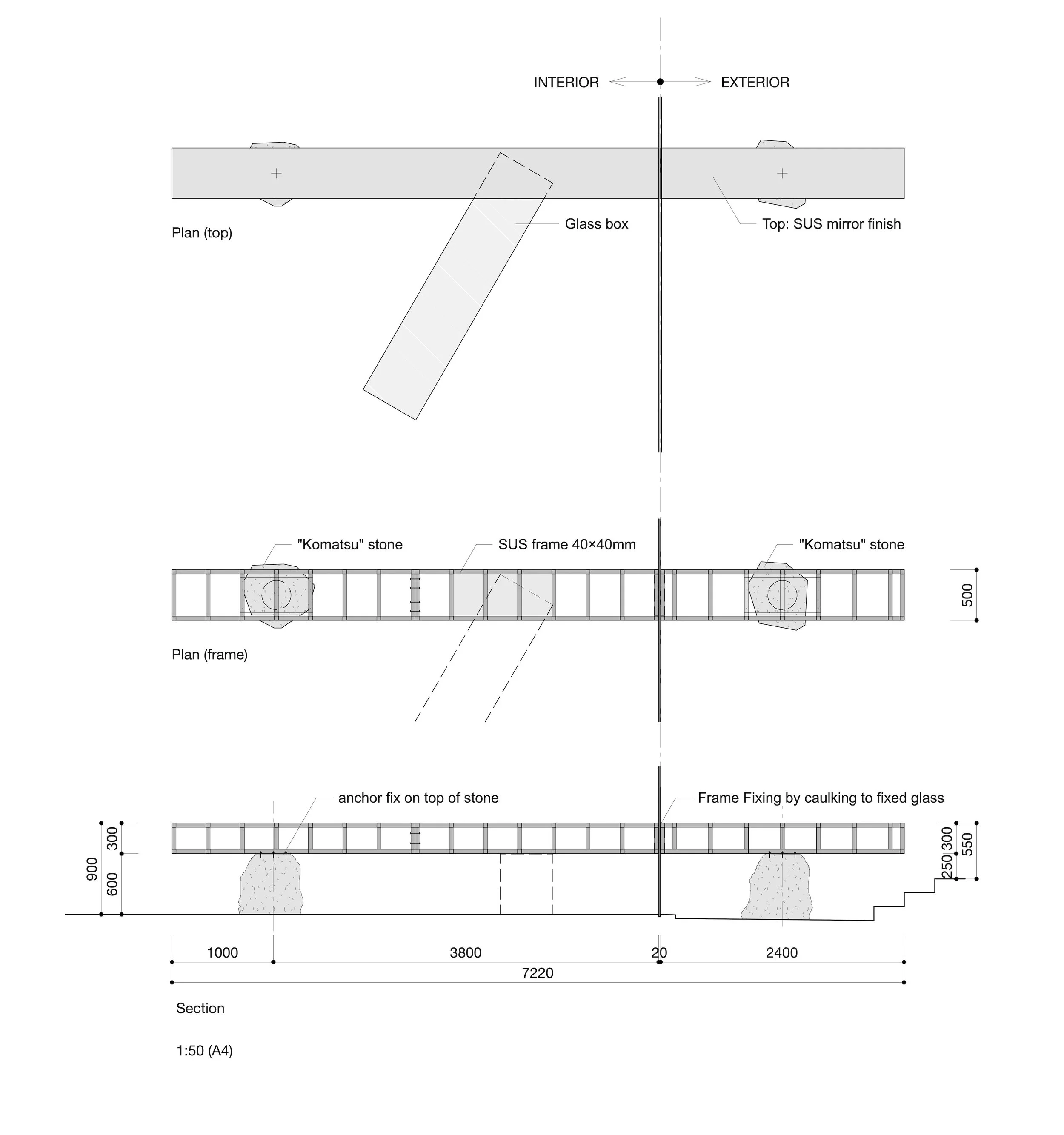
Drawings of the display table ©︎Insideout ltd.
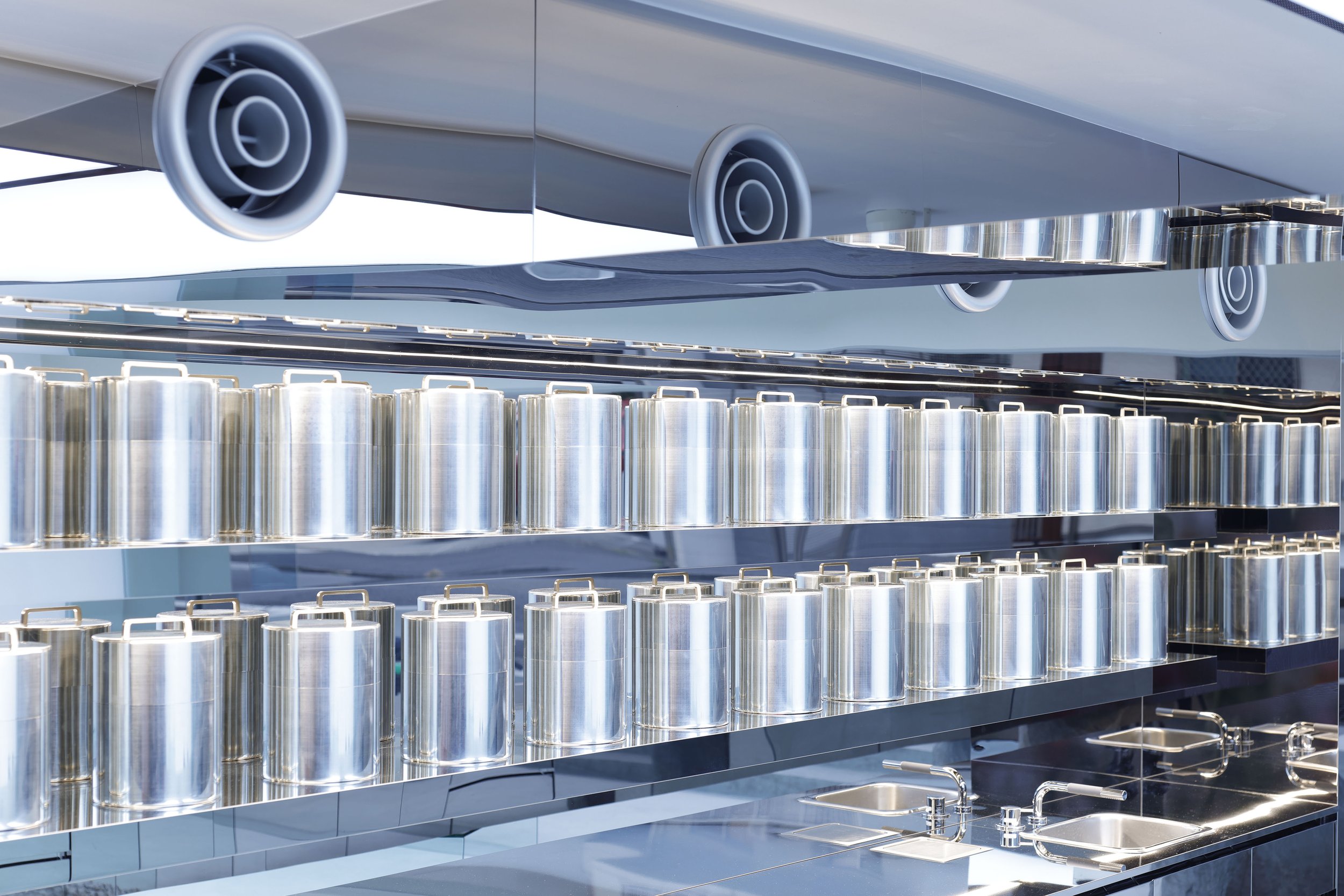
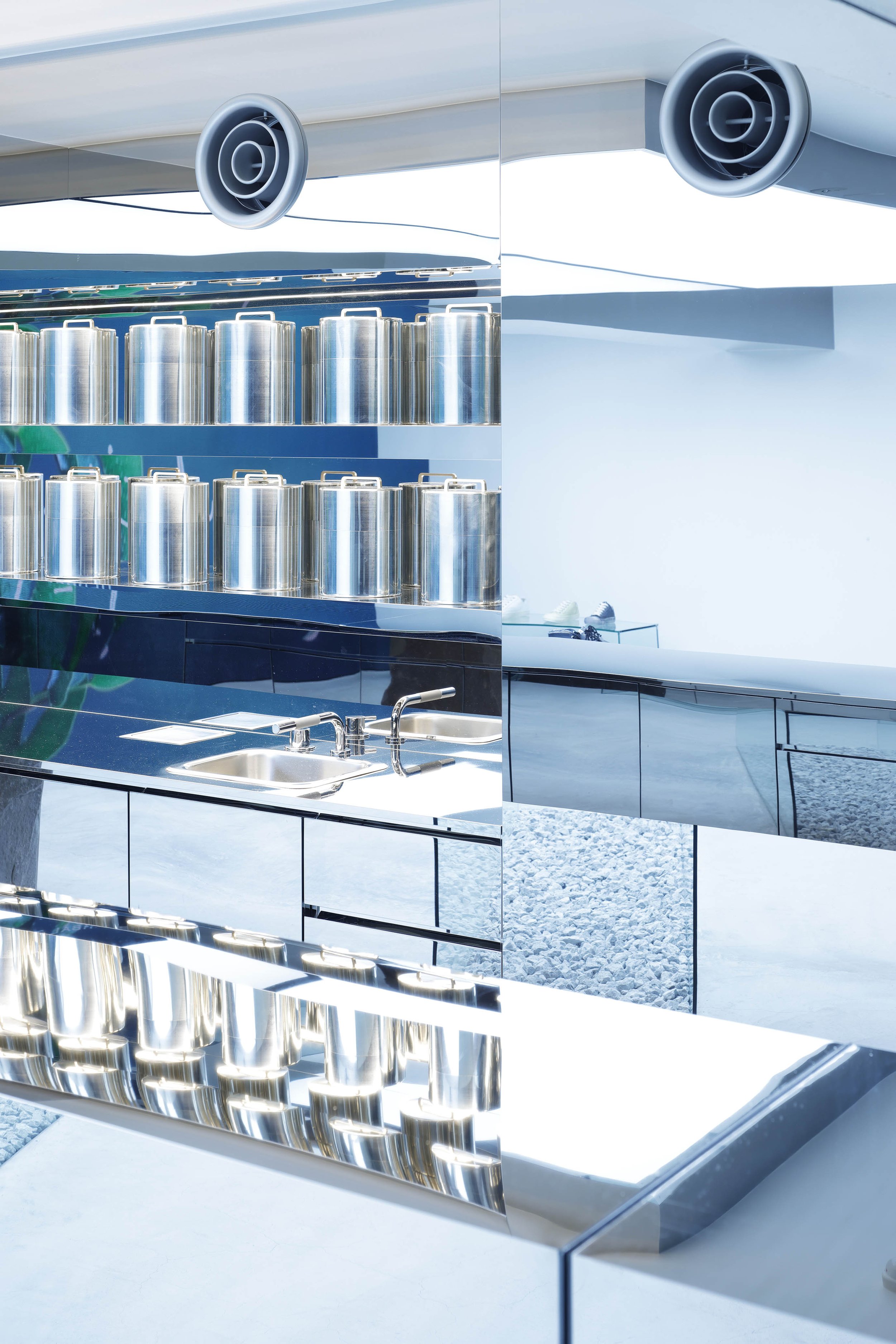
The construction was carried out by Ishimaru and Mihoya Glass, both experienced in shop interiors. Kubo adds that he could realise his design to perfection because of this construction team. Kubo aimed to erase the boundary between inside and outside, and the glass frames of the fixed windows were carefully concealed. Also, the counters were initially planned to be fixed with bolts through the glass, but after testing, an adhesive method was adopted, as the builder decided that it was better not to make holes in the glass. The counters were initially planned to be fixed with bolts through the glass, but the builder decided that it was better not to make holes in the glass, so the adhesive method was adopted. The joint between the natural stone and the counter was also a challenge, but thanks to the builder’s skill and enthusiasm, an acrobatic floating counter, with no support for approximately 3m distance, was achieved. The LED screen, which the owner wanted, was designed to fill the entire wall with LED units, increasing the depth and making the shop feel more spacious.
At the end of the interview, Kubo said, “Inside and outside is a theme that I have been pursuing for a long time. For the Ura project, I concentrated on making the shop feel like an outdoor space. Mihara-san and I are always exploring ways to make products look better. Sometimes, we talk about contemporary art and Mono-ha (School of Things), such as the relationship between points, planes and lines. In this shop, the products will change in the future; however, I tried to keep the spatial composition unchanged.” Collaborations with other brands are planned for the future, and it will be interesting to see how the art-like space will evolve under the unique theme of Ura.
DETAIL
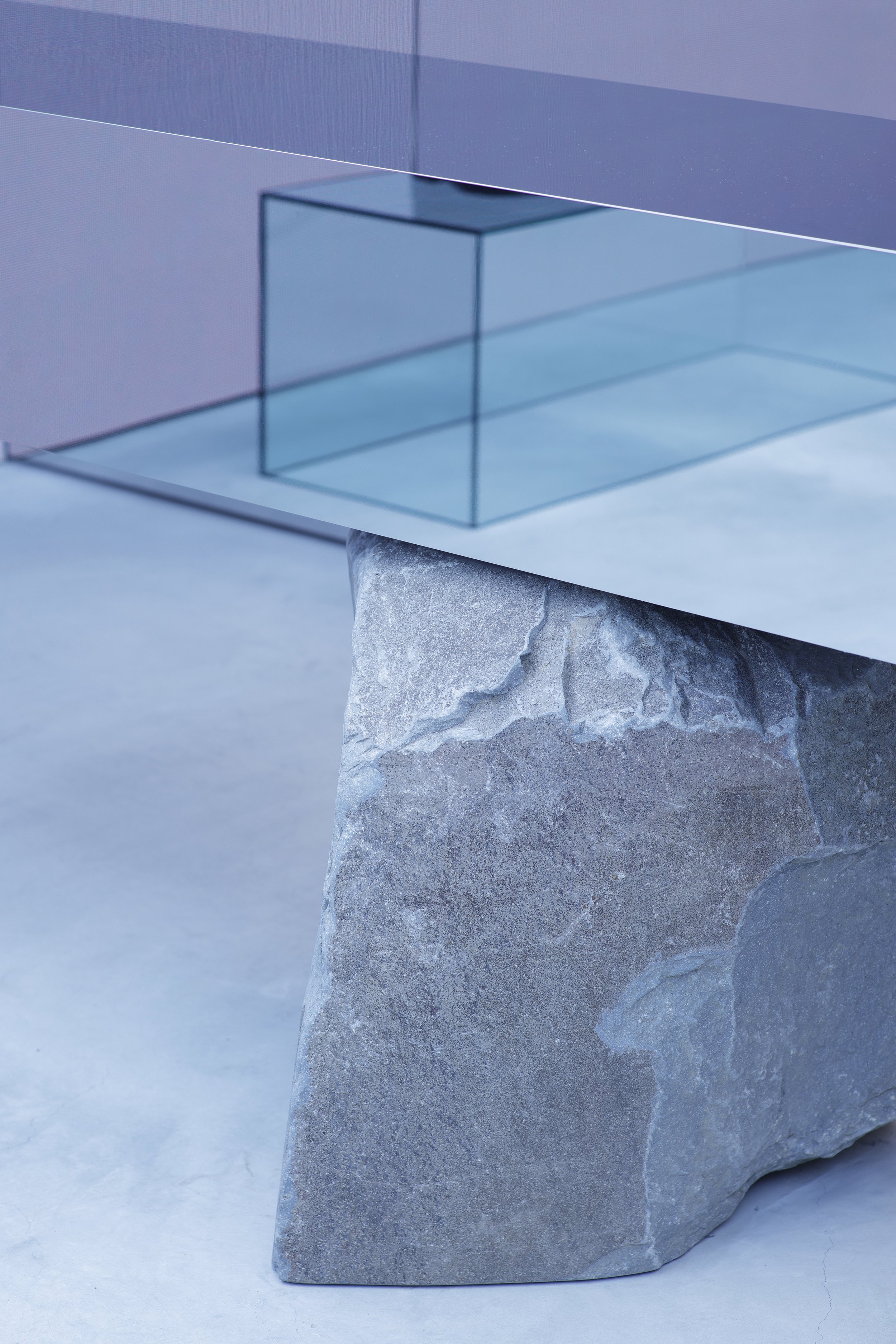
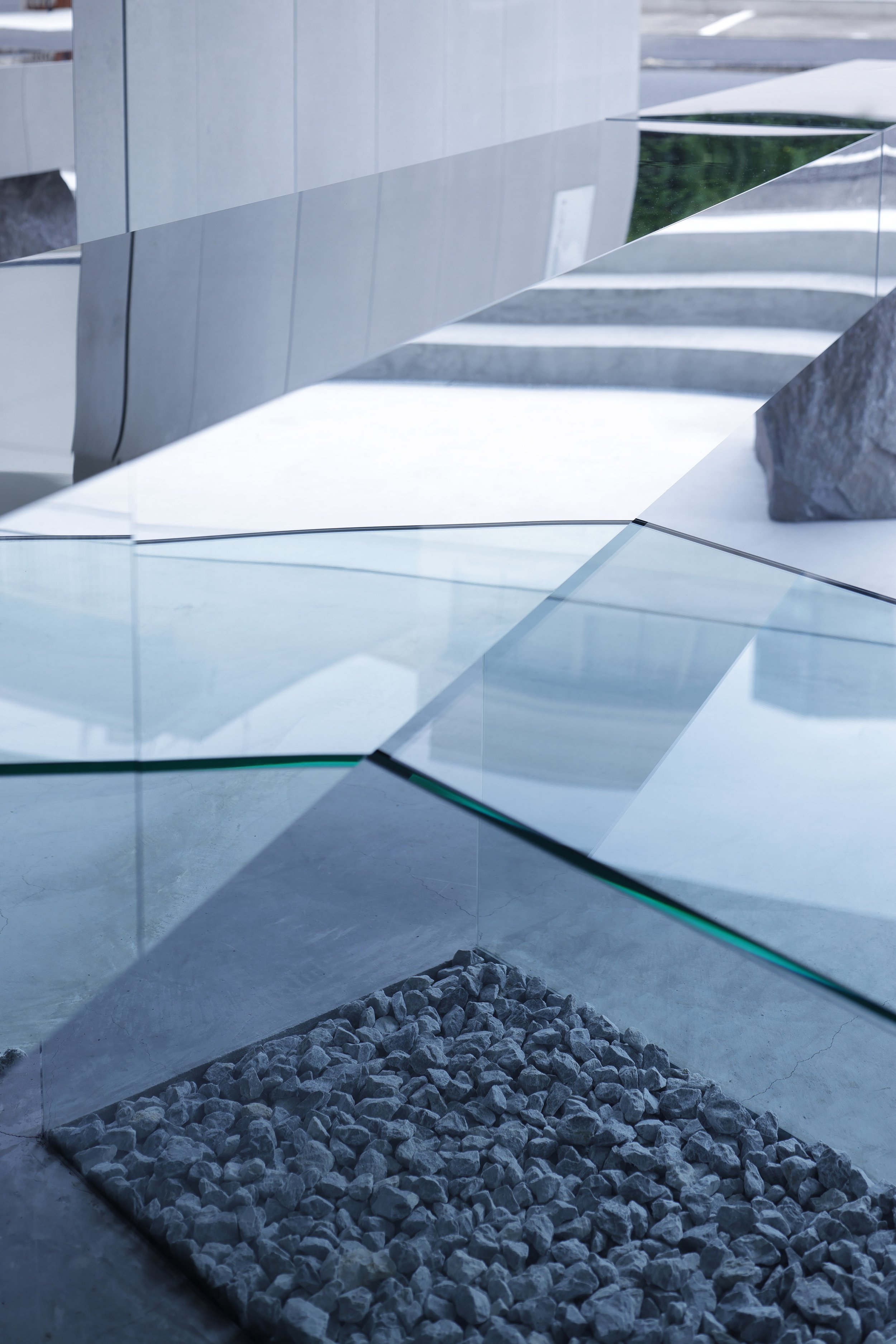
A detail of the mirrored display table, seen from outside. The display table is mounted on Komatsu stone, selected by the designer Kubo from the Manazuru Peninsula, Kanagawa Prefecture.
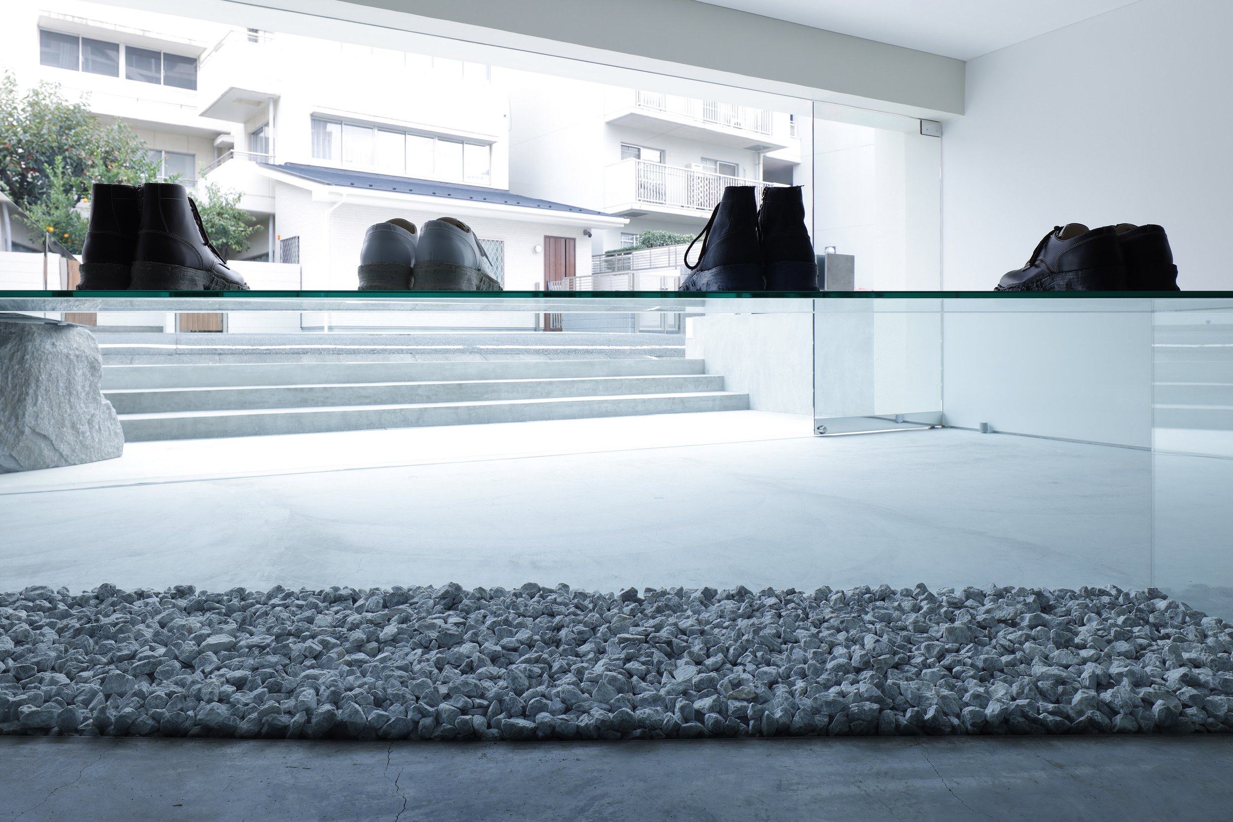
A glass box was placed under the display table. The vertical load of the display table is supported not by the glass box but only by the stone on the left and the glass surface on the right.
The inside of the glass box is covered with white gravel.
A detail of the joint between the stone and the display table seen from the inside. The builder installed invisible hardware that could be rotated to fine-tune the angle of the stone on site.
Plan ©︎Insideout ltd.
CREDIT
Name: Ura
Design: Hiroto Kubo, Irene Alonso/ Insideout ltd.
Lighting Design: HIBIKI Inc.
Glass Work: Mihoya Glass
Masonry: Takebayashi Stonemason
Construction: Ishimaru co., ltd.
Art Direction: KIGI
.
Location: Jingumae Building B1F 2-17-6 Jingumae, Shibuya-ku, Tokyo
Owner: SOSU Co,, Ltd
Main use: Shop
Completion: October 2023
Floor area: 68sqm (shop 36.5sqm, storage 10.5sqm, terrace 21sqm)
.
Material
exterior wall: Solido (recycled material mixed cement panel)
floor: mortar
interior wall: PB + EP, mirrored stainless steel
ceiling: luminous stretch ceiling
furniture and fixture: display table/mirrored stainless steel, natural stone (Komatsu-ishi), glass t10mm + white gravel (Sawa-ishi) movable display table/glass t10mm wall shelf/mirrored stainless steel


