IPSA AOYAMA by Joint Center
Skincare Store | Tokyo, Japan
IPSA AOYAMA | Joint Center | photography: Yoshio Shiratori
DESIGN NOTE
Minimalist interior for Japanese skincare brand IPSA
A detail that connects the ceiling and walls seamlessly
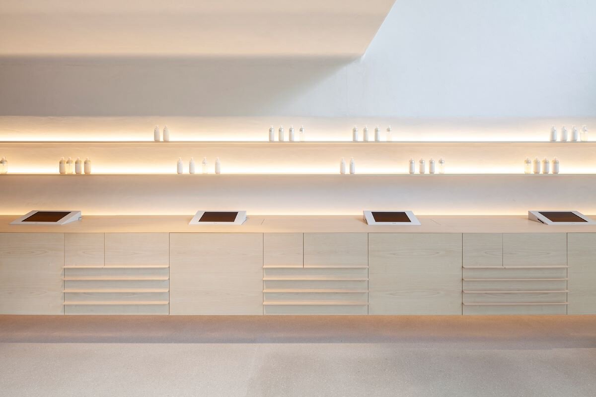
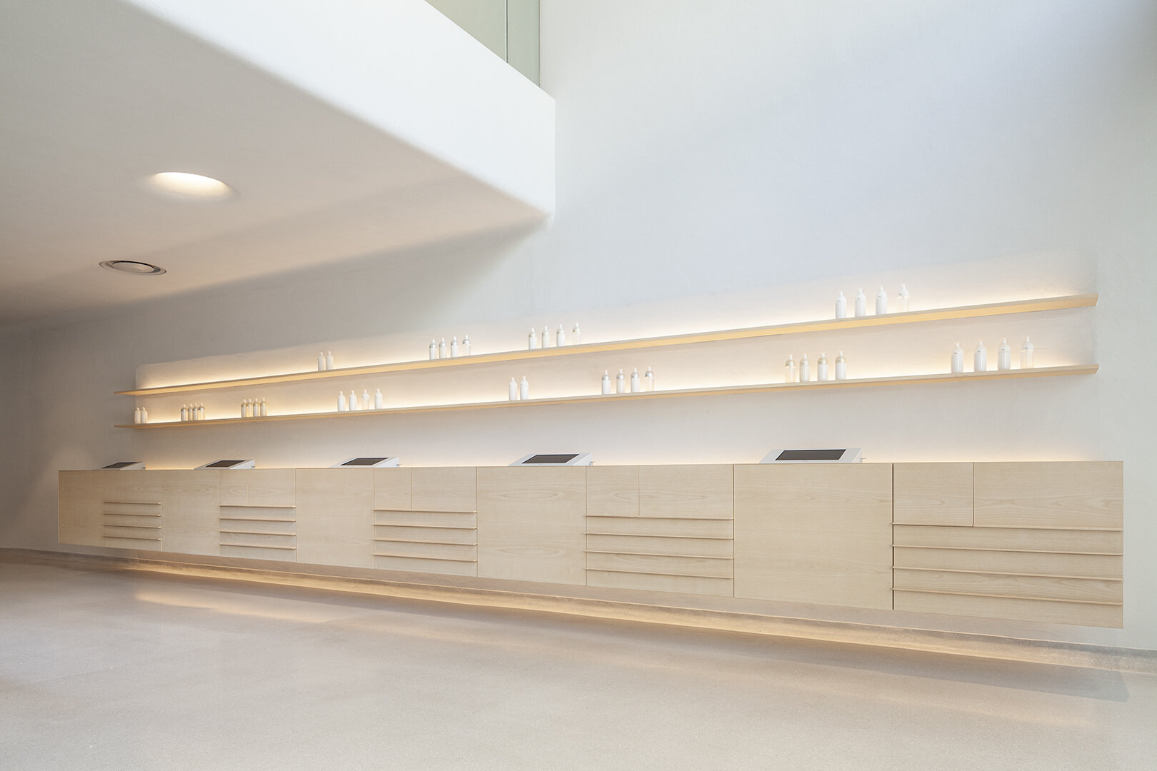
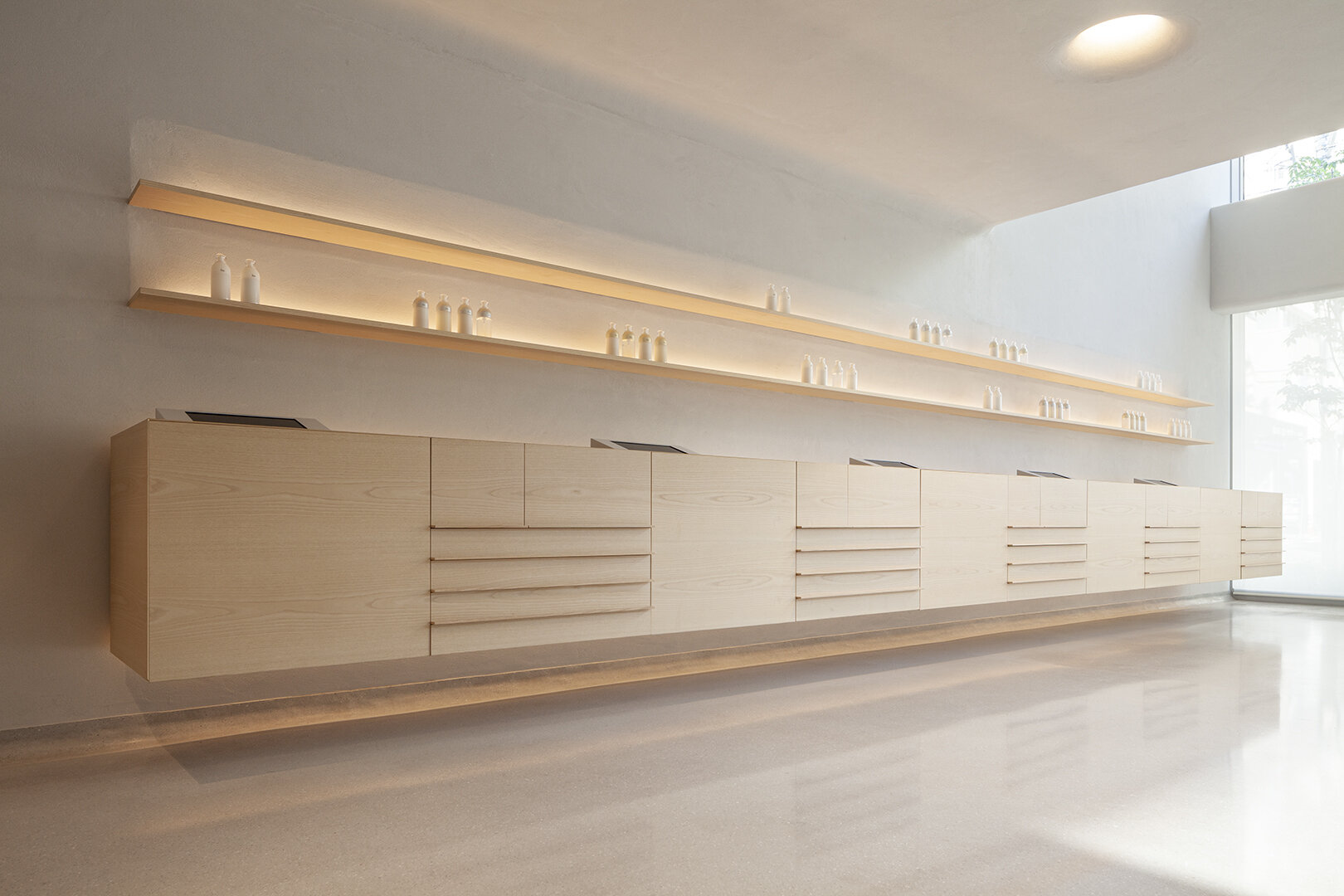
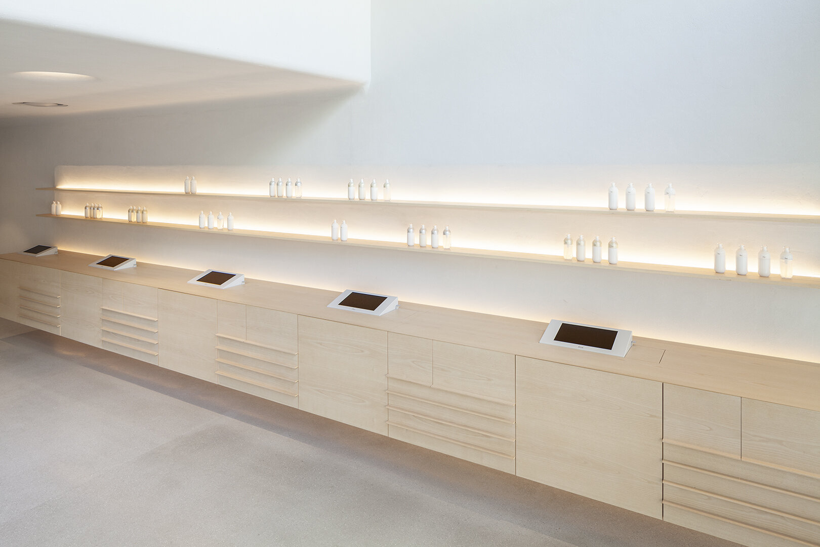
Functional white ash-made fixtures


photography : Yoshio Shiratori
words : Reiji Yamakura/IDREIT
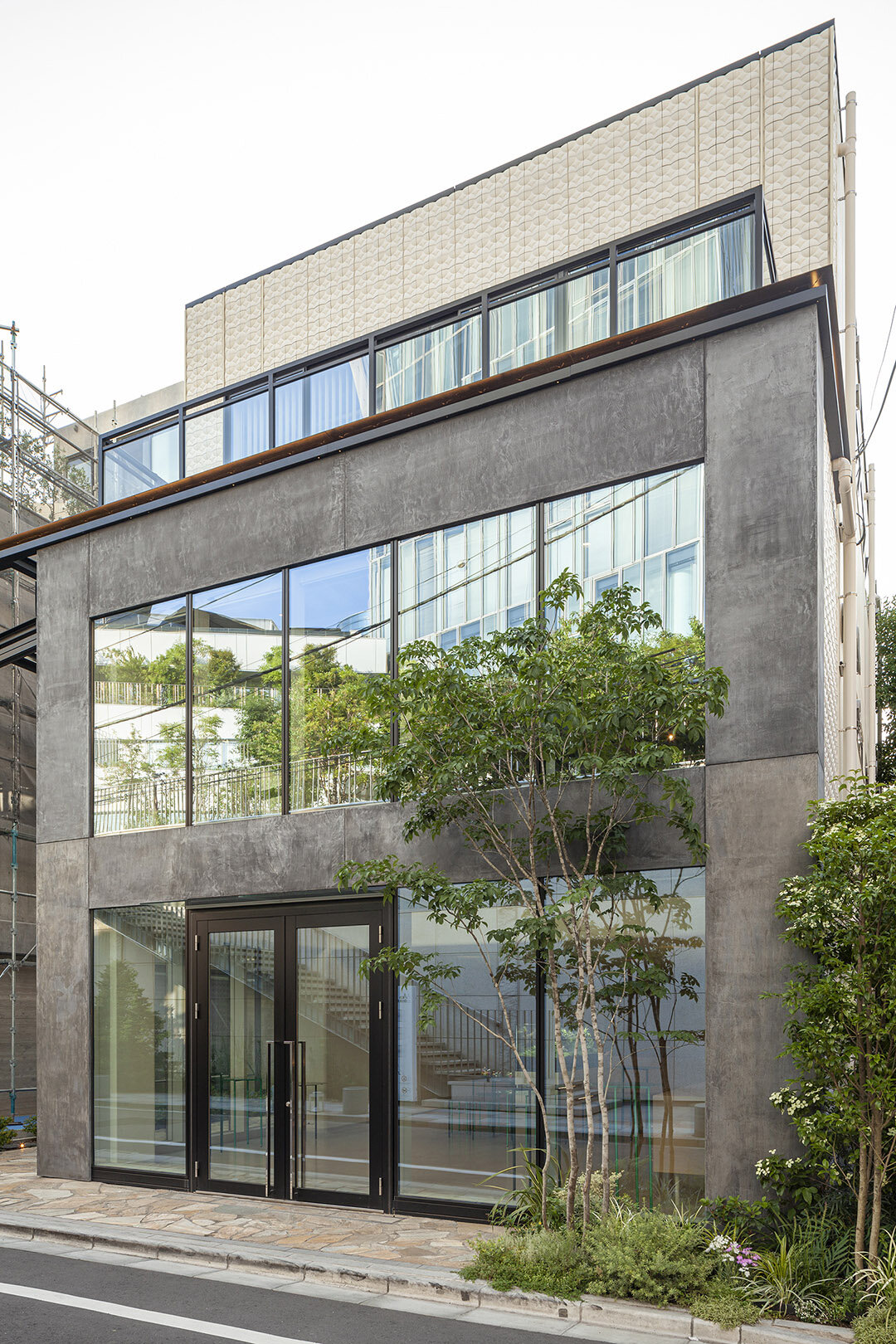
Tokyo-based design studio Joint Center has designed a flagship store of skincare brand IPSA in Aoyama, Tokyo. That was their first stand-alone store on the street level. Also, CDL (Communication Design Laboratory), who has been working on its branding for many years, was in charge of the store design direction.
"CDL gave us the store concept of a place that would stimulate aesthetic vitality, and we were asked to create a space that could be used for launch events, workshops, and counselling. We had worked on designing IPSA's offices in the past, so we understood their brand concept, but designing it was not easy because it was not like a traditional store in a department store," said Choei and Shigemitsu Hara of Joint Center.
"As we came to understand the brand identity of IPSA, we decided that this space should be as simple as possible. Normally, we would use several materials that fit the concept of the space. Still, here, I aimed to leave no impression of the interior materials or colours when the customers leave", Choei Hara added.
photography: Joint Center
Inspired by the sophisticated bottles designed by CDL, Joint Center worked on the interior design to make the beautiful products stand out. They created the border between the wall and the ceiling seamlessly, like a curved background used for photography, so shadows would not be noticeable much. The holes for the downlights in the ceiling were also designed seamlessly.
The two designers explained, "We wanted to create a seamless space that would allow the products to come to the forefront. For the wooden fixtures on the first floor, we chose white ash, which is lighter in colour and has an unfinished look. We designed this fixture to store all the tools used for counselling, and when the drawers and doors are closed, nothing can be seen".
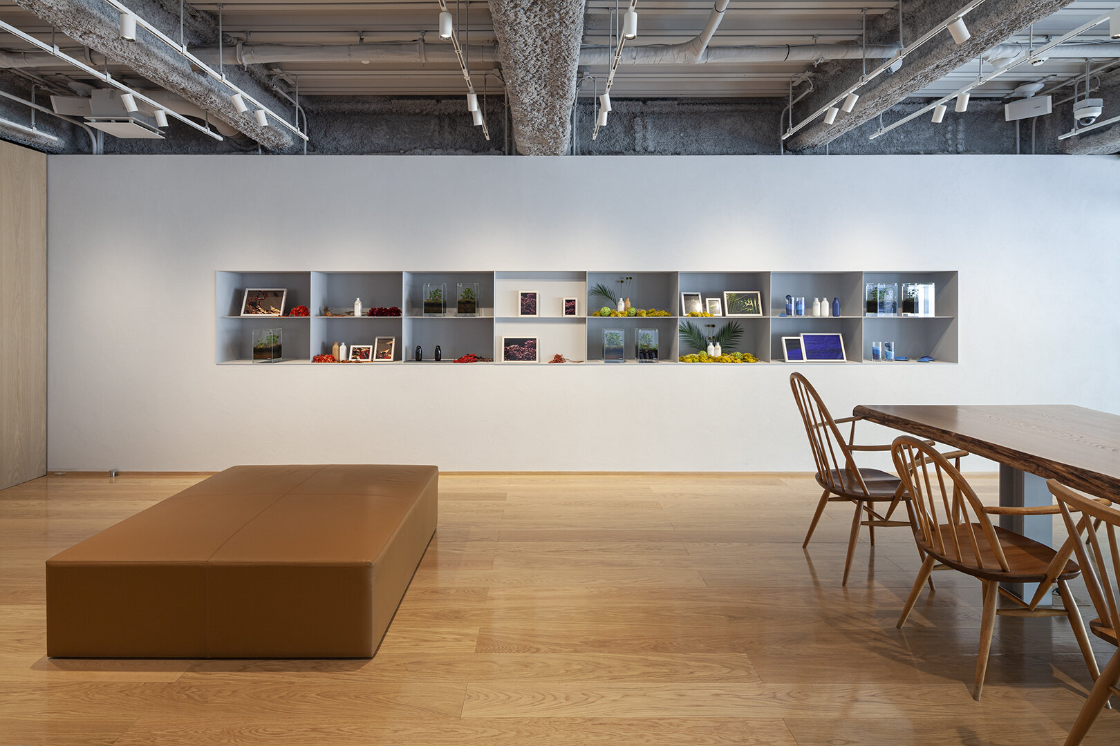
The second floor, connected by a stairwell, is equipped with a communal table of solid Japanese horse chestnut to enable workshops and events. "Making the place where the brand story is communicated to the customers was the most essential", Choei Hara reiterated. As the designer told us, the minimalist design, matched with its purpose, showcases the philosophy of IPSA.
DETAIL
The original furniture used for counselling was made of white ash. The boundary between the ceiling and the walls was finished seamlessly to minimize shading.
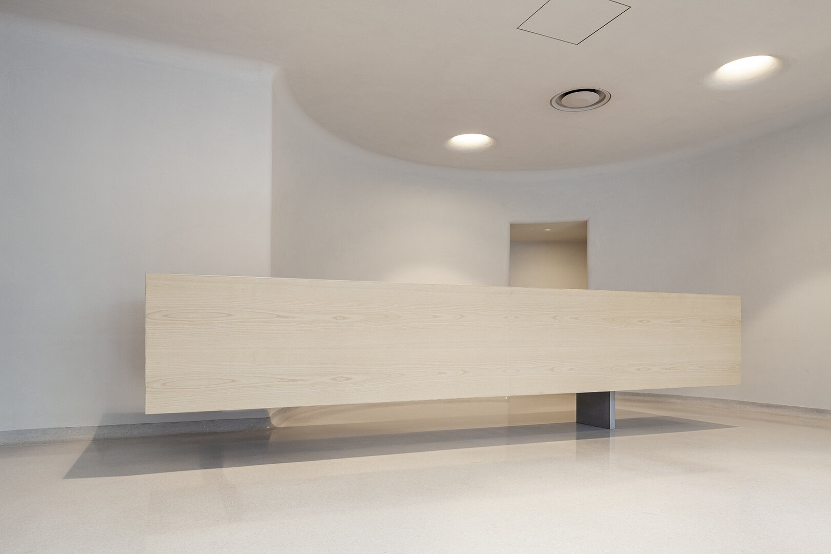
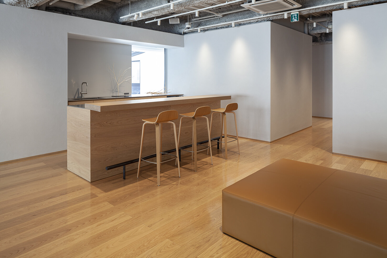
The designers designed the counter to be lighter look, with one side supported by the wall and the other by steel legs.
On the second floor, there is a Japanese horse chestnut live-edge table that can be used for workshops.
CREDIT
Name: IPSA AOYAMA
Shop Design Direction: CDL
Design: Choei Hara Shigemitsu Hara / Joint Center
Lighting Design: muse-D
Plaster Work:Harada Sakan
Construction: Bosha-Keikaku Kobo
・
Location: FPG links OMOTESANDO 3-10-13 Kita-aoyama, Minato-ku, Tokyo
Owner: IPSA CO., LTD.
Main use: Shop, event space
Completion date: May 2019
Floor area: 1F 109.7 sqm, 2F 86.0sqm
・
Material
floor: 1F/terrazzo 2F/oak flooring + white oil + wax
wall: Keiso-do diatomite based plaster
exterior wall: mortex
ceiling: Keiso-do diatomite based plaster
1F fixture: white ash veneer + matt clear coat
1F counter: white ash veneer + matt clear coat leg/steel + metalic paint
2F tabletop: live edge Japanese horse chestnut + oil finish
2F bench: leather


