FREITAG Store Kyoto by TORAFU ARCHITECTS
Kyoto, Japan
FREITAG Store Kyoto | TORAFU ARCHITECTS | photography : Daici Ano
DESIGN NOTE
Industrial interior, exposing the concrete and steel structure
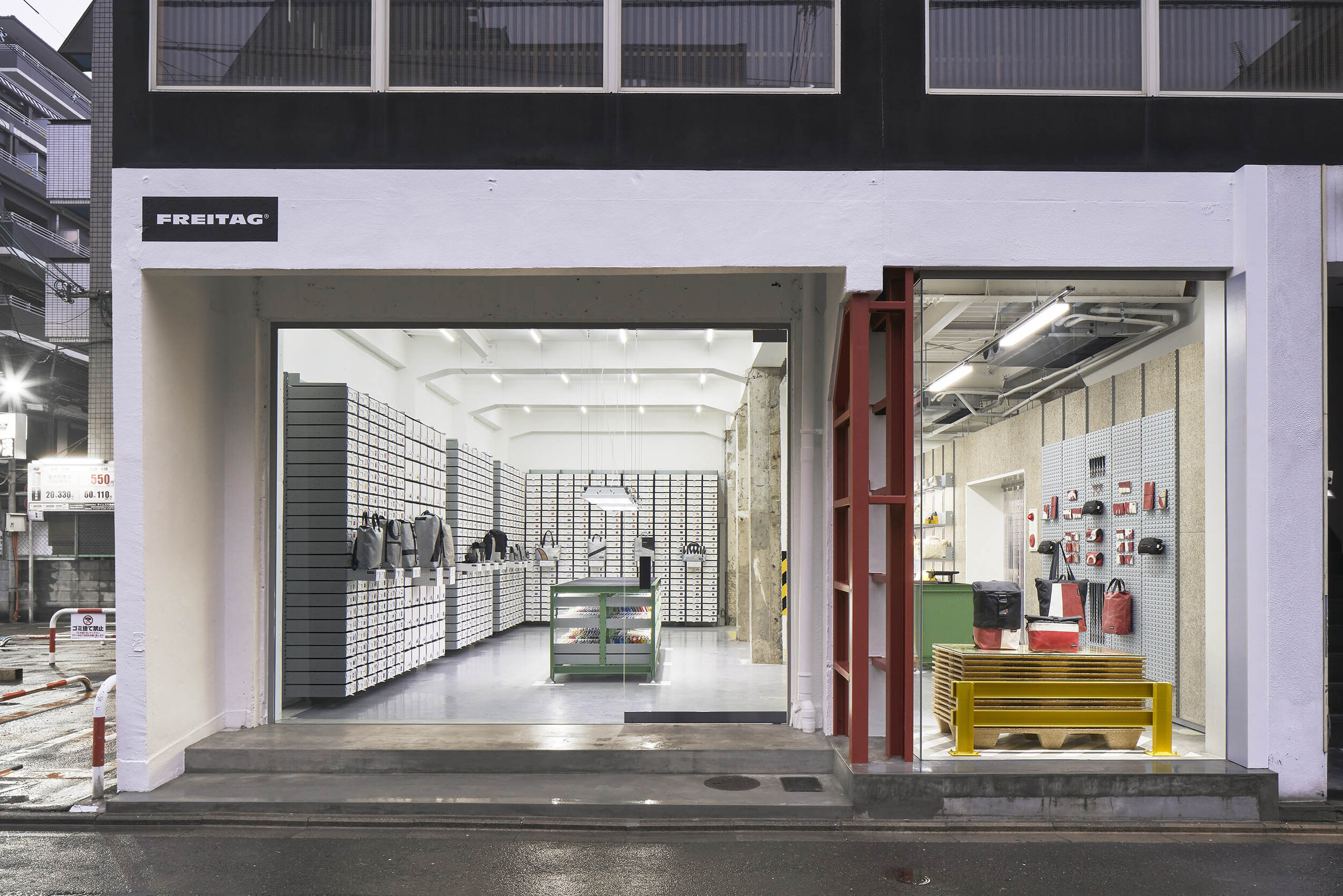
Open-plan store with views from the street
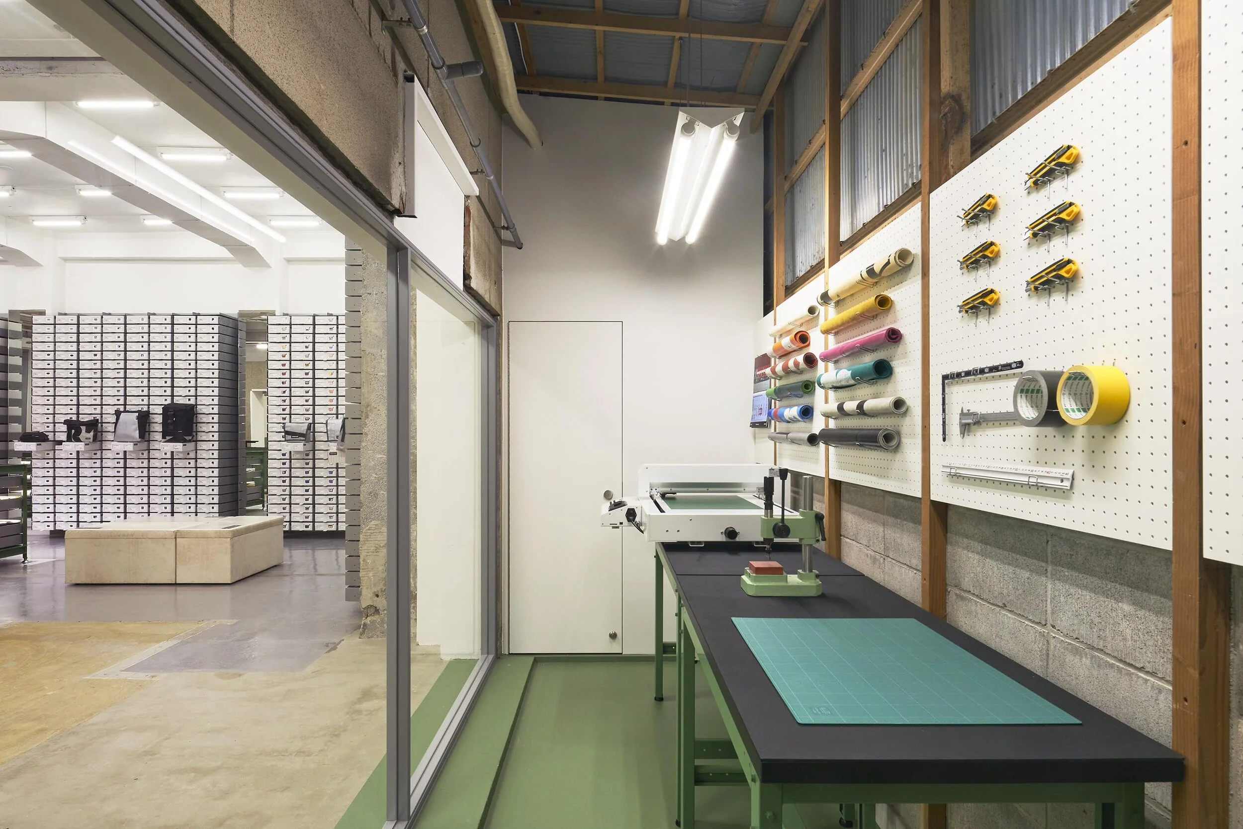
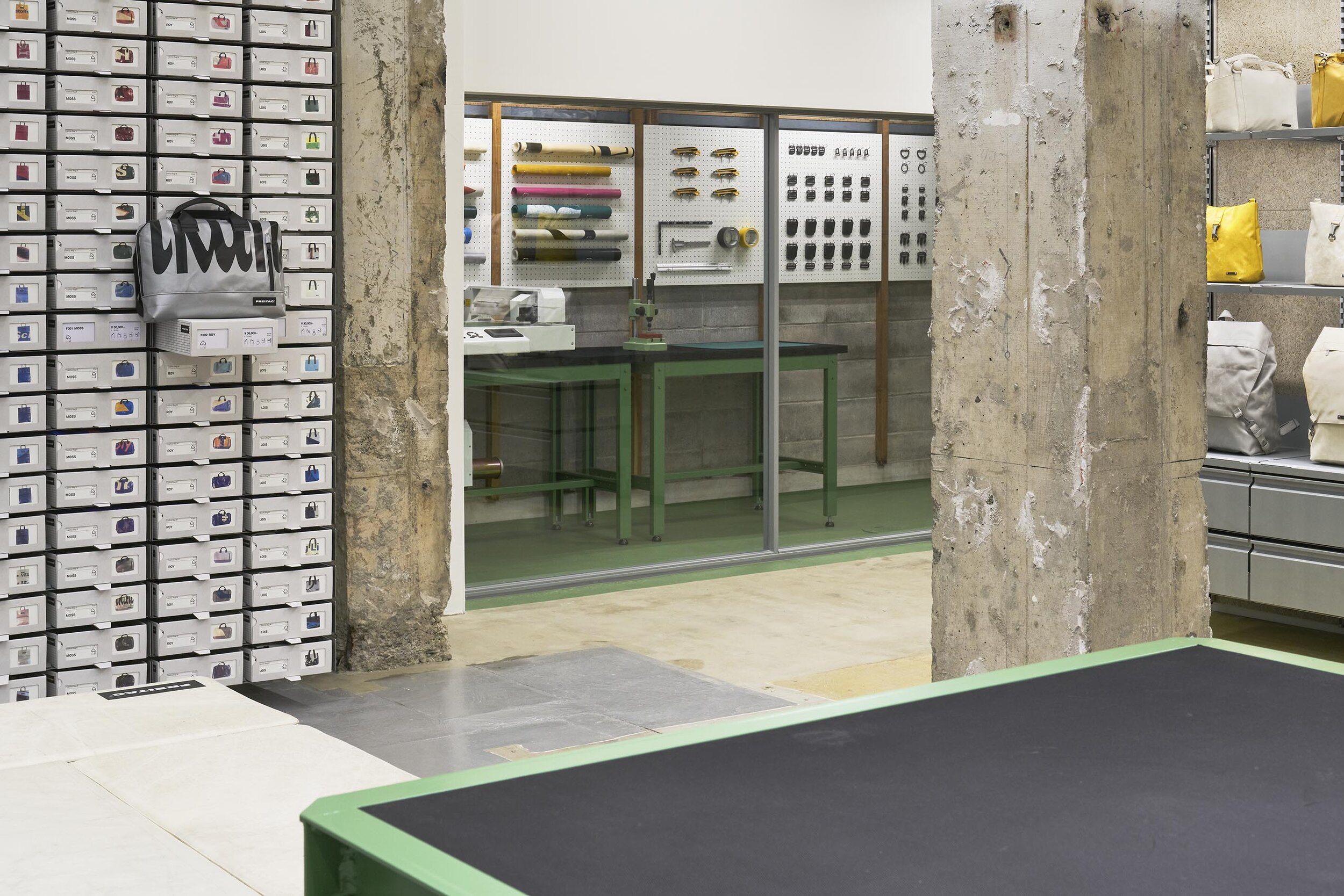
DIY workstation with tools

photography : Courtesy of Aesop,
words : Reiji Yamakura/IDREIT
Torafu Architects has designed a store for FREITAG selling messenger bags and accessories made from recycled truck tarpaulins in Kyoto. The renovation project was the fifth store for the design studio, following Ginza, Shibuya, Osaka and Seoul.
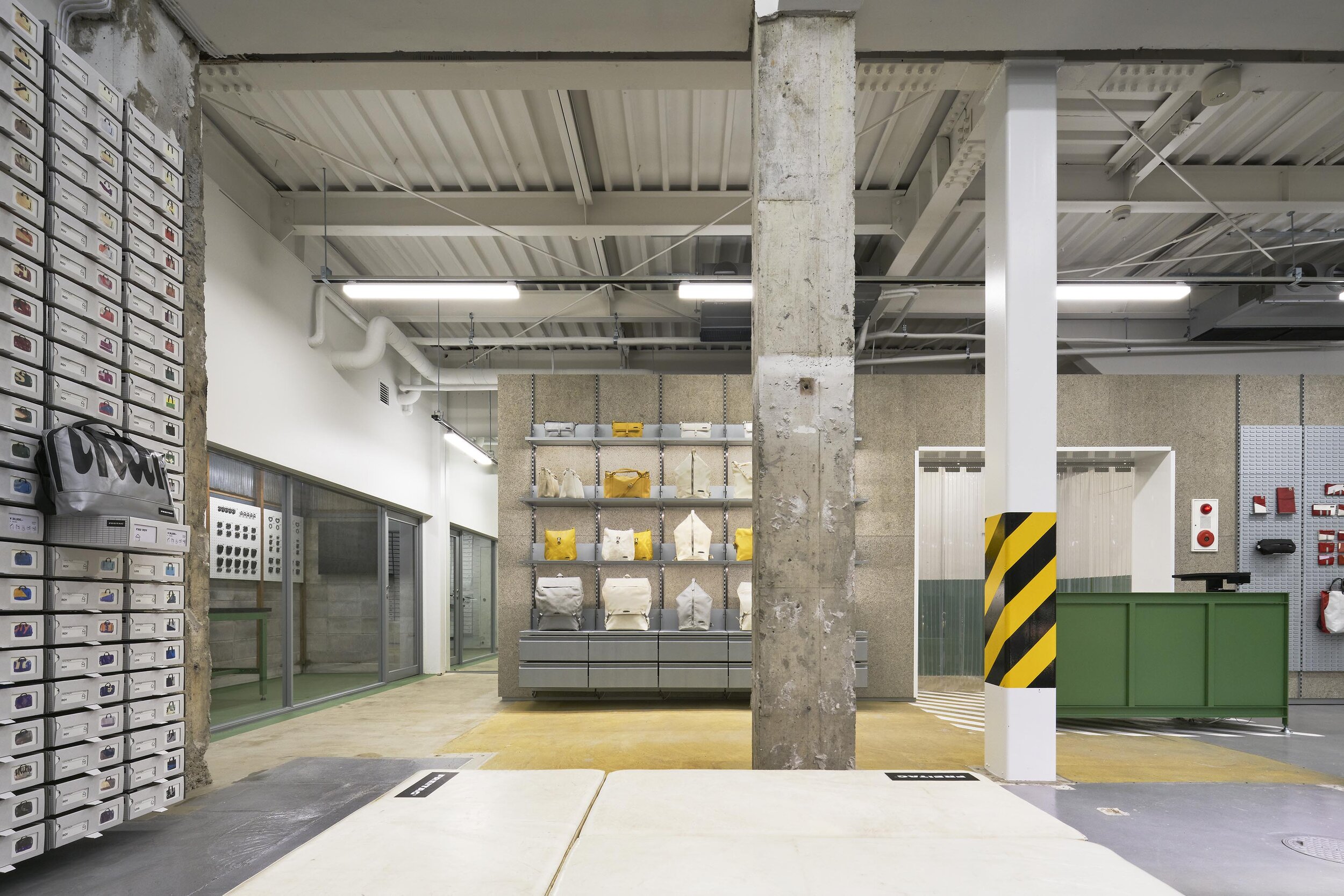
When we asked Koichi Suzuno and Shinya Kamuro about their design concept, they said, “FREITAG’s products are created using the patterns of colourful truck tarps. Applying their unique concept to architecture, we decided that we should leave the paint marks in place and the exposed concrete structure should be shown as it is, rather than something painted or covered over. In other words, we tried to create an atmosphere that the building looked like - it had just been demolished.”
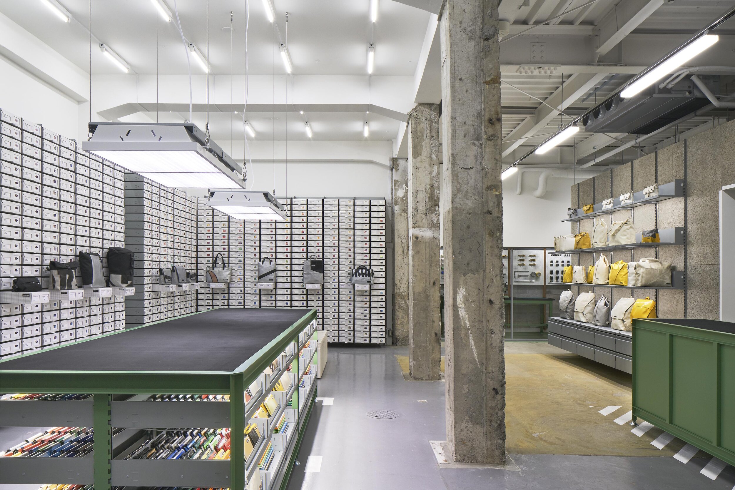
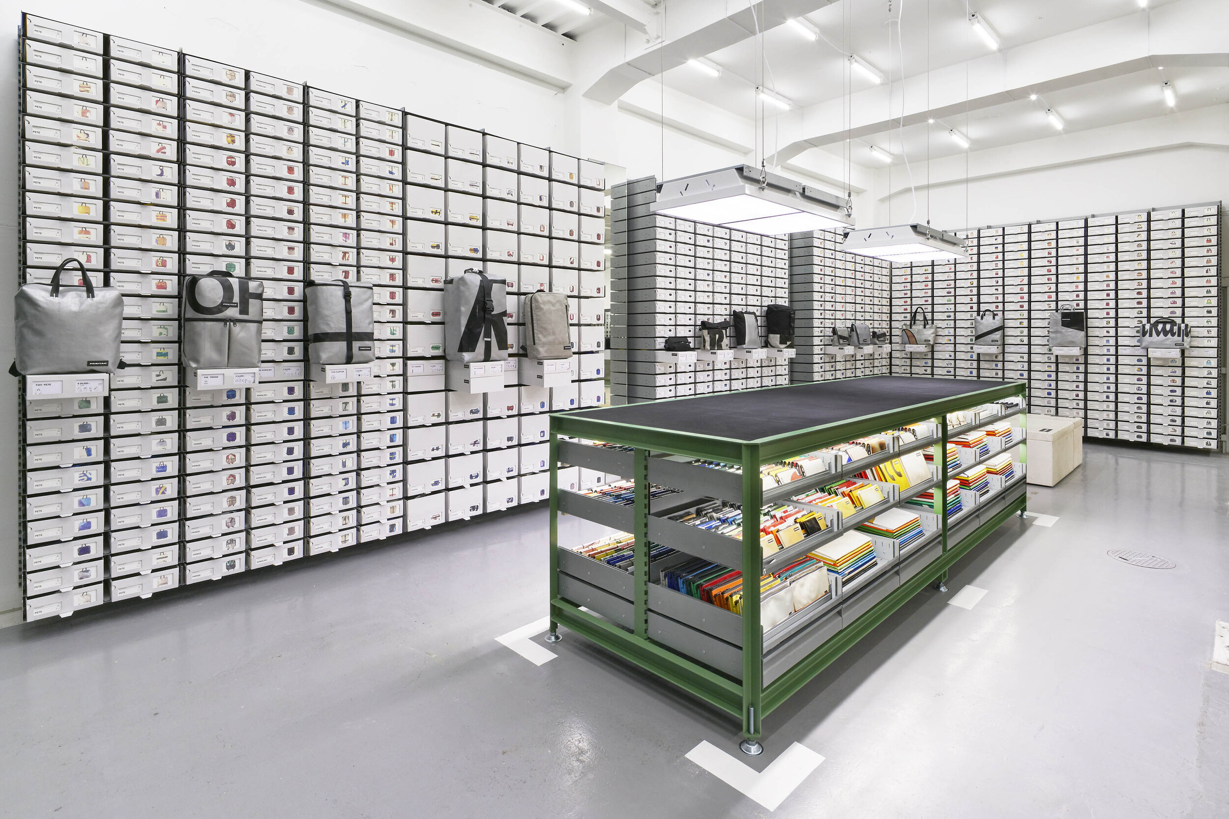
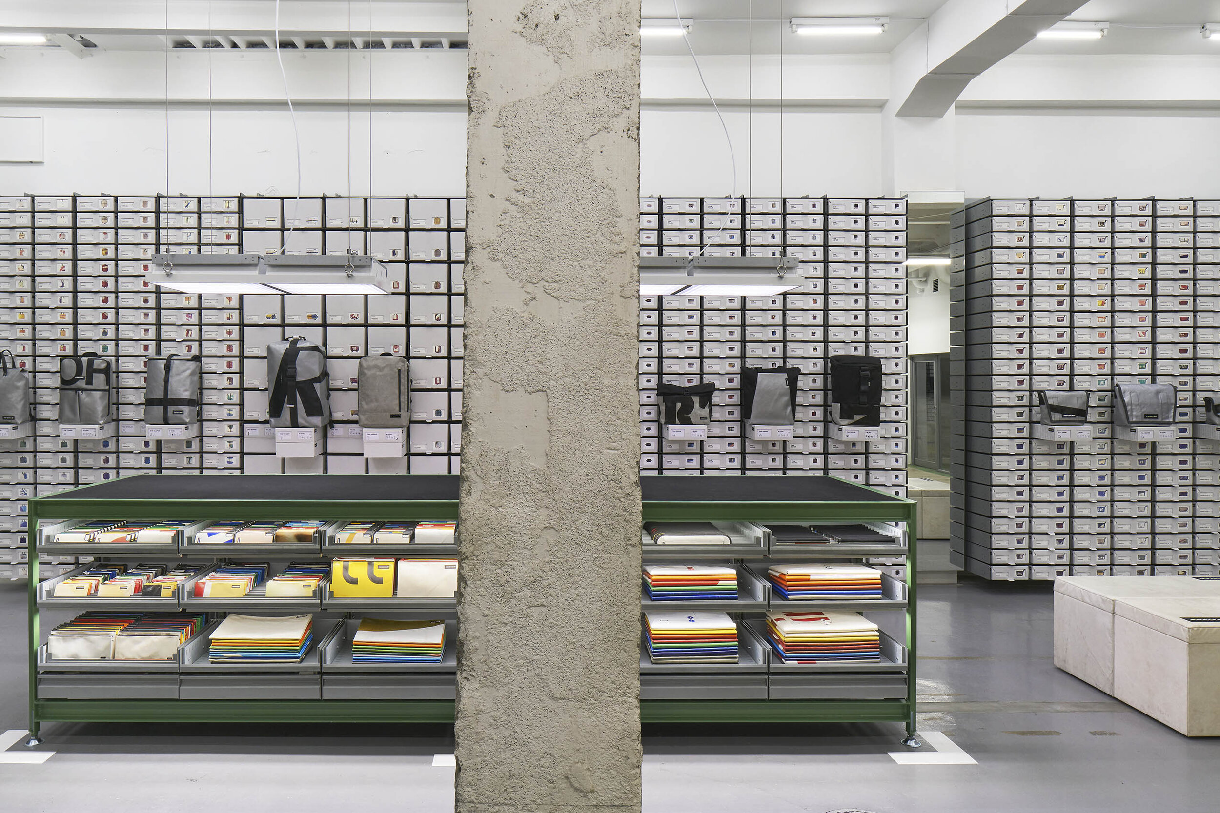
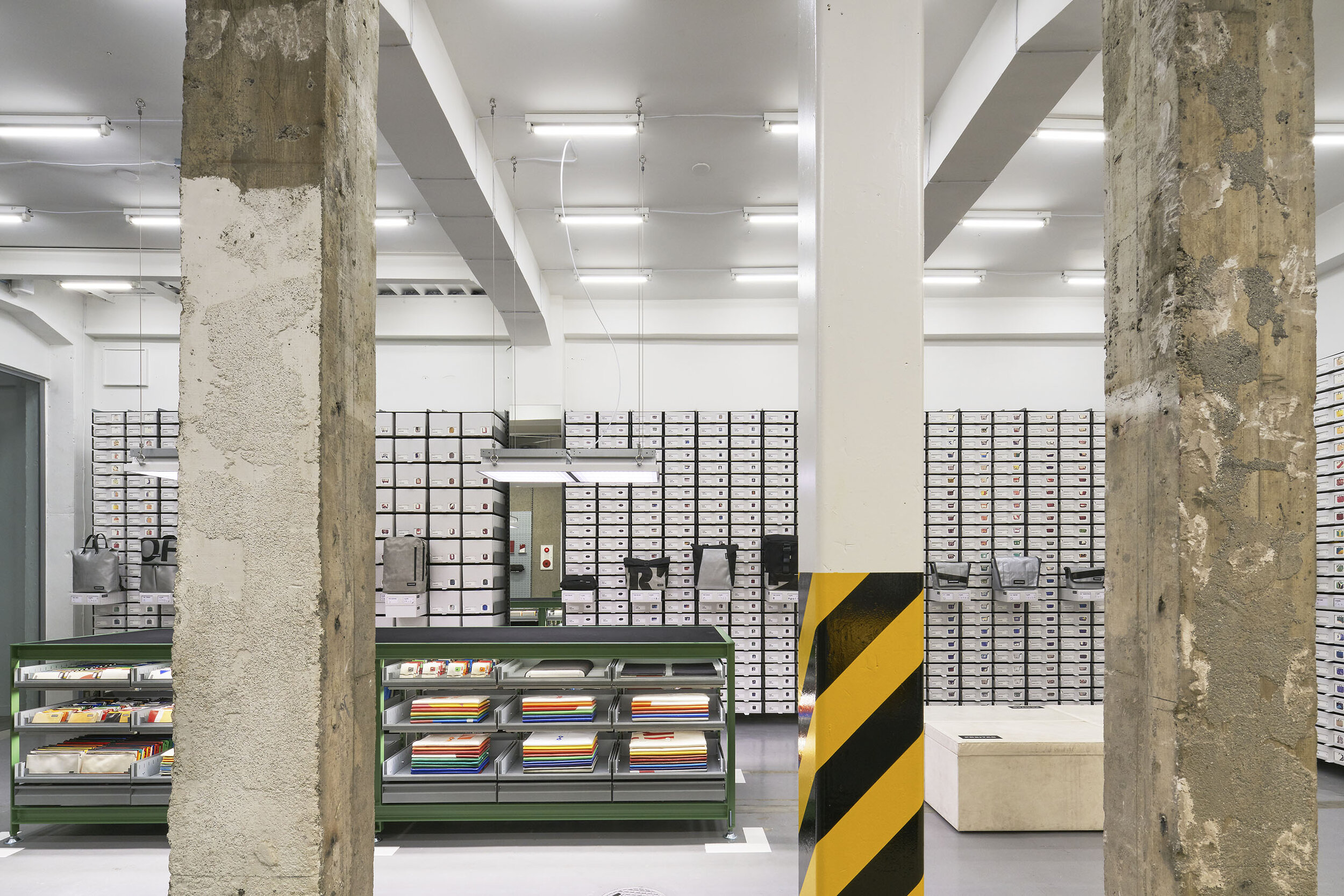
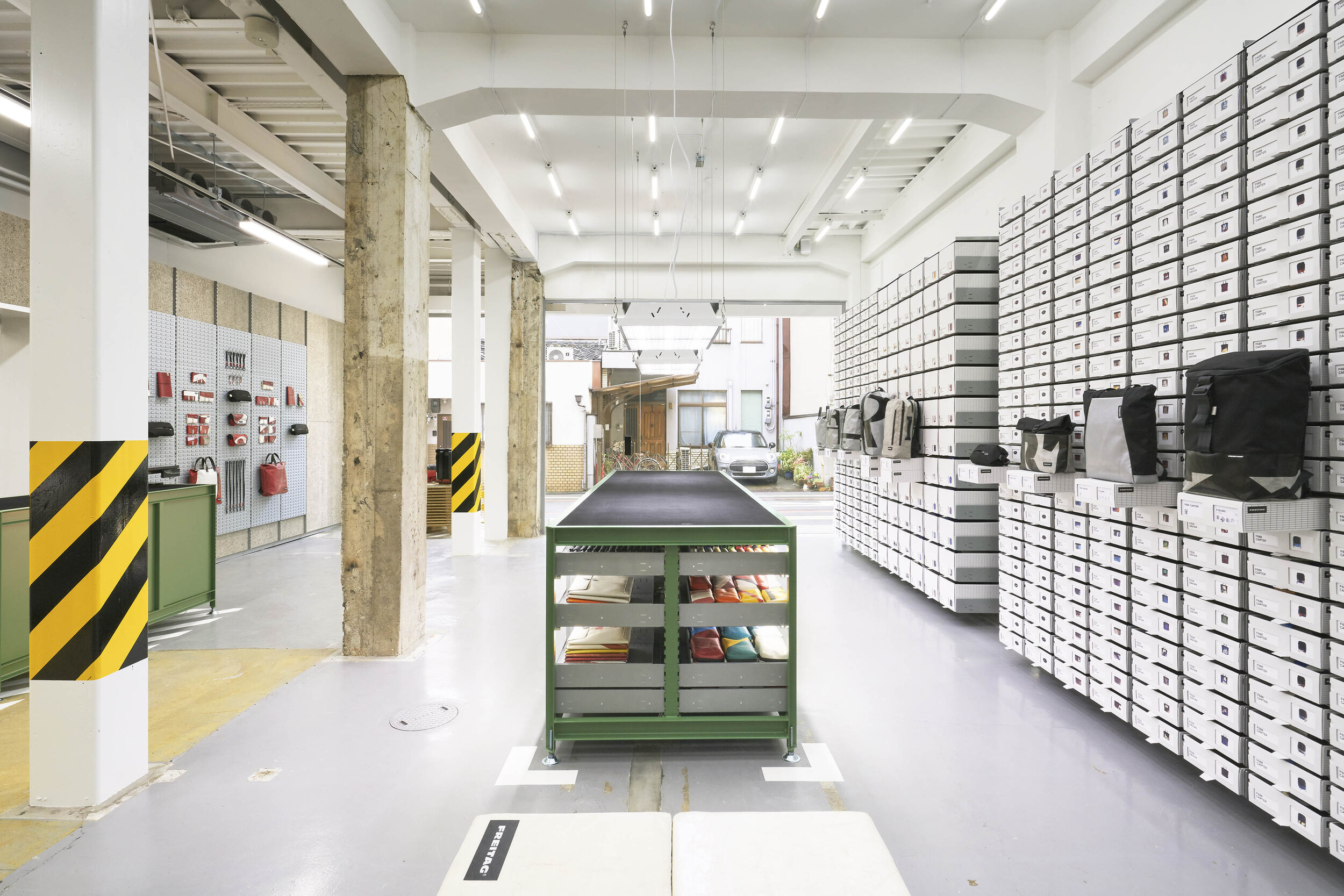
The store locates on the ground floor of a mixed-structure building, RC on the left and steel on the right. They also explained, “Before the deconstruction, all the walls and pillars were covered with boards, so we stripped off the materials and checked the condition of the structure before deciding which parts to keep. We designed the whole layout as one floor, removing the walls that bordered the different structures, leaving only the columns. For the façade, we created a new impression by replacing the shutters and lower walls with an open glass window that allows the shop to be seen from the street. In the shop, large rubber-topped workbenches and FREITAG’s original fixtures are used to create a clean look.”
Before construction, the designers went to the site to remove the surface boards and check the structure before the design. (photography: TORAFU ARCHITECTS)
The old wooden pillars that emerged by the disassembly were designed to the wall support of the DIY area. (photography: TORAFU ARCHITECTS)
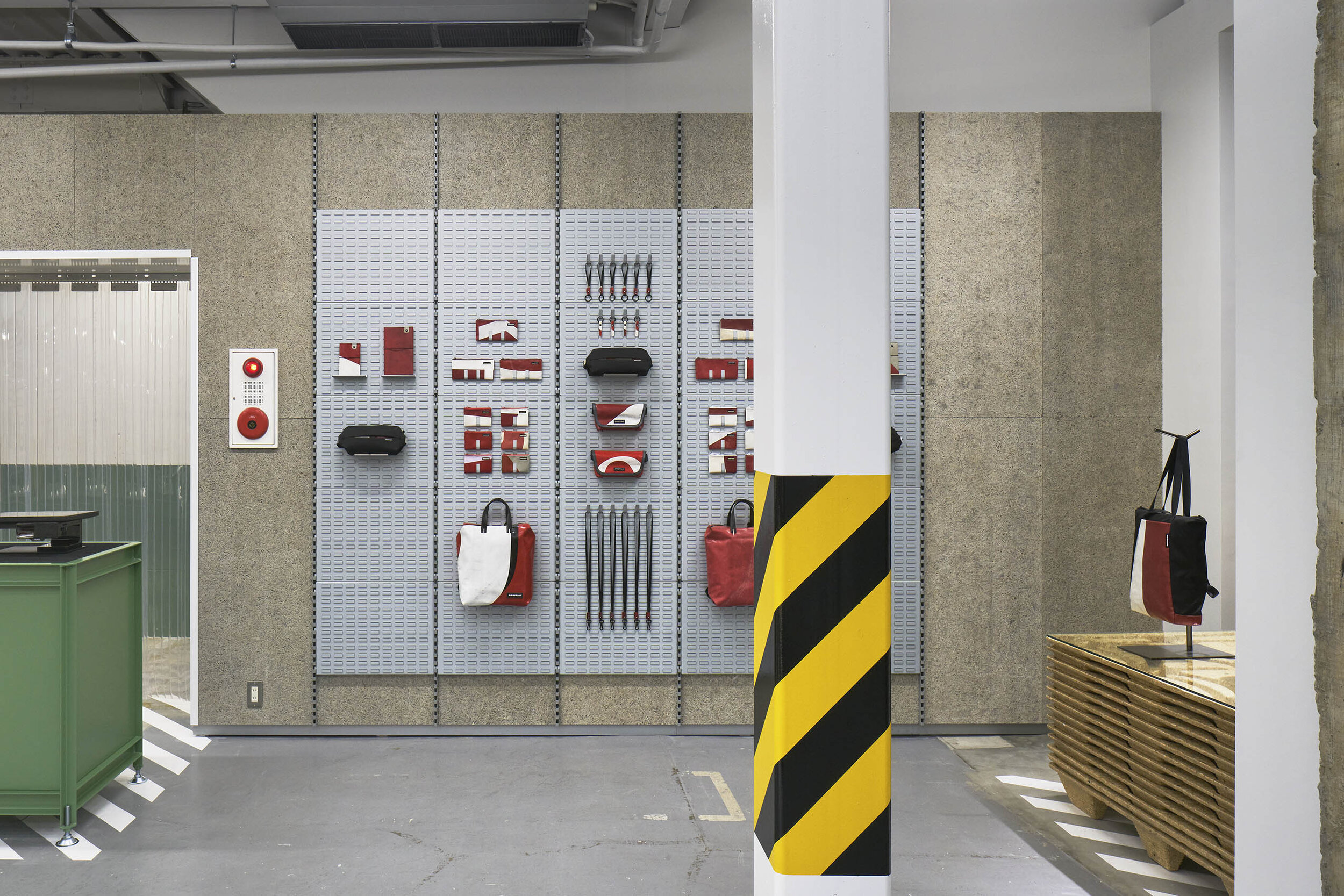
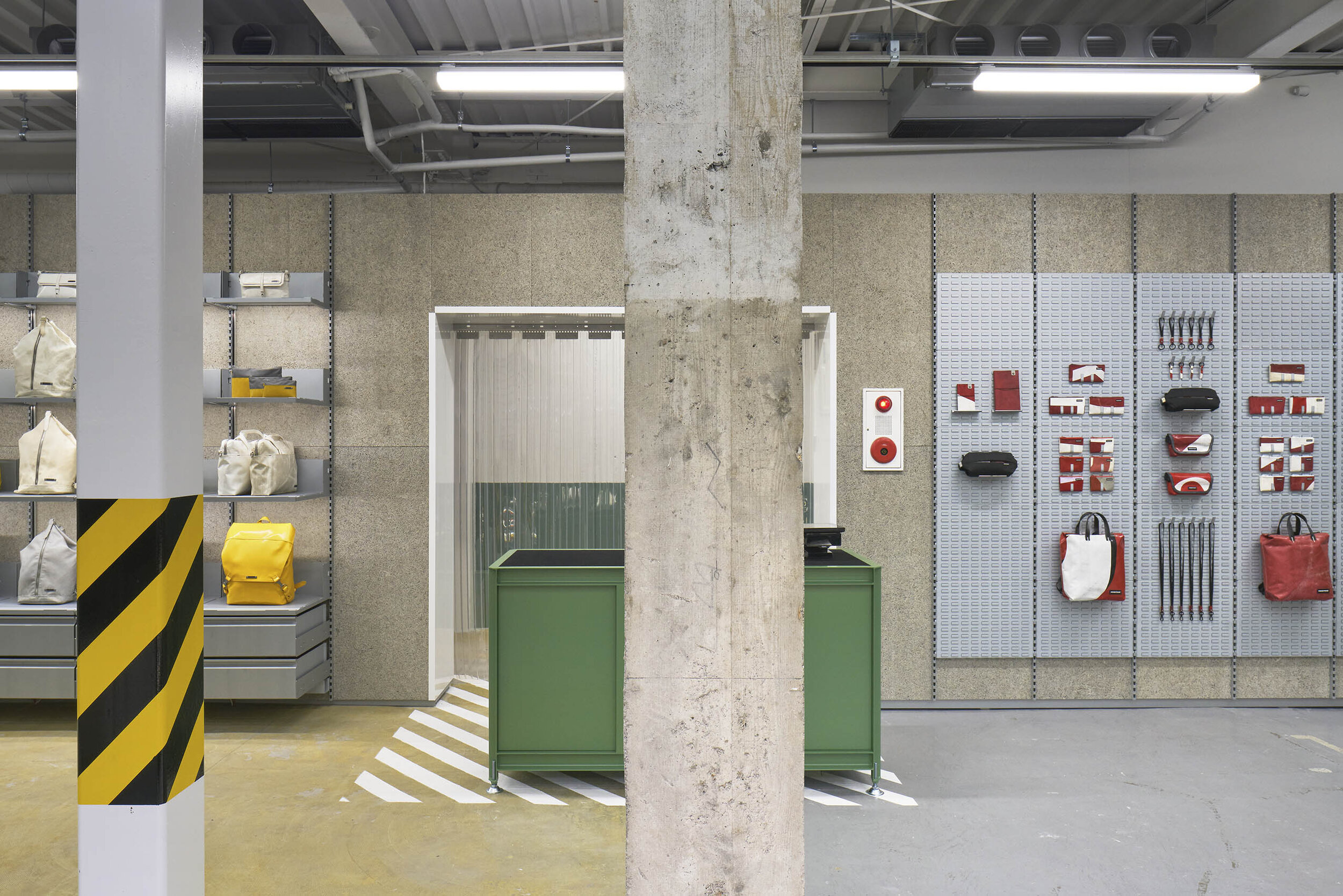
The existing wooden structure, which the design team positively saw as an architectural character, was transformed into a DIY workstation by adding pegboard. The duo also recalled, “Communicating with the FREITAG team in Switzerland, who liked the rough look of the interior, we enjoyed working with the team to create a factory-like design, including the alarm system and yellow and black caution tapes.”
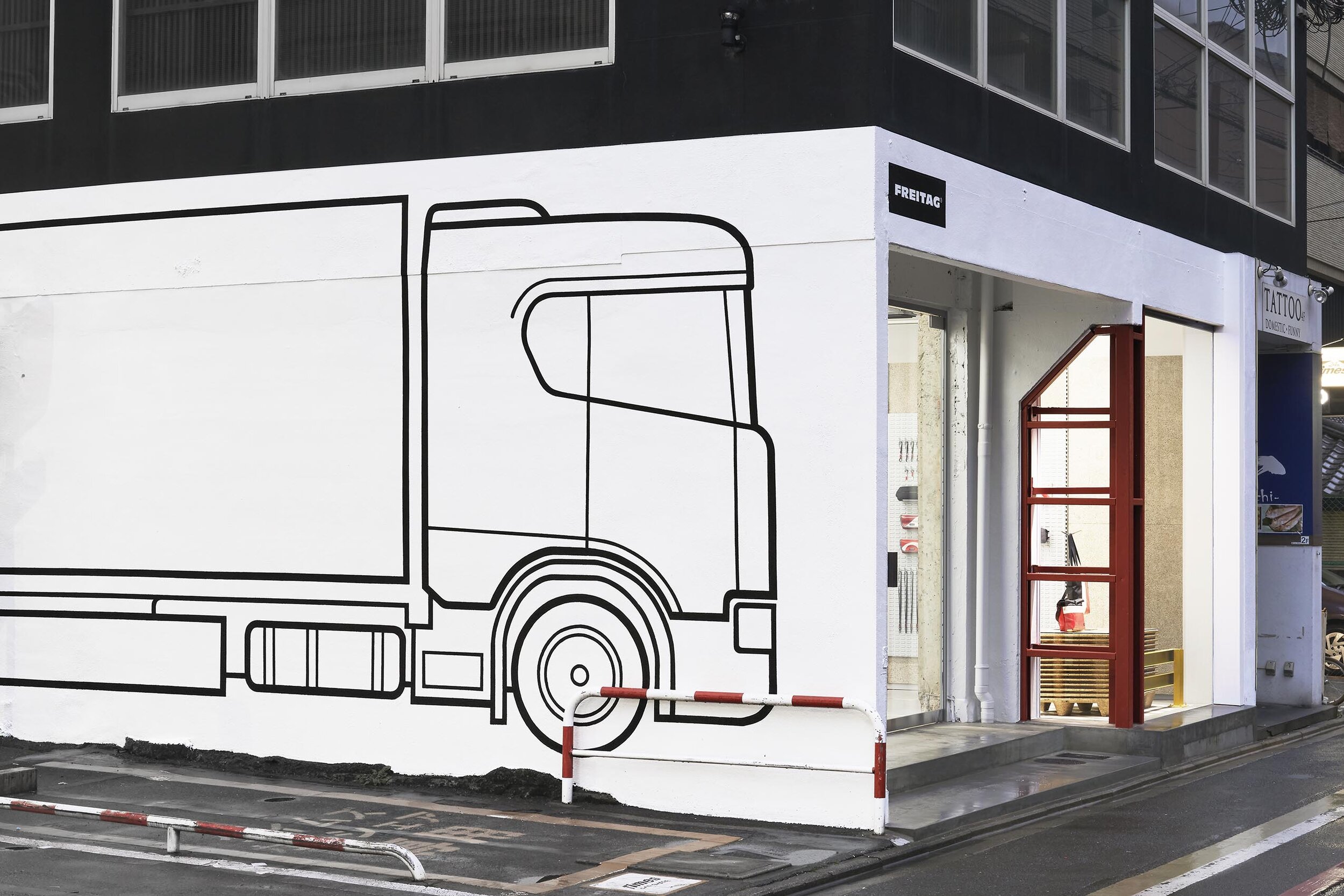
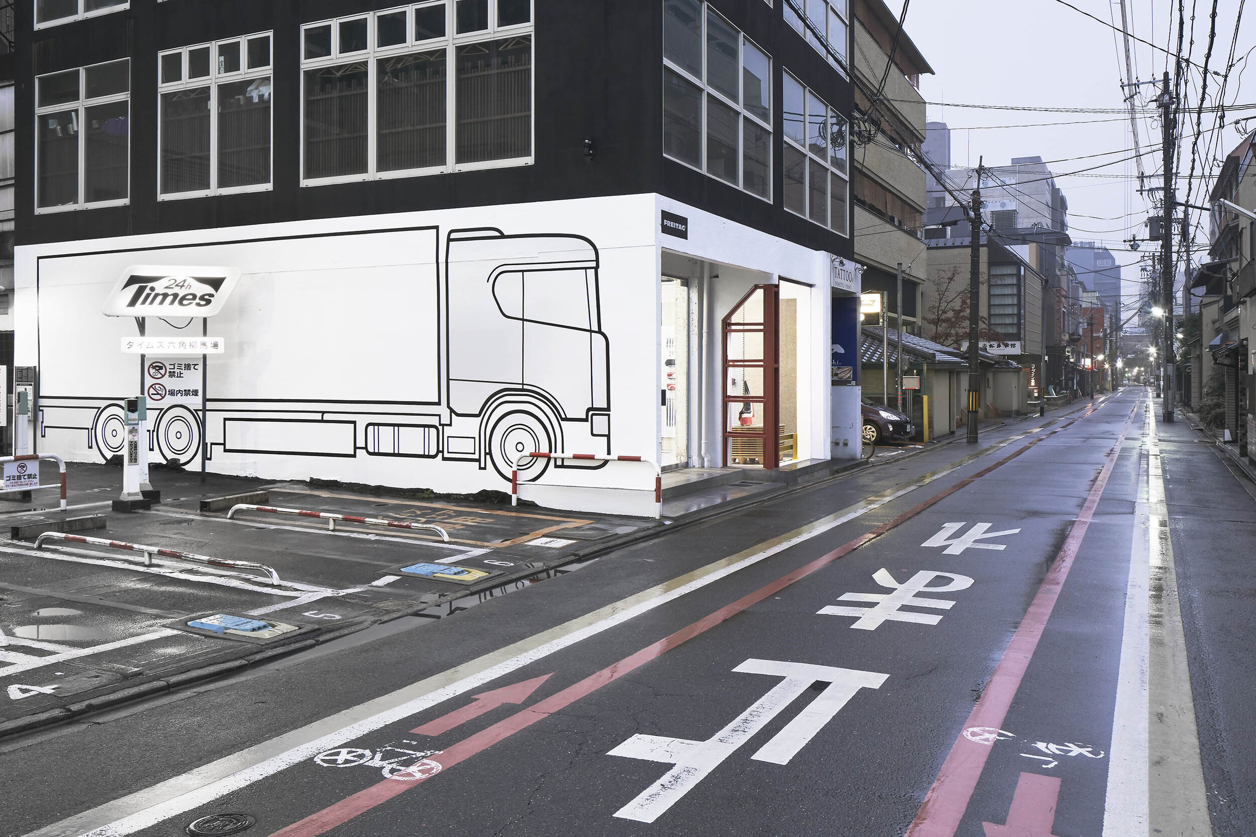
The full-sized truck illustration on the exterior wall, originally drawn by the Swiss graphic team and finished by a Japanese painter, symbolizes their brand identity.
DETAIL
In the store, the existing rough concrete pillars are side by side with the new systematic fixtures supplied by FREITAG.
In response to the client's request, the yellow tape was used to create a space that resembles a construction site.
The former facilities space, a semi-outdoor area, has been transformed into a DIY workstation.
Large glass windows were built to increase the visibility from the road in front. The two buildings with different structures, RC on the left and steel on the right, were renovated as a single unit by removing the wall in the middle.
On the exterior wall, a truck was painted to represent the brand identity.
The painting work process. (photography: TORAFU ARCHITECTS)
CREDIT + INFO
Name : FREITAG Store Kyoto
Design: Koichi Suzuno, Shinya Kamuro, Minaho Sakane, Nicolas Pabion/TORAFU ARCHITECTS
Lighting design: ENDO Lighting Corp.
Construction: ISHIMARU
Location: 400-1 Izutsuya-cho, Nakagyo-ku, Kyoto-shi, Kyoto, Japan
Owner: FREITAG
Main use: Retail store
Completion date: December 2019
Floor area: 97 sqm
Material
wall: white paint, wood wool cement board, DIY workstation/pegboard
wall shelf: system shelf ‘V100’ provided by FREITAG
lighting: LED + aluminium louvres


