nishinakasu TAKESHI DOROKAWA by Takasu Gaku Design and Associates
Restaurant | Fukuoka, Japan
nishinakasu TAKESHI DOROKAWA | TGDA | photography : Ikunori Yamamoto
DESIGN NOTE
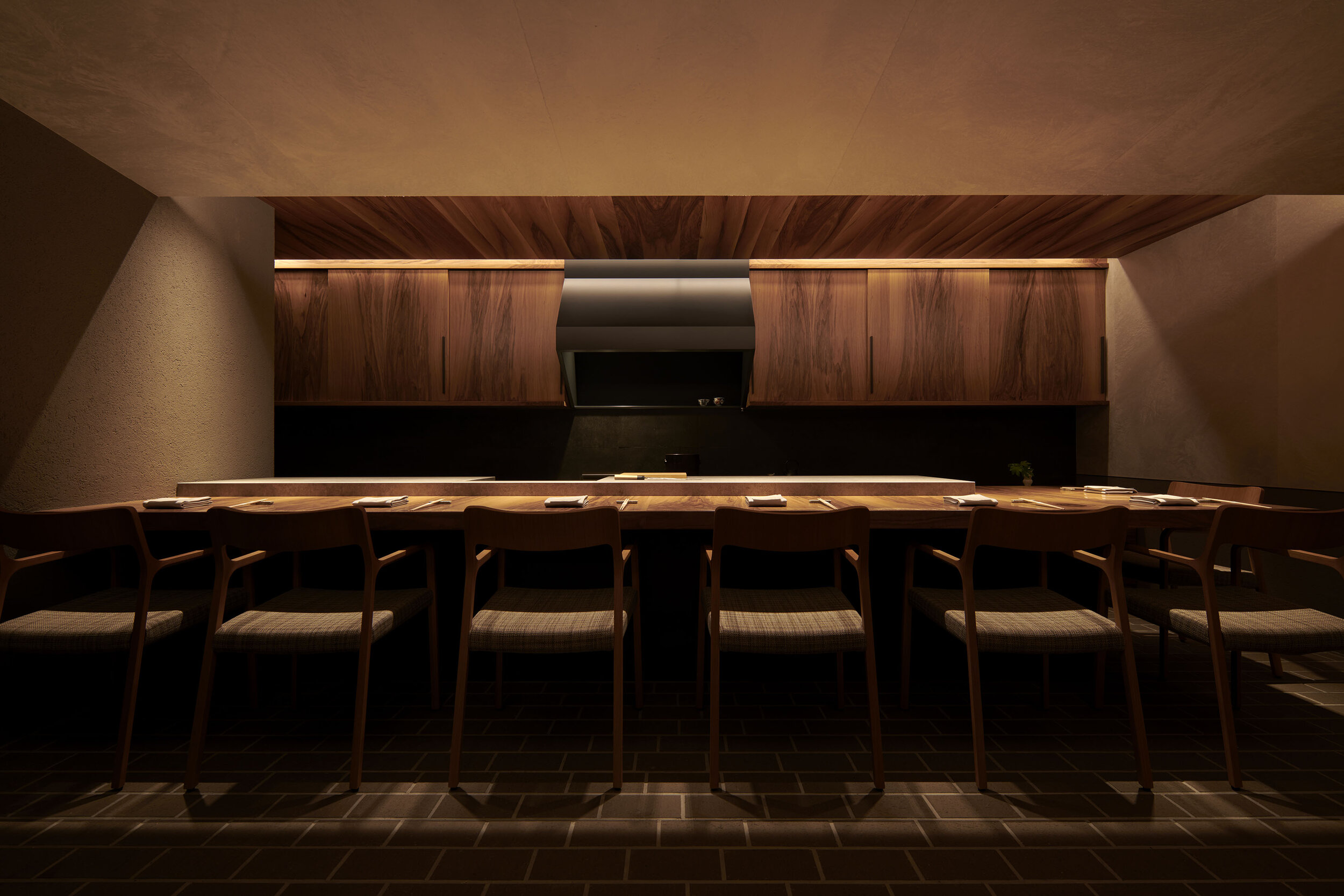
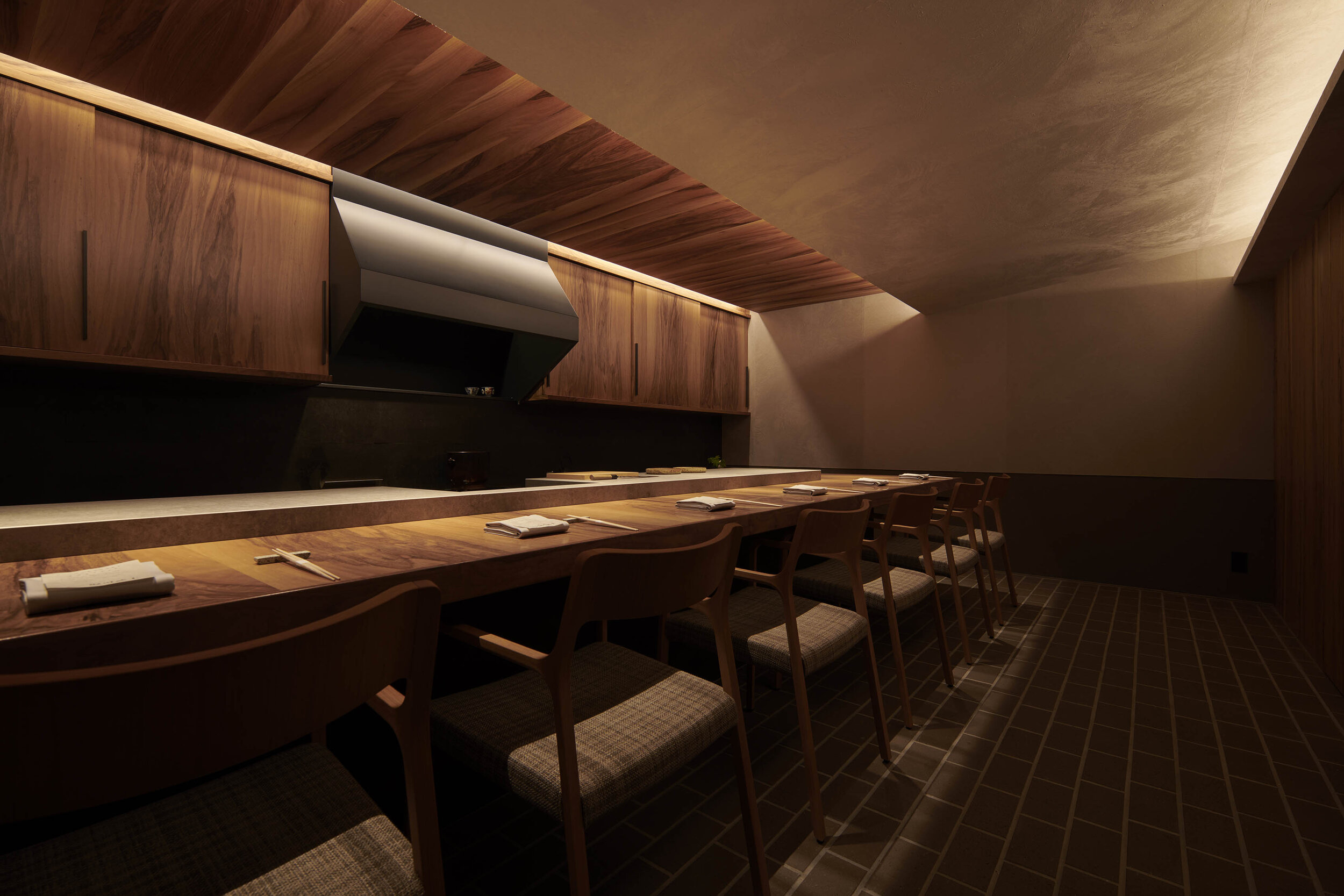
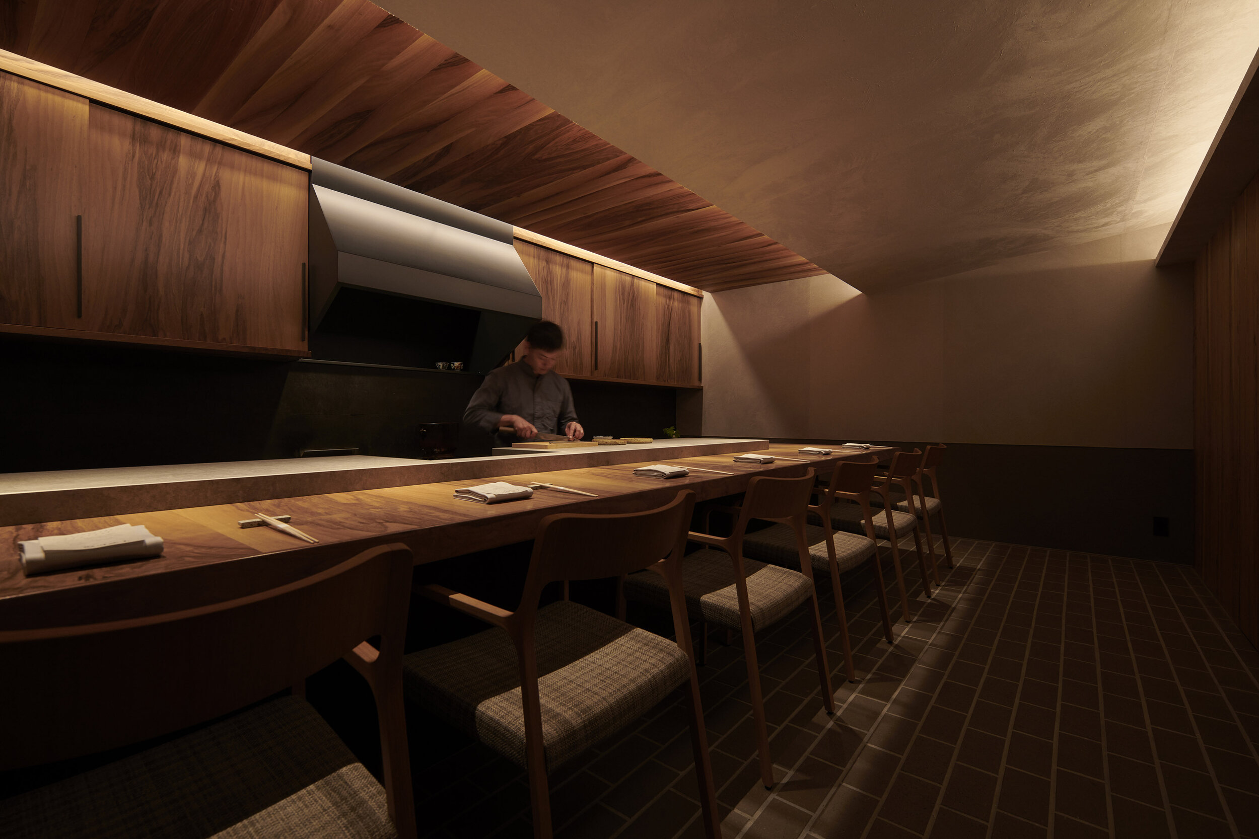
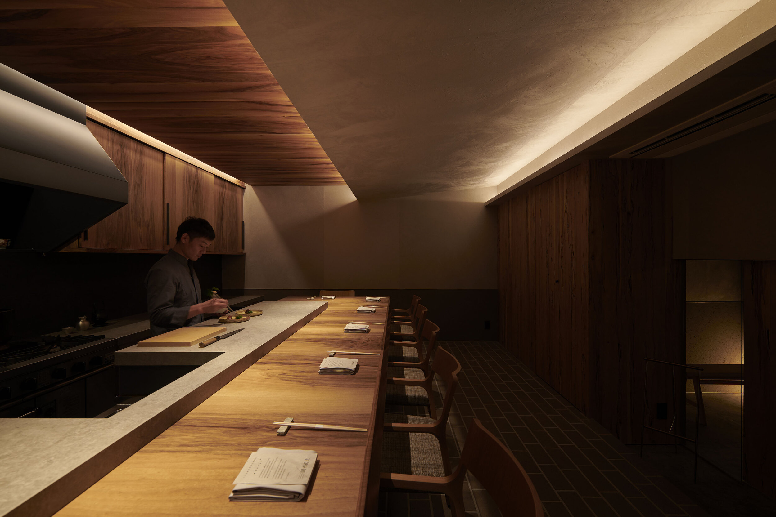
A restaurant with only 7 seats facing the chef
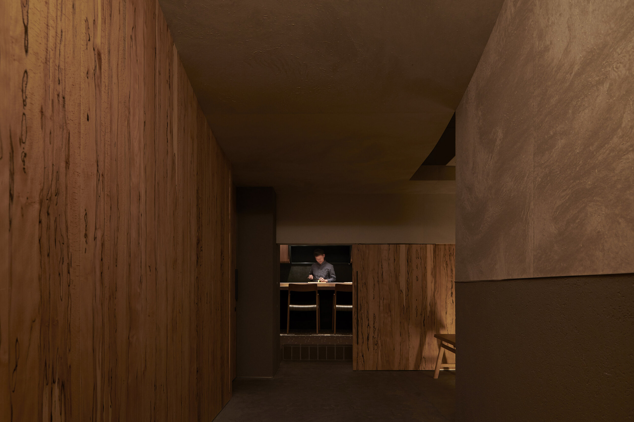
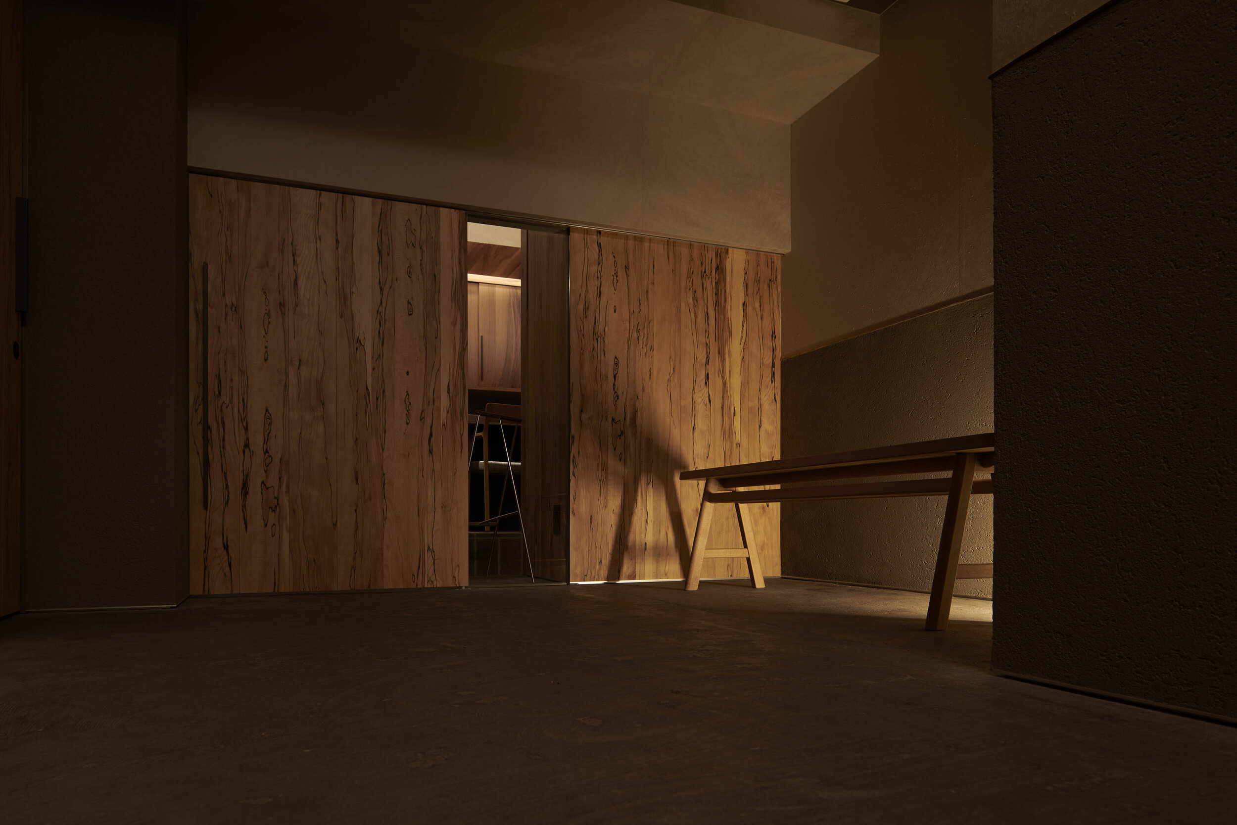
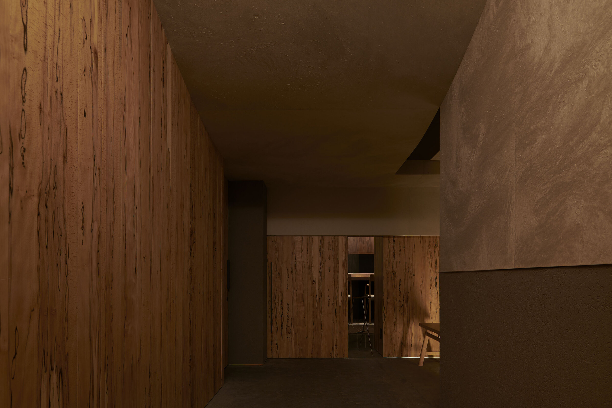
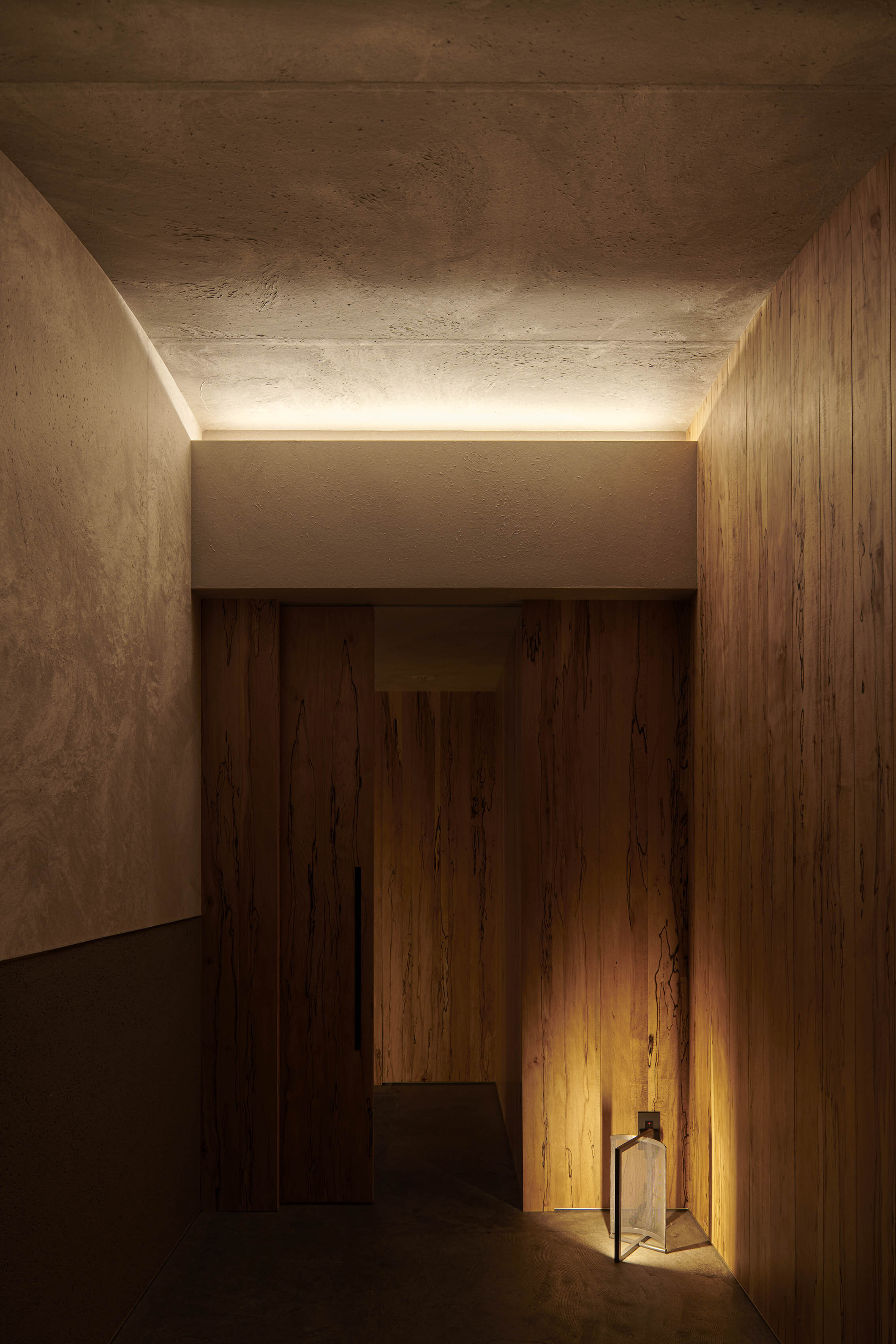
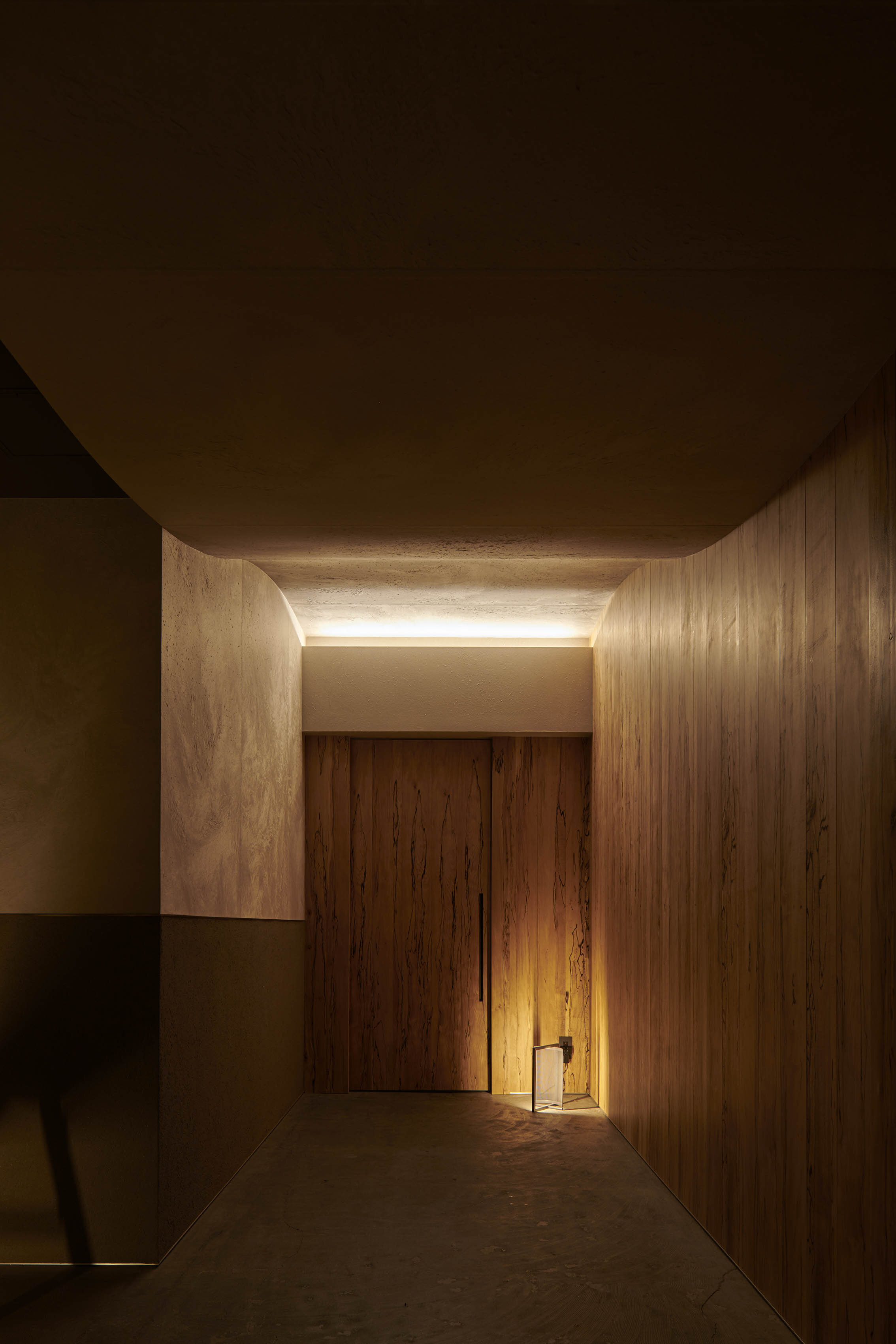
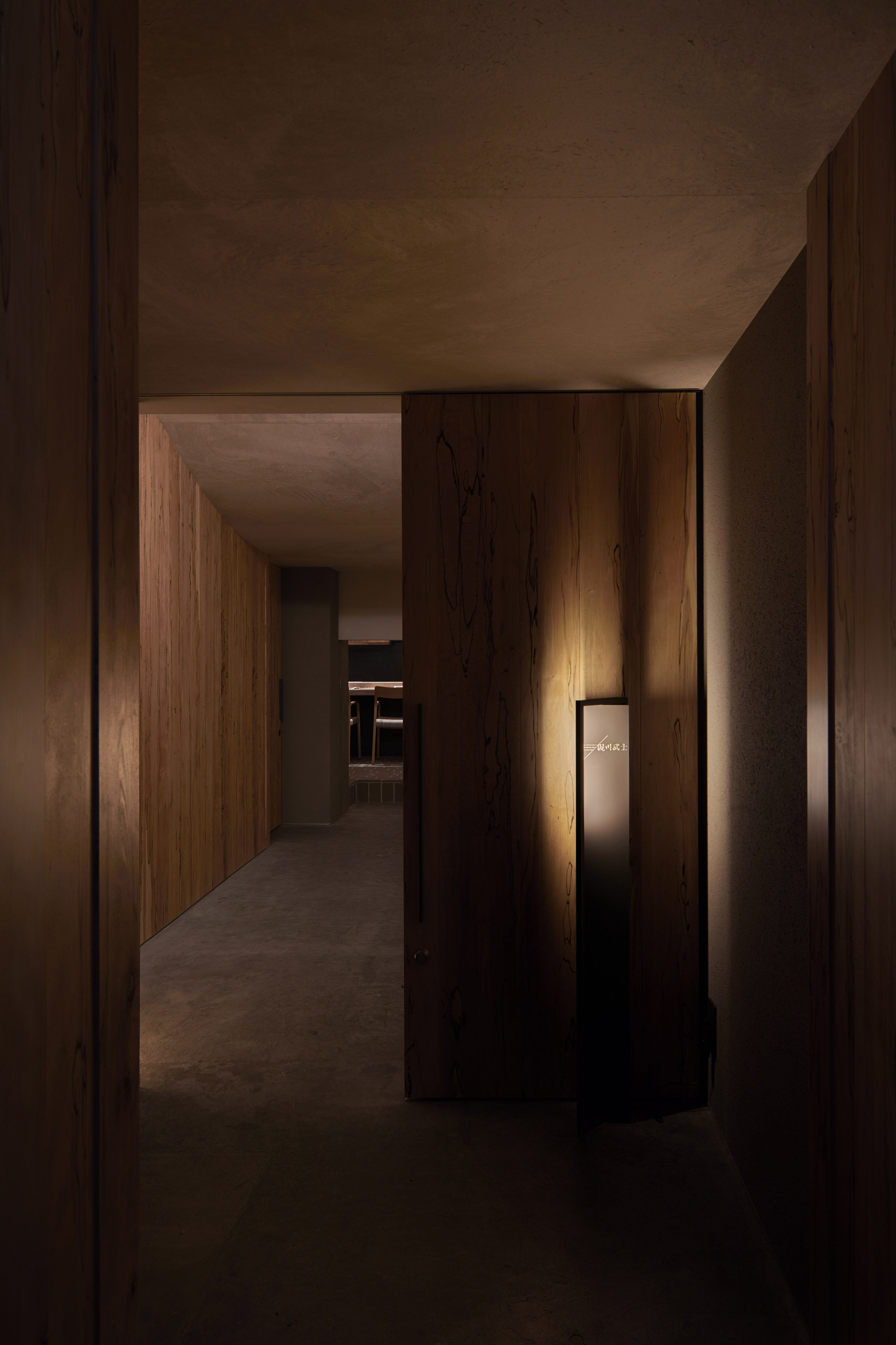
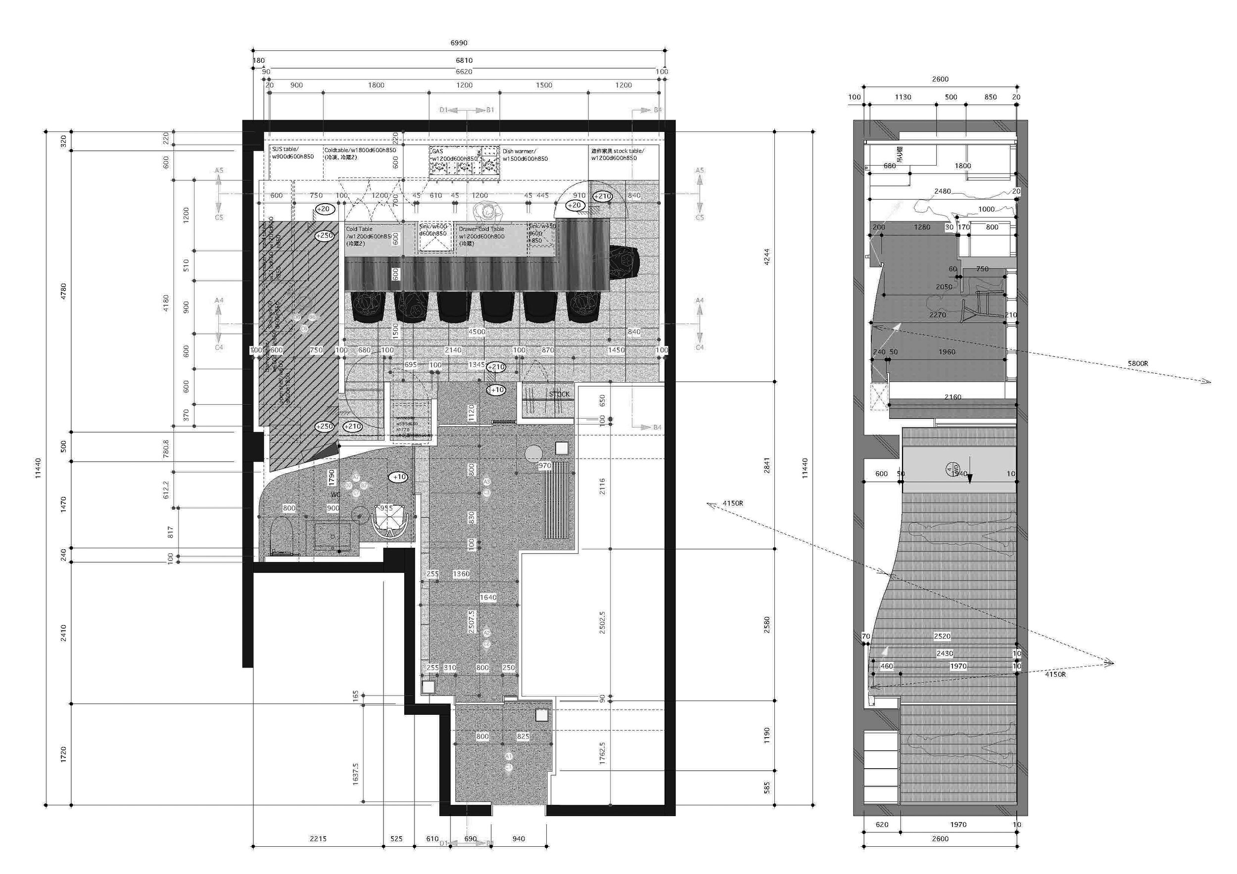
A long, narrow approach that raises expectations
Culinary-driven concept: a fusion of Italy and Japan

photography : Ikunori Yamamoto
words : Reiji Yamakura/IDREIT
Fukuoka-based design studio TGDA (Takasu Gaku Design and Associates) has designed a restaurant 'nishinakasu Takeshi Dorokawa' in Nishinakasu, Fukuoka.
When we asked Takasu about his design concept, he replied, " We designed this restaurant based on the concept of "a fusion of Italy and Japan". I came to chef Dorkawa's first Italian restaurant, MELMOSO da dorokawa, for about ten years. I noticed the change in his dishes and presentation to embrace Japanese elements. So I was inspired by his cuisine and tried to reflect the change into the interior design."
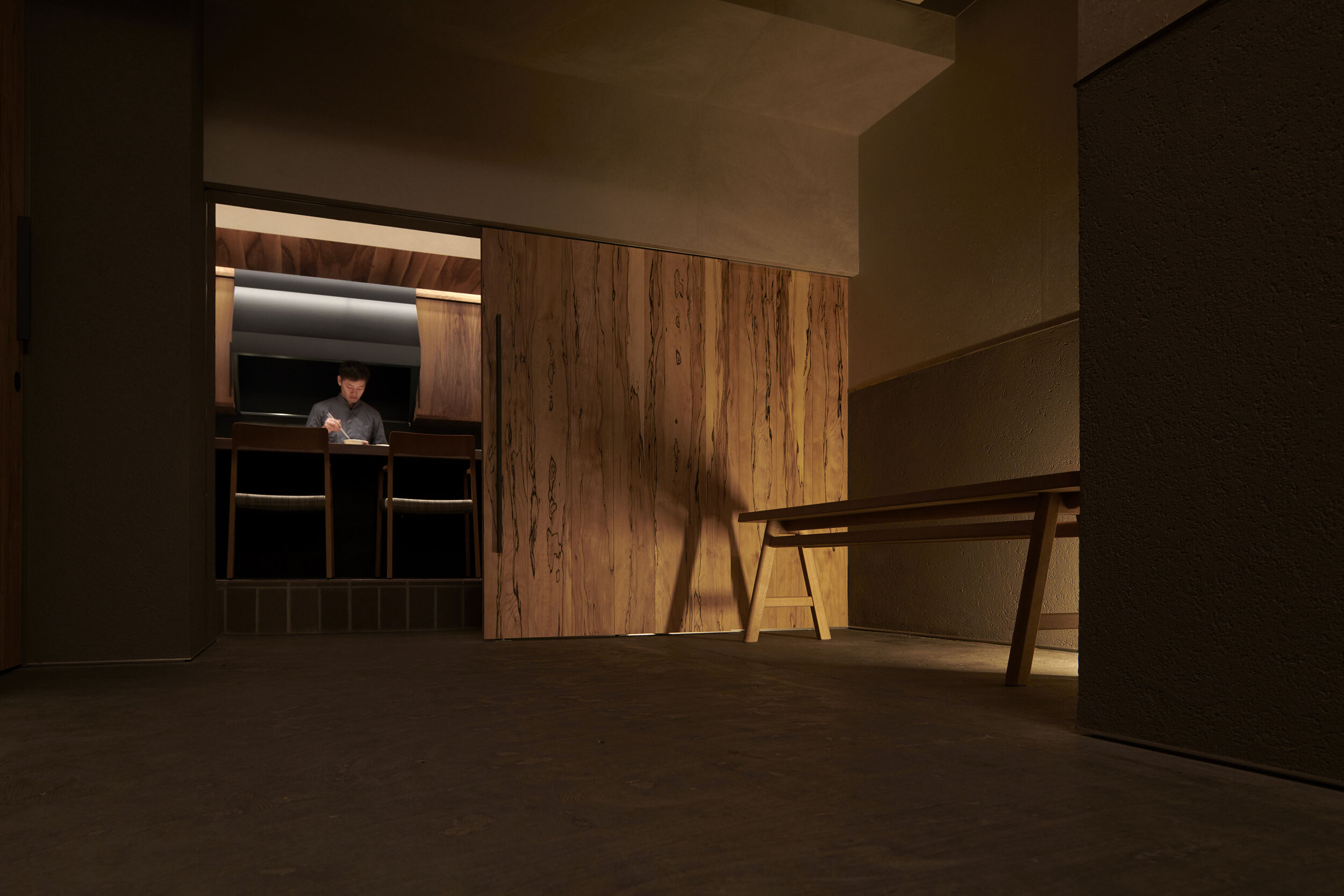
The site the owners decided on had a few limitations. However, Takasu solved these challenges by creating a long approach that raises the guests' expectations and a unique low entrance like a traditional tearoom.
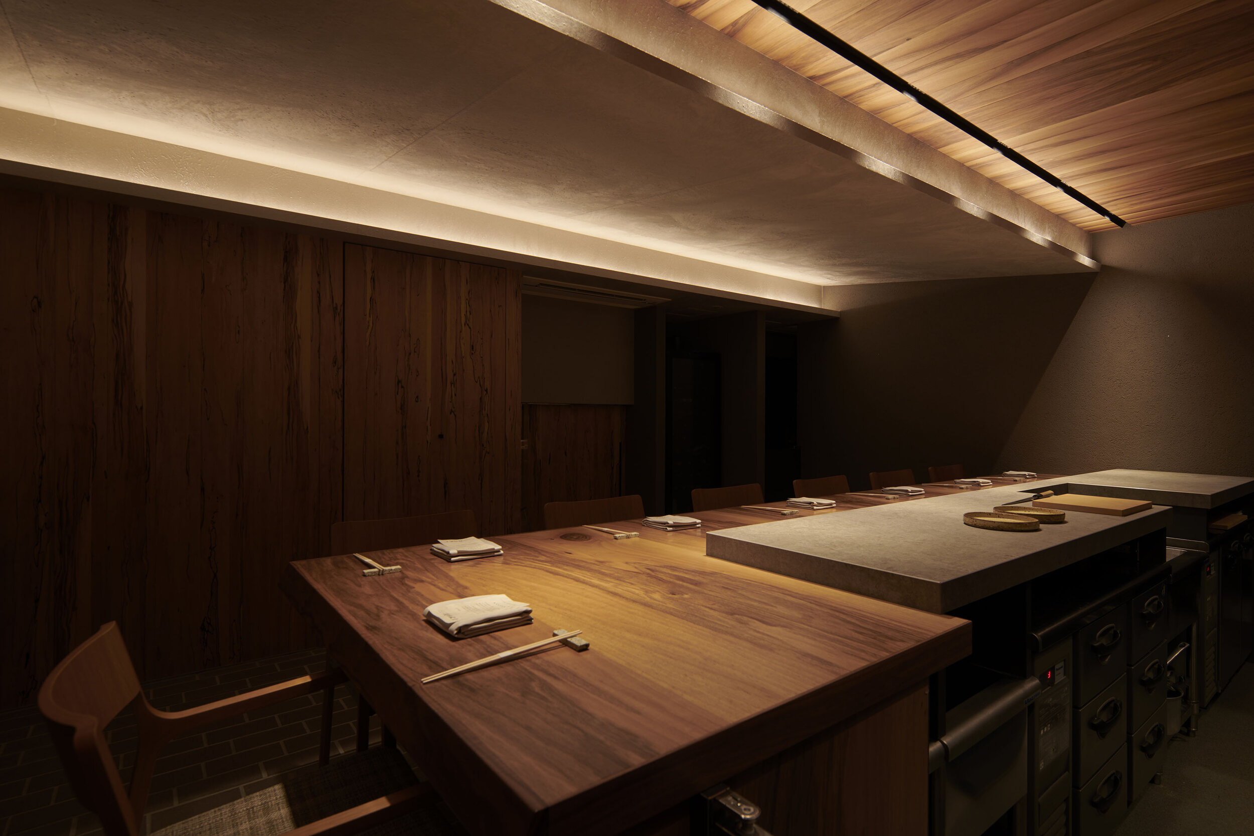
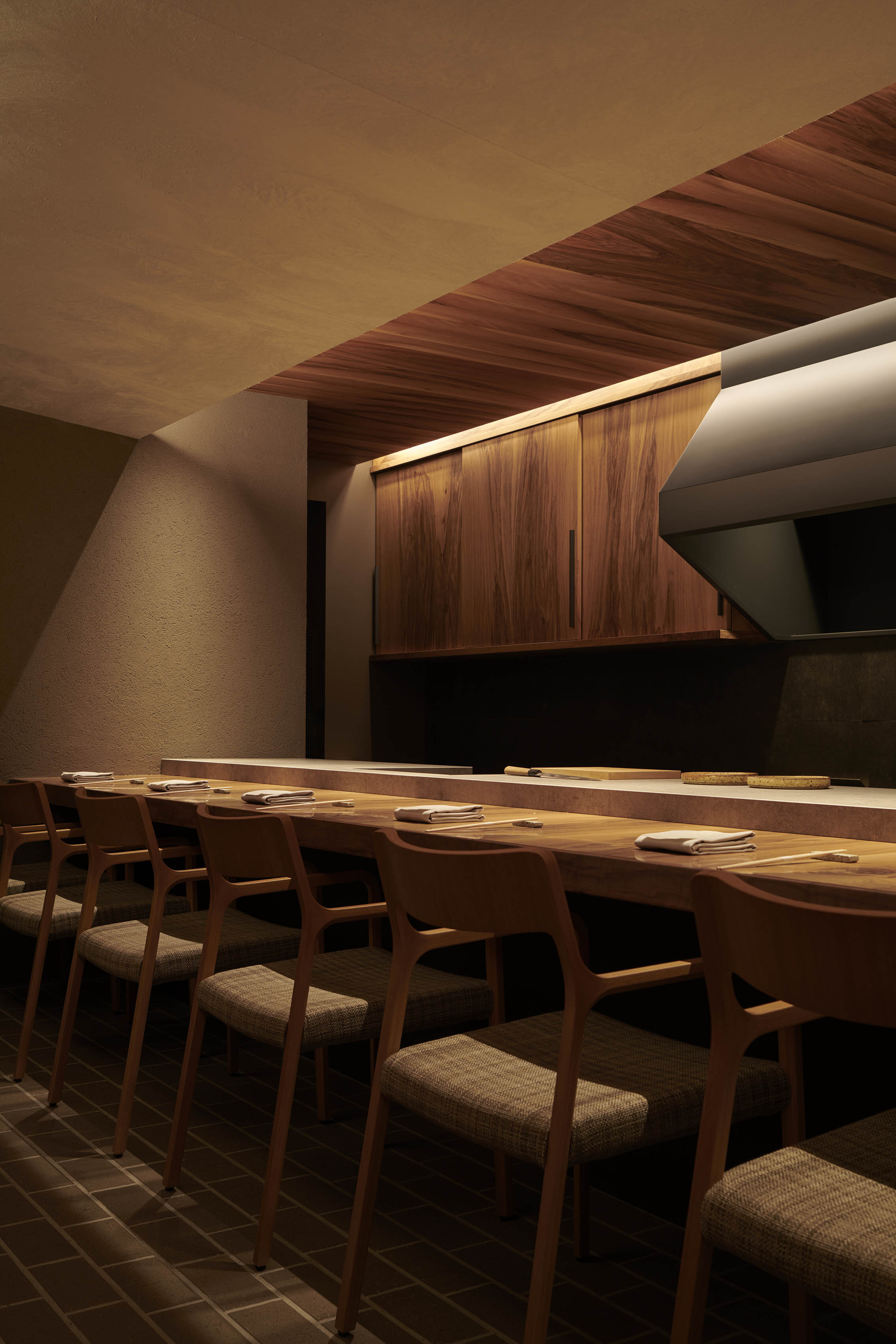
When we asked the concept about the counter facing the chef, he said, "Functionally, we were requested to create a layout that would allow the chef to serve a full course of Italian-based cuisine by himself. So we designed a seven-seat counter with a clear view of the chef's hand.
We chose a classic layout for the counter with the chef standing in front of the sliding door, where all eyes are on him. We decided on the height of the countertop by placing the worktop 5 cm above the dining counter so that the guests could see the chef's skill. Also, the chef's style is to cook meticulously with a traditional stove and oven rather than the latest equipment, so the design team carefully listened to his wishes and created a simple and beautiful kitchen.
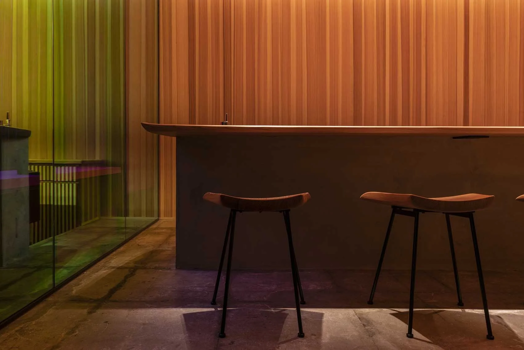
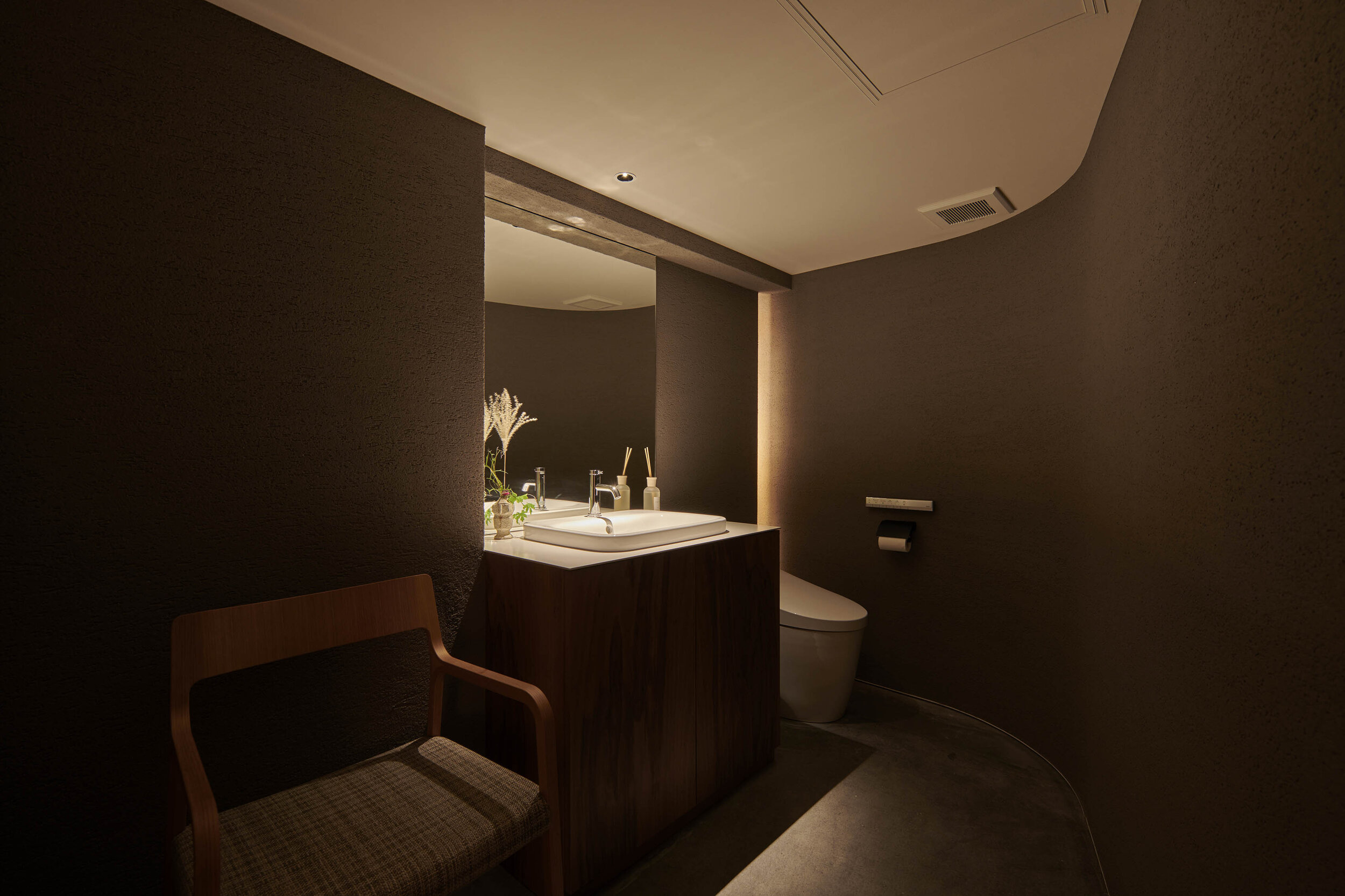
When we asked him about the details of the counter, he replied, "In this restaurant, we created a sense of tension so that customers would feel excited before they reach the seating area. However, if we designed everything sharply, it would be not easy to relax, so we wanted to make the touchable areas comfortable. We designed the edges of this counter to taper upwards, which is both tactile and visually pleasing. That's why we designed the edge of this counter to taper upwards, soft to the touch and gentle look. We also made the walls of the bathroom partly curved to ease the tension. We tried to create such a subtle sensory difference by manipulating the details.
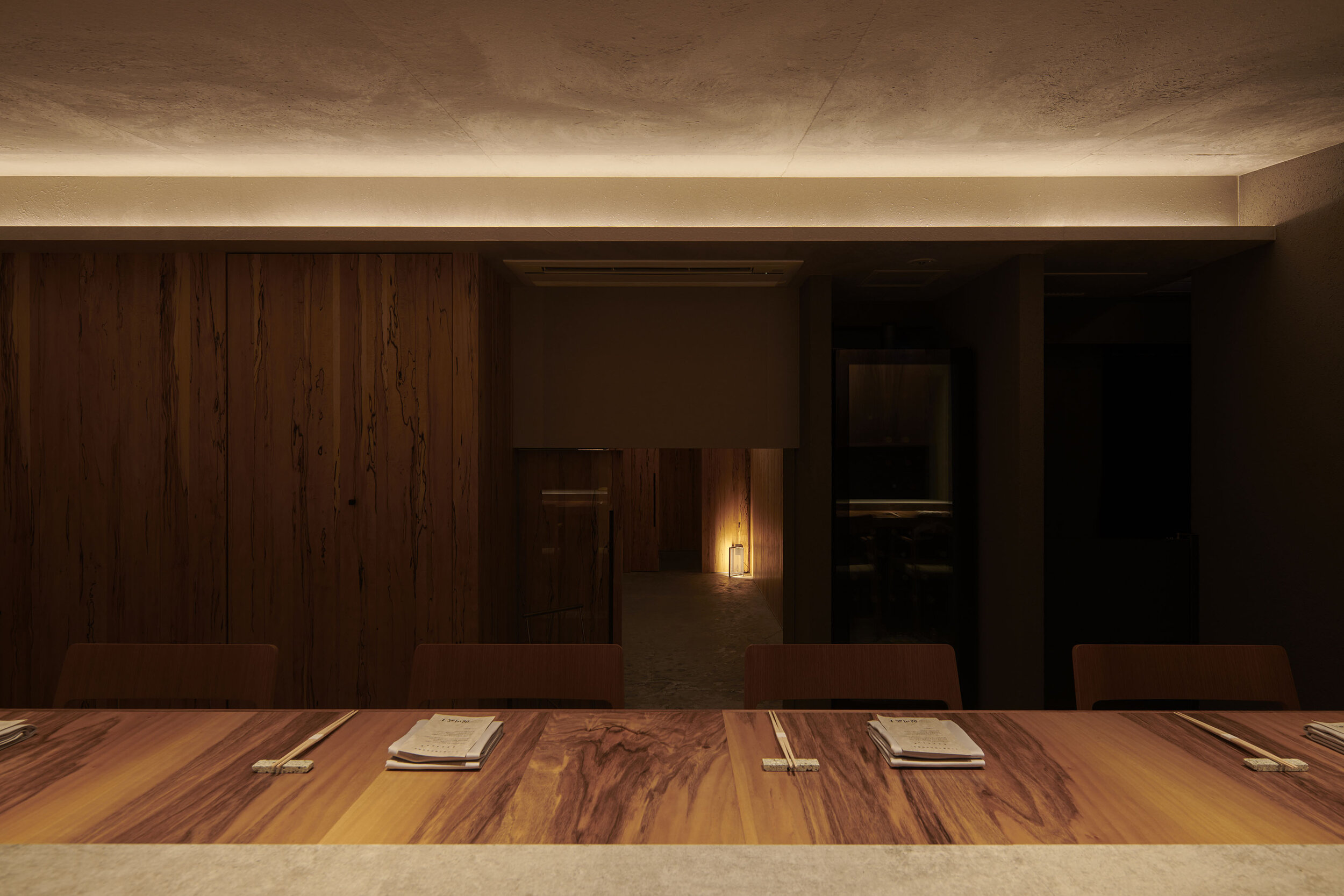
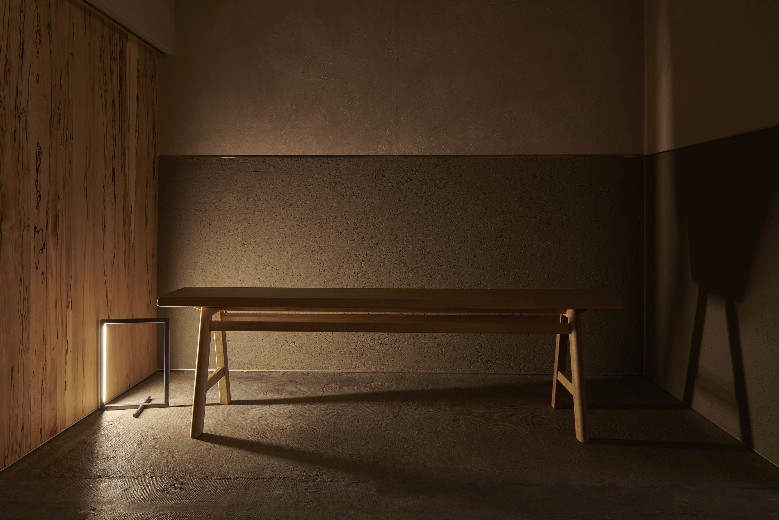
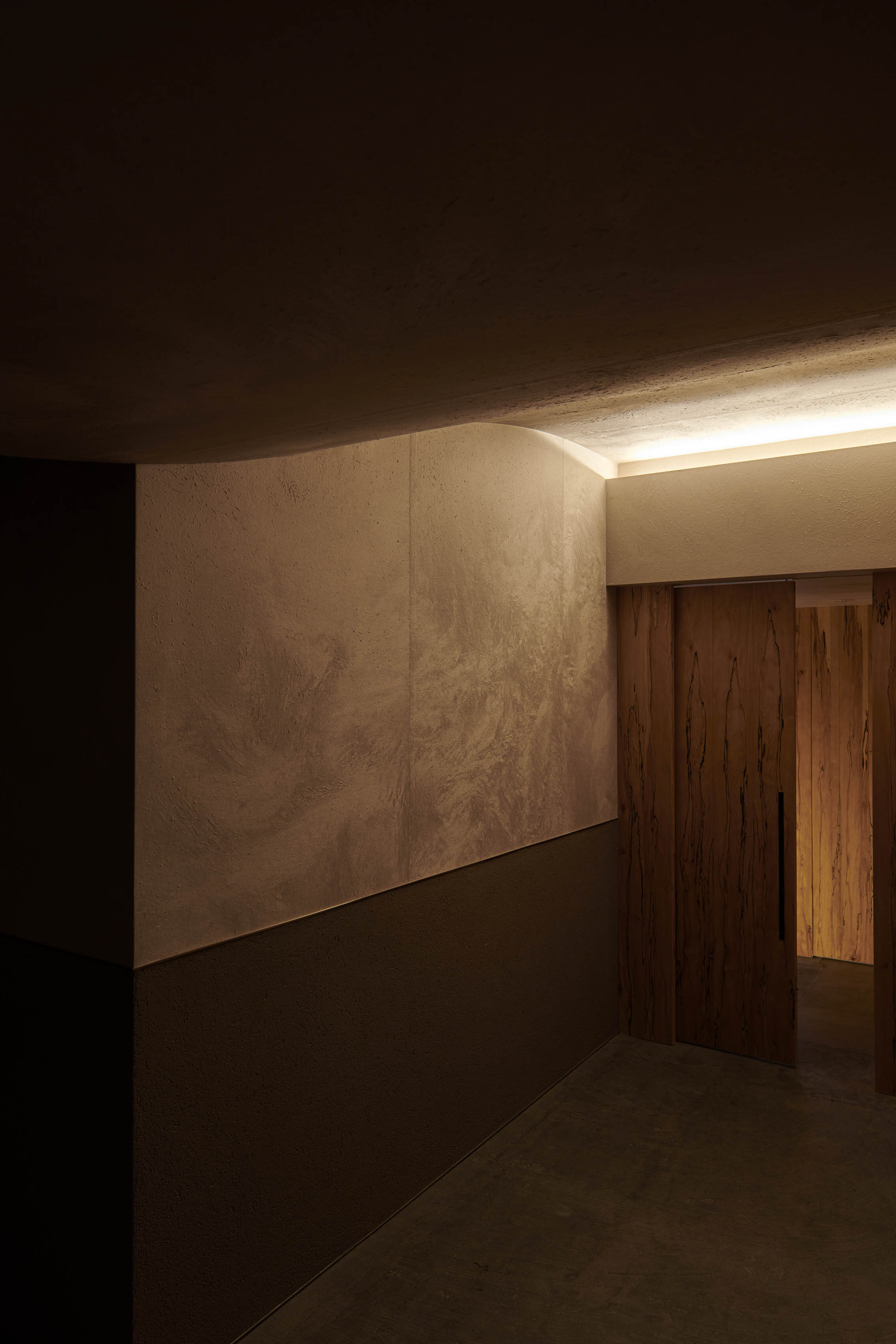
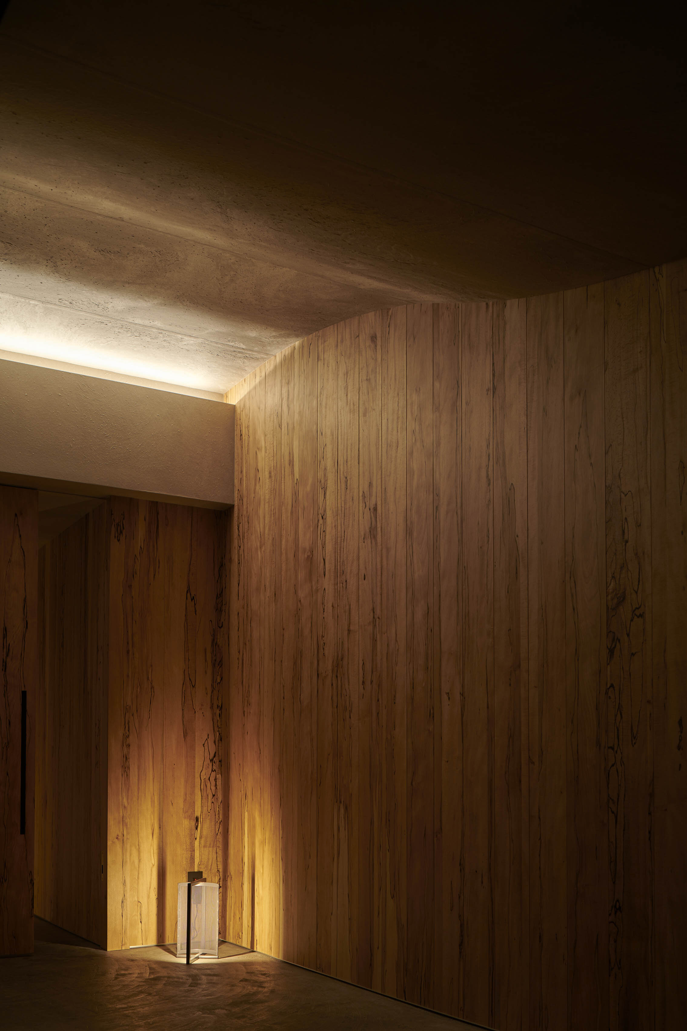
As for the materials, they have used truffle beech, a spalted wood with a distinctive black grain caused by truffle fungus for the entrance and sophisticated Italian walnut for the counter. On the one hand, the ceiling was covered with handmade Japanese Echizen washi paper from Fukui, the chef's homeland, so that guests can enjoy the textures from Italy and Japan. Furthermore, Takasu also designed the stand lighting and benches so that the designer's ideas can be seen in every touchpoint of the restaurant.
DETAIL
The edges of the counters are tapered upwards for a comfortable touch. The lighting fixtures and air conditioning units were carefully planned to be as invisible as possible.
The designers have made the entrance to the dining 1100mm high, like a Japanese traditional tea room.
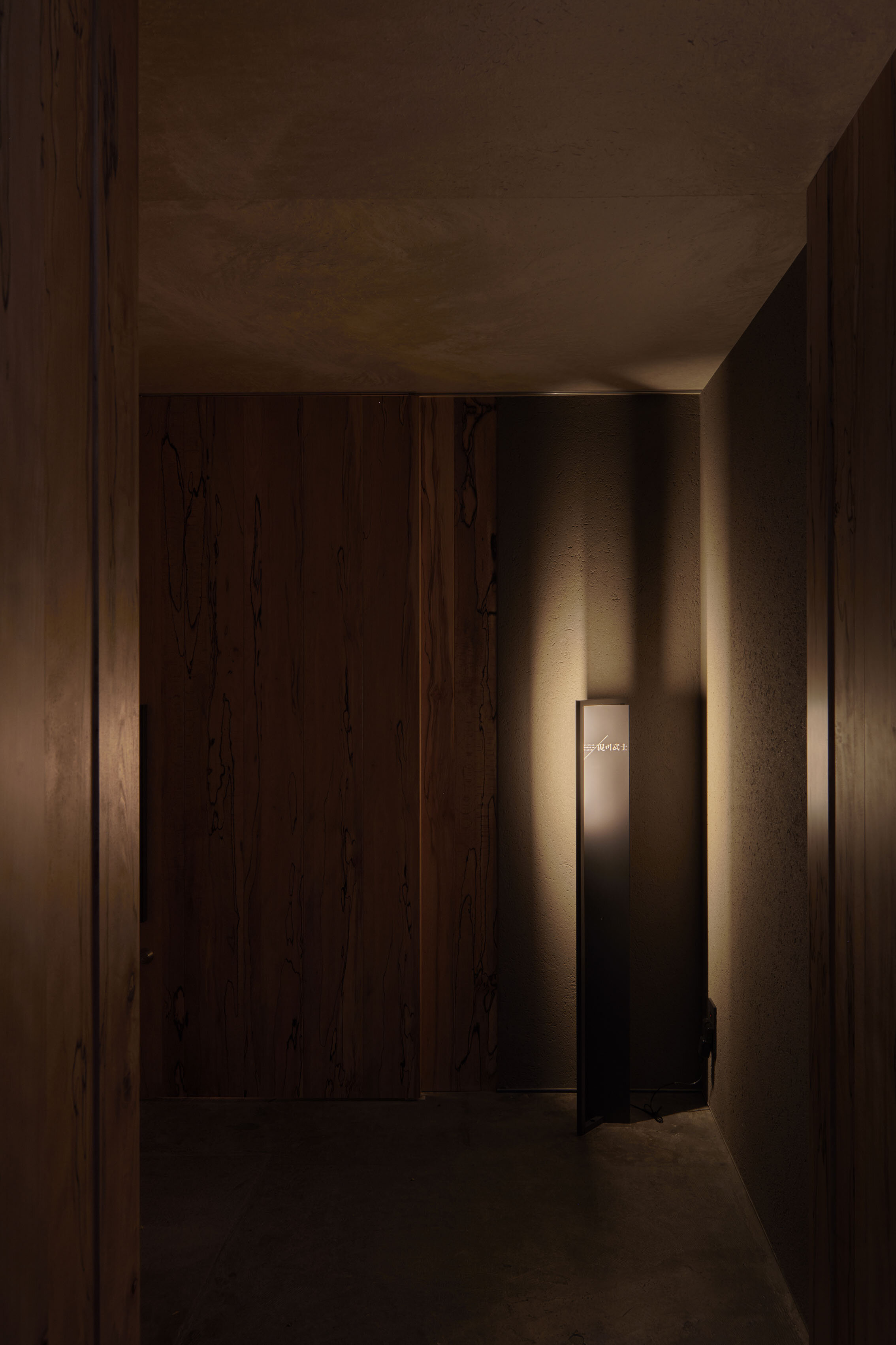
The walls of the corridor are installed with spalted truffle beach veneer. The ceiling and part of the walls are covered with handmade Japanese paper with a distinctive texture.
The original bench designed by Takasu was inspired by the shape of a torii gate.
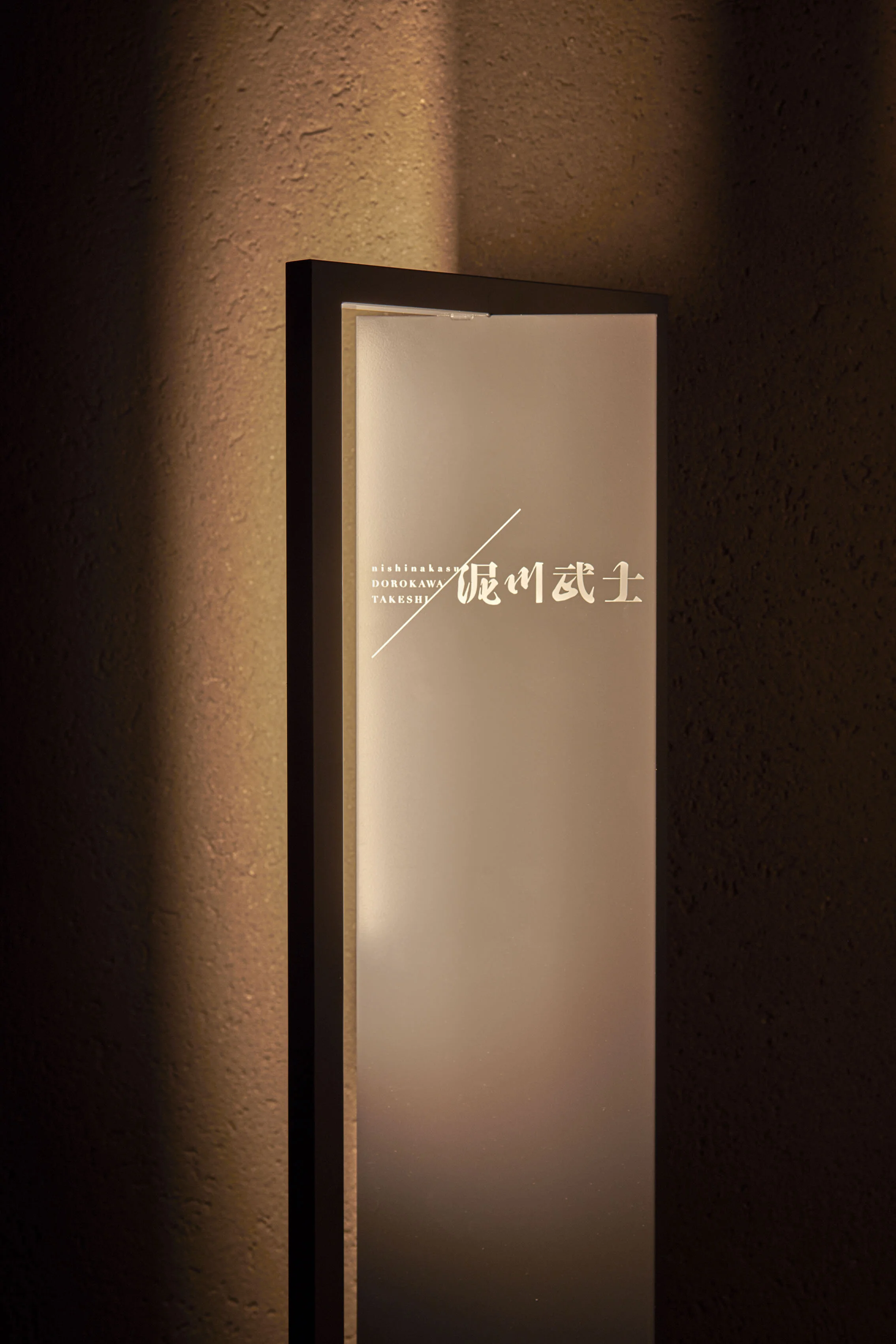
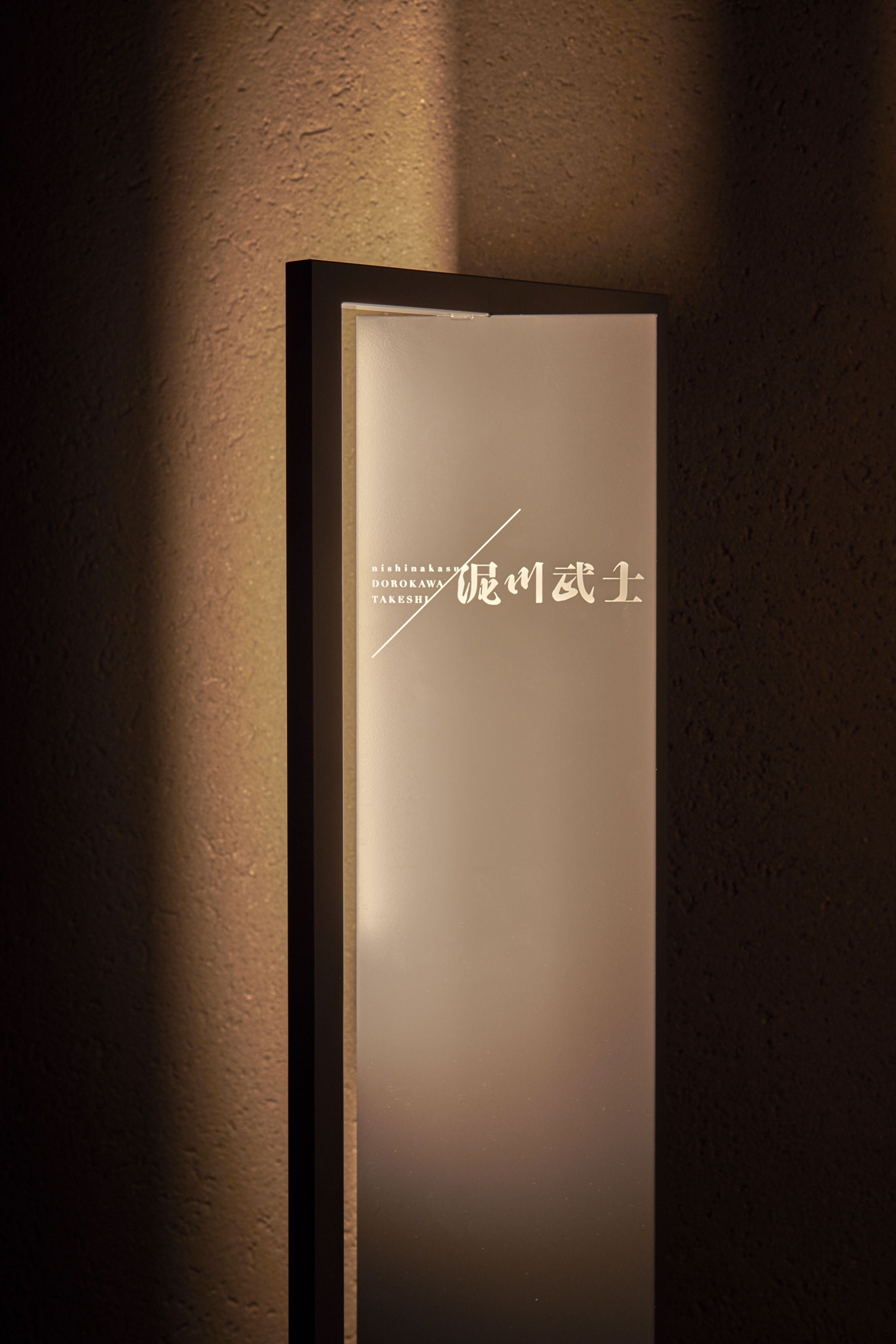
The custom-made lighting stands are made of stainless steel pipes.
CREDIT + INFO
Name : nishinakasu TAKESHI DOROKAWA
Designer: Gaku Takasu / Takasu Gaku Design and Associates
Lighting design: Tatsuki Nakamura / BRANCH LIGHTING DESIGN
Graphic design: Toshikazu Nishida / 24D
Sound design: Mao Teraoka
Spoltedwood & Veneer: YASUTA Veneered Surfaces & Design
Handmade Japanese paper: Taki WASHI Factory.,ltd.
Construction: NAGASAKI SEMPAKU SOBI Co., Ltd.
Location: 5-6 Nishinakasu, Chuo-ku, Fukuoka-shi, Fukuoka
Owner: Takeshi Dorokawa
Completion: September 2019
Main use: restaurant
Floor area: 52.95 sqm
Material
floor: corridor/mortar + aqua color, dining room/brick tile
wall: truffle beech veneer(YASUTA Veneered Surfaces & Design), handmade Japanese paper (Taki WASHI Factory.,ltd.), Jolypate (AICA Kogyo Co., Ltd.)
ceiling:handmade Japanese paper (Taki WASHI Factory.,ltd.), Italian wallnut veneer (YASUTA Veneered Surfaces & Design)
counter: Italian wallnut veneer (YASUTA Veneered Surfaces & Design) + ceramic stone (DEKTON)
furniture: arm chair/RINN (Arflex), original bench/solid oak (manufacturer: nomade design), floor light: stainless pipe + stainless mesh + LED (manufacturer: chavie + Hikari)


