Interview with JO NAGASAKA/Schemata Architects —part 2
2/2
our goal IS to create “an architecture that could be nurtured”, not one that is perfect when built
— Jo Nagasaka / Schemata Architects
photography : Takumi Ota
words : Reiji Yamakura/IDREIT
continue from part 1
— Next, please tell us about your work, HANARE, which was a newly built house in the mountains in Chiba 10 years ago but has a concept that is still relevant today.
This house was commissioned after the client purchased the site as a second home to spend about 1/3 of the year. The two requests were to have a view of the lake to the west of the property from inside and to maintain privacy. In addition, although it was not a design request, the client wanted to place a separate ordering system to understand the house construction as he went along, which greatly influenced the design.
— You must have been surprised when you saw the steep slope of the land?
Yes, haha. Because the site was in the middle of a mountain with no access to roads, it took a long time to get permission to build, to secure the construction road, and to install electricity, gas, and water. It was also the first time for us to place a separate order for a construction project of this scale.
The development began with the construction of a road to the site. (photography: Schemata Architects)
— How did you think of the site plannning?
The need for a retaining wall and privacy made us think that it would be better to have the building on a higher ground, and the L-shape was led to be built on the slope and above the construction road. We adopted hybrid sturucture: steel structure for piloti to make sufficient parking space ,and wood structure for the upper floor to obtain insulation performance.
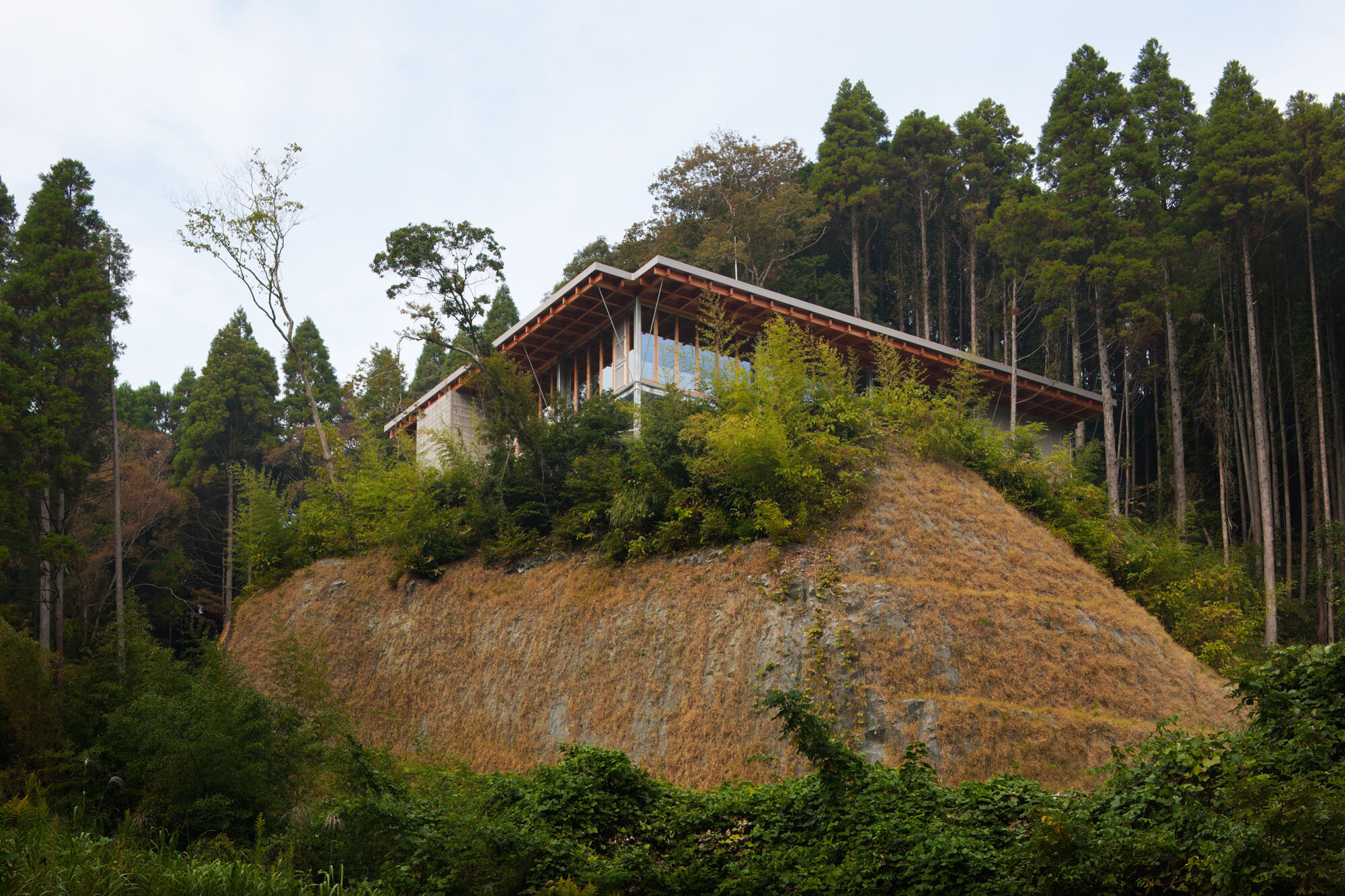
The two sides of the L-shape face south and west, so the west opening has a view of the lake, but the problem was how to keep out the afternoon sun. So, we borrowed an elevating truck to take actual measurements, and verified that a 2-meter-long eave would prevent light from penetrating deep into the interior, and decided on the distinctive architectural shape.
HANARE is a residential project on a steep slope in a mountainous area in Chiba Prefecture. It has 2m eaves on the south and west sides.
The architects adopted a wooden structure for the living spaces to obtain sufficient thermal insulation, and a steel structure for the piloti to ensure a large parking area.
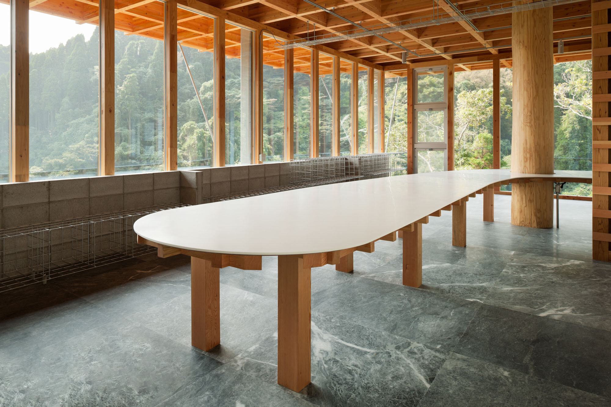
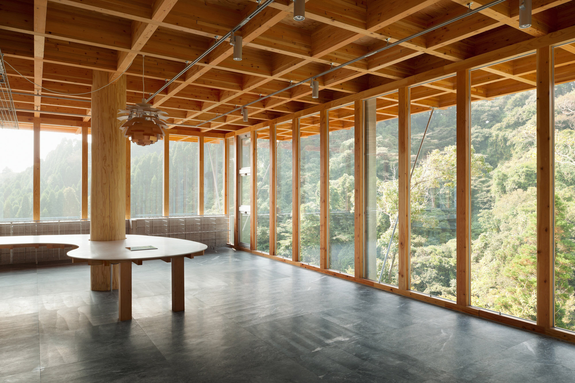
The organic shaped tabletop was designed to follow the L-shaped living area. The concrete blocks on the south act as a Trombe wall to collect solar heat.
— I see. Let me ask you about the interior design. How did you come up with the unique table with log that has such a strong presence?
Until the creation of the table, this house was based on a horizontal and vertical modernist design. One day, however, the client said, “I don't like square tables because they look too hard”, which led me to come up with this table. In the world of architecture, there is a rule that if marble is to be used for the floor, bare concrete blocks should not be used and the ceiling should be finished neatly. I think there was an obsession that design should follow such traditional rules and create a unified space, about 10 years ago. At that time, many architects were designing spaces with white walls and ceilings, concrete floors, and metal sashes. When I conducted the renovation design for Sayama Flat in 2008, I realized that there was something wrong with those conventional rules. For HANARE, I could have kept the same tone for the whole building since it was a new building, but I thought it would be better to take a natural stance, adding only the minimum necessary elements.
‘Sayama Flat’, a renovation of an apartment interior designed by Schema Architects, 2008. With the “subtraction” concept, they arranged the design while demolishing to create a unique space that retains the existing elements. (photography: Takumi Ota)
— You did not align them on purpose, did you?
Exactly. I often use the phrase “a relationship that allows for change”. It should be good to have a tough architecture where adding or subtracting something later does not affect the general tone. That is why when the client told me that he did not want a square table, I thought of a non-square one, and at the same time, accepted the irregular shape of the tabletop, and used a material that people would not normally use, a log, to clarify our design concept.
The designer purposely chose the log, a material not often used in modern style spaces. (photography: Schemata Architects)
A log column extends through the tabletop. For the floors, marble was installed in response to the client's request.
— I understand. Did you have that feeling only in your mind? Did you share it with the staff?
The staff was worried, and so do I along with them. It was a repetitive process of proposing a design that met the client's needs and then getting the next request. If we had taken a conventional, rigid approach, we might have been tempted to abandon the design. However, we were conscious of the “relationship that allows for change” after the construction was completed, and aimed to create a tough architecture that did not follow conventional rules. In other words, our goal was to create “an architecture that could be nurtured”, not one that is perfect when built. Therefore, the log pillar symbolizes the design struggle that led to it.
— Was the marble floor also at the request of the client? My personal impression is that the design approach is the opposite of the famous Barcelona Pavilion, where the architect specified everything from the furniture to the use of space, while both of them using stones.
Yes, it was the client's request. When we used marble, Mies's Barcelona Pavilion came to my mind too. It is true that HANARE, with its bare concrete blocks and exposed ceiling base, is very different from the Barcelona Pavilion in terms of the use of materials. However, when I visited the Barcelona Pavilion in Spain, I felt that there was “a relationship that allows for change”. I admired the charm of that architecture like a platform that was very tolerant and open to various things.
For HANARE house, the plumbing and wiring has been installed in the simplest possible way, so that the user can maintain it by themselves while living in the house.
In the parking space with steel structure, there is exposed piping under the floor of the living space.
— That is a very interesting way of looking. HANARE is also unique in its treatment of the facilities.
The client has been very interested in smart houses since that time and wanted to arrange the facilities by D.I.Y. after the construction was completed. Therefore, considering future maintainability and process management, we tried to reduce the complexity of the process. Normally, piping is done under the floor, followed by floor finishing work, and then the facilities setup work again. However, in this case, the process was simplified by attaching marble to the concrete floor, then drilling holes in the concrete, including the stones, to allow the piping to penetrate. In addition, we exposed the pipeworks, instead of concealing them so that the residents can update the facilities as they use them. Likewise, the fittings, furniture, and lighting were installed in a simple way so that users can grow them in the future.
— I get it. I think the idea of "nurturing architecture concept" was very rare at the time.
Right. Nowadays, people are beginning to understand the idea of using a building while creating it by themselves, like the current our office of Schemata Architects. I always try to think of ways for designers to be involved with architecture with the premise that the completion of a building is not the best time, but that it is just a process and architecture keeps changing. The same philosophy is at the root of T-HOUSE New Balance and the Japan Pavilion, which utilize old materials in other places. Sayama Flat, a renovation of a housing complex, and this HANARE were the starting points for such ideas. Users can add or subtract elements later on. I thought it would be interesting to have a building that grows after completion. After that, we designed HAY TOKYO, a store for Danish interior brand, and Musashino Art University 'Building 16' project, which will be completed soon, based on the same concept.
Based on the ‘nurturing architecture concept’, Schemata Architects has designed HAY TOKYO in 2018. (photography: Masataka Nishi)
HANARE is the first example of a D.I.Y. approach that does not require a professional builder for daily maintenance. Nowadays, the idea of self-building is taking root in Japan, and there are websites for D.I.Y., and I feel that we have continued to take our own approach while sensing this trend.
We would like to pay attention to the utilization of old materials with modern technology, as Nagasaka expects, saying "In the future, we will be able to incorporate materials that were used not only for historical architecture but also for more mundane buildings into our designs”.
Also, a major difference between the 2000s and today is that not only individual owners but also organizations such as major corporations and schools have come to understand the concept of “an architecture that could be nurtured”. This should be the result of a step-by-step change in the mindset of the users, caused by Schemata Architects’ designs, which accept “change” after the construction is completed and grow over time.
JO NAGASAKA
Principal, Schemata Architects / Jo Nagasaka established Schemata Architects right after graduating from Tokyo University of the Arts in 1998, and now has his design office in Kitasando,Tokyo. The scale of his work ranges widely from furniture and architecture to urban landscape. The type of his work is also extensive including café, shop, hotel and public bath. In any size of his architecture, he is always conscious about 1:1 scale, exploring materials and design, expanding his works in both domestically and globally. He's been discovering new perspectives and values from everyday things and existing environments, while presenting unique ideas such as “subtraction”, “misuse”, “update of knowledge”,”invisible development”,and “semiarchitecture” and established an original architect image.


