Interview with Tadahiro Butsugan / ABOUT
I was motivated by the owner's dream that the next generation would follow if they could boost craftsmanship in Shigaraki.
— Tadahiro Butsugan / ABOUT
photography : Takumi Ota, Yoshiro Masuda (before renovation)
words : Chisa Sato
In 2017, a shop and gallery called NOTA_SHOP was established in Shigaraki, Shiga Prefecture, in a large former pottery factory. Shigaraki has long been known as one of Japan's leading pottery production areas.
In the spacious renovated space with old, exposed wooden beams, ceramic works and modern objects made in Shigaraki are showcased on display tables made from massive timbers.
Five years after its opening, NOTA SHOP has become a destination store attracting crafts lovers from the city, as its unique style resembles an art installation. We spoke to designer Tadahiro Butsugan from design studio ABOUT on how he spent four years developing it.
Interior of craft shop and gallery ‘NOTA_SHOP’. Equipment from the former pottery and newly installed fixtures live together in the old wooden building.
The central white cube is a gallery installed around the steel columns for structural reinforcement.
— How did you meet the owner, Shunsuke Kato, the head of NOTA&design?
Around 2012, when I was still a member of the Osaka-based design firm Graf, we first met at a picnic organised by the younger members. The two outstandingly fashionable people I met there were the owner, Mr Kato, and his wife, Kayoko. At that time, I heard that they were making ceramics in Shigaraki. I was also intrigued by Mr Kato's background, having studied design in England and worked as a designer in Tokyo before returning to his hometown of Shigaraki. After that picnic, we hit it off straight away and became friends.
— How did the NOTA_SHOP project begin?
Around 2013, Mr Kato told me that he had bought a building, and when I went to the site, I was surprised to see how big it was.
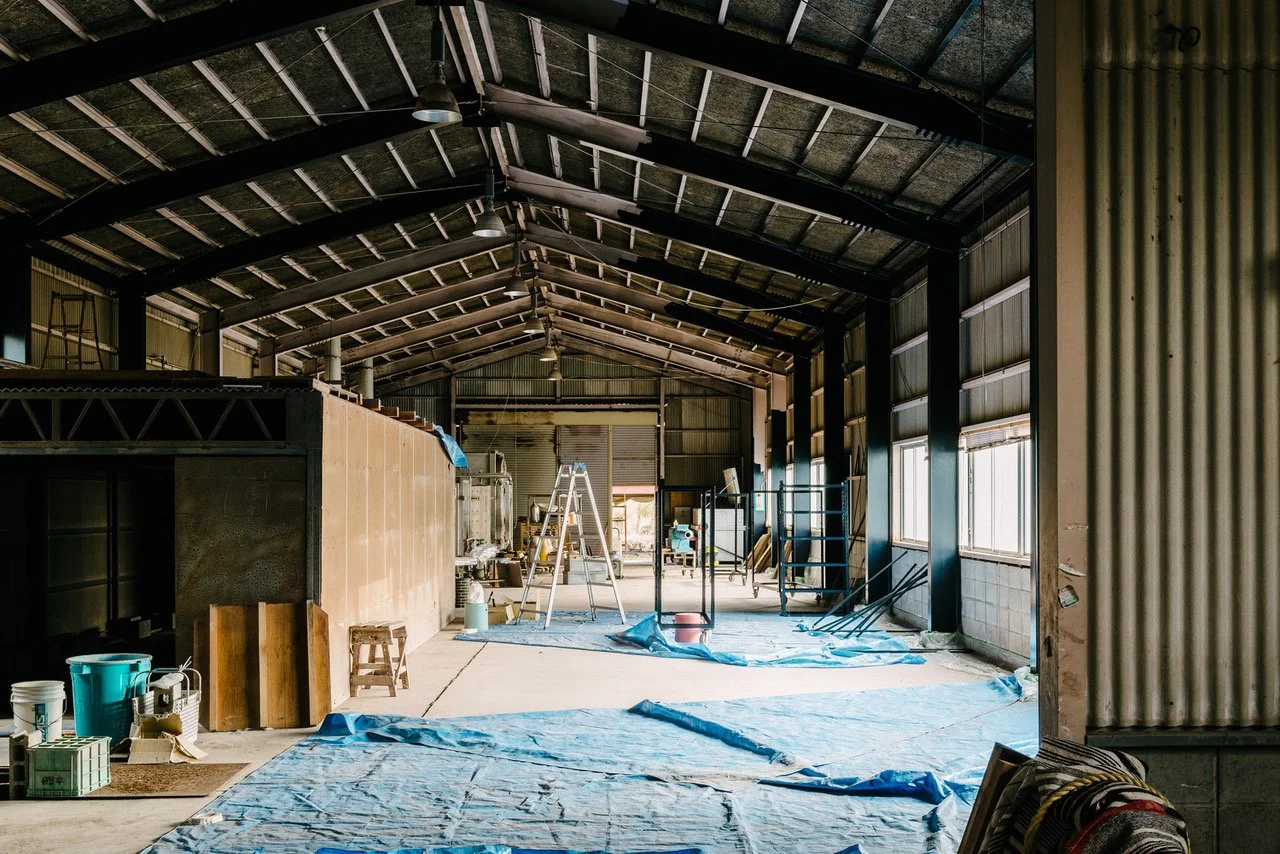
There were two steel-framed buildings, one wooden building and a smaller detached house, and the pottery factory had a total area of approximately 1500sqm. Also, many objects in disuse, as well as rubbish were left behind, and I went there once a month. It took about two years to clear everything up. It was an old, derelict building, but I felt it had potential. The advantages are the building’s atmosphere gives a sense of Shigaraki's history, and the surrounding area has beautiful countryside and local railways. I was driven by the optimistic expectation that something was about to start here.
Images before renovation. The wooden building is used as a shop, while the steel-framed building is used as NOTA&design's studio.photography: Yoshiro Masuda
— What did you discuss with the owner before designing the shop?
As a ceramic production centre, the current mood in Shigaraki is not optimistic. Mr Kato was aware of the critical situation in which the ceramics industry would decline if the situation continued as it was. They wanted to dispel their old-fashioned image and bring Shigaraki's craftsmanship into the spotlight. They also wished to make it a destination store that customers would like to visit, as there are no shops in the neighbourhood. I was motivated by the owner's dream that the next generation would follow if they could boost craftsmanship in Shigaraki.
The owner was very passionate about it, and I really sympathised with that. Looking back on my own experience, I had designed a few local projects at that time and was interested in the potential of shops in rural areas. SNS were becoming more common, and independent businesses were being re-evaluated.
— What did you think about the design of the space?
The building was quite vast, and our budget was limited, so we based the idea on using as much as possible of what was available on this site. I had seen the owner's home and knew they had excellent taste, so I believed that if I just decided on an outline for the shop, they would use it well.
The interior retains the atmosphere of the pre-renovation. The cart, on the right, used in the furnace has been converted into a packing counter.
Display table made of two 7m solid wenge boards. Legs are pallets from a pottery factory, used for drying pottery.
The shop was arranged in a wooden building, and NOTA&design's studio in a steel-framed building. We removed the ceiling of the wooden building, a former factory, and exposed its beautiful wooden trusses. However, structural reinforcement was needed, so we added steel columns and built a white cube gallery around them. The natural light and shadows coming in from the east and west windows are breathtaking, so we left the central wall white, also conscious of showing the contrast well.
— Bold solid timbers were also very impressive.
In the whole space, I aimed to convey the spaciousness of the old factory, as well as express strength and vitality. The solid zelkova and wenge boards for display were provided from my personal collection. I chose to use polished plaster for the floor, inspired by the styling in Mr Kato's home. As their product, pottery’s material is clay, we wanted to use stone-mixed plaster for the floor to give it a different texture.
Office space in the NOTA&design studio.
The designer Butsugan designed a new brick staircase to go up to the top of the office.
In one corner of the studio, the original kiln is still in use.
— What is the room with the brick staircase used for?
This is NOTA&design's studio. The material of this staircase is exterior brick with fine holes. I designed it with the idea of bringing an outdoor atmosphere indoors. I drew the plans for the stairs and other parts of the building while the owner, Mr Kato, and his team painted the walls.
— NOTA _SHOP is a large-scale space, but the texture of the floor and the delicate vertical wood cladding on the exterior walls showed fine craftsmanship.
We felt the contrast between the large building and the labour-intensive details would make the space more special. I also did the construction of the exterior walls. Boards less than 40 mm wide were applied with a gap of approximately 3 mm. The wall works were very time-consuming. Before I set up my own design studio, I was on a multidisciplinary creative team Graf, so I learned that I had the option of building it with my own two hands. The shop's employees would have felt an emotional connection to the shop, having helped with the construction work before it even opened.
A tiny cafe space set up in a corner of the shop. Light pours in from the top light.
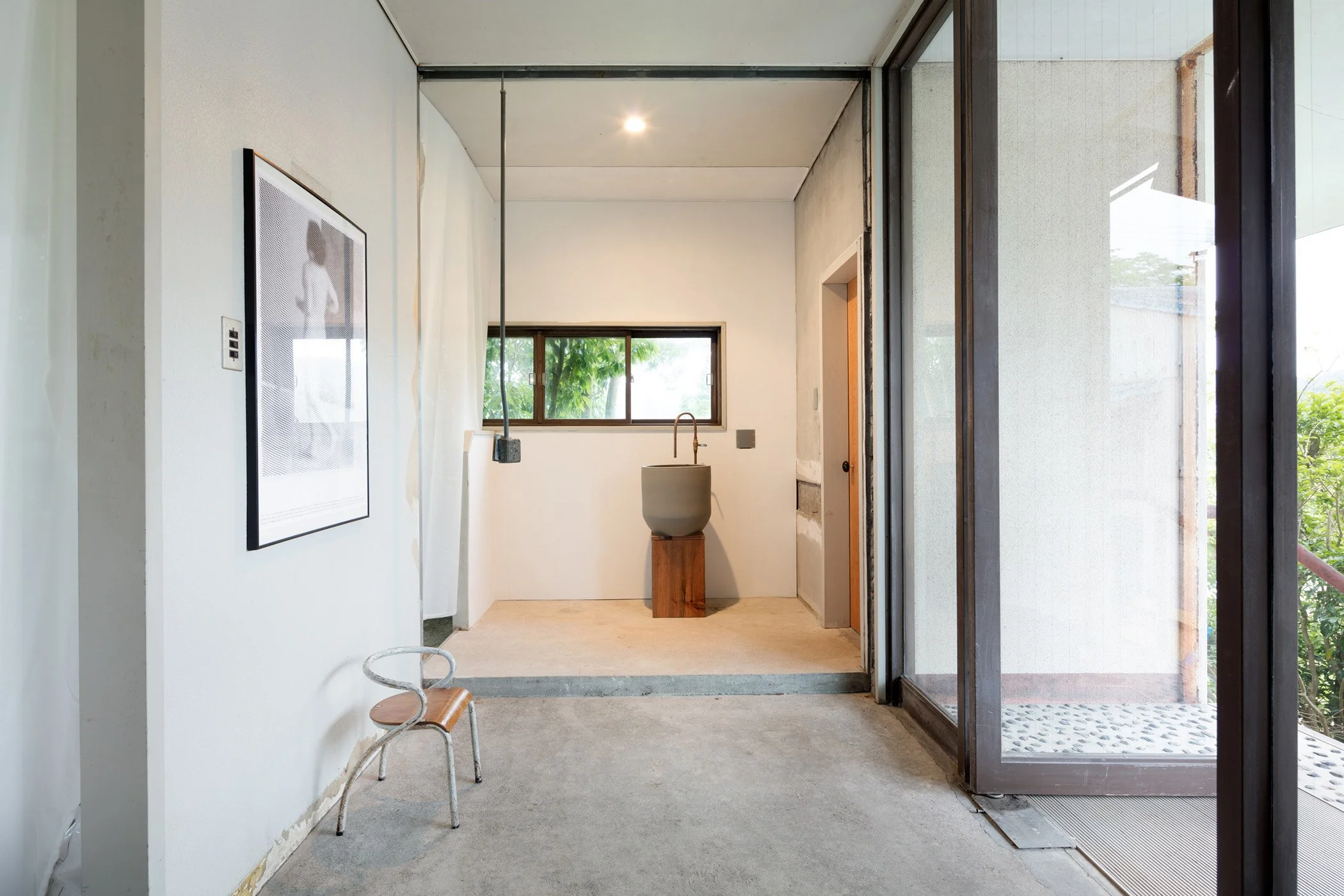
Water facilities have been left in their original position.
An annex building, next to the steel-framed building, has also been renovated and is now used as part of the offices.
— Installed in a part of the shop, the furniture in the cafe looks lovely and matches the mood of the interior.
All the furniture and objects are part of Mr Kato's collections. They loved collecting furniture and antiques and stocked many of them in their warehouse. I think this was the beginning of a new era in which personal taste has value. Taking fashion as an example, in the past, the choice of brand was the only key issue. But today, it is more important what items you choose and how you style them.
Jiro Aoyama (1901 - 1979), an art critic in the Showa period, said, "Beauty is the discovery of those who see it", and I feel that the importance of "Mekiki (connoisseurship)" and "Mitate (perception and interpretation)" is now recognised in public. The current social context and SNS trend have brought such personal choices into the spotlight. Today, everyone can communicate their personal preferences and style on Instagram.
— You mentioned that you were interested in the role of local shops and what they should be like. Did you come to any conclusions based on your experience with this project?
Unfortunately, many people nowadays go to shops, but all they do is take pictures and leave without buying goods. So, today, shop owners must understand their products and convey the shop owner's point of view to the customer. We, interior designers, have to think about the value of the experience in the shop. I think shops are key to raising the cultural standards of a town.
Once I went to Cafe Shozo in Kuroiso and Kurumi-no-ki in Nara. I felt these shops were unique places for locals to go; they tend to dress up a bit, and the people who frequent these shops engender the town's culture. The experience in the shop - its space, products, the taste of the food and customer service - will inspire and nurture young people. Therefore, it is essential to define the shop, find a concept for it and figure how it is to be presented. That is what we, as spatial designers, have to do to create a shop, as a real place, in our time.
SEE DETAILS
Tadahiro Butsugan
ABOUT, seeks to create designs from the margins and in relationship to their surroundings. Our approach is to conceptualise and re-evaluate original design. Based on the principles of simplicity and minimalism, we create designs inspired by existing contexts, such as materials, places and history. We want to be a design team that creates environments using authentic methods passed down from the past to the future.
http://tuoba.jp/


