AESOP Nihonbashi Takashimaya S.C. by CASE-REAL
Retail store | Tokyo, Japan
AESOP Nihonbashi Takashimaya S.C. | Case-Real | photography : Courtesy of Aesop
DESIGN NOTE
Context-Driven Site specific design
Composition of Japanese cypress ‘Hinoki’ and granite ‘Mikage’
concentric circle layouT


photography : Courtesy of Aesop
words : Reiji Yamakura/IDREIT
Designed for Aesop, an Australian botanical skincare brand, location inside a shopping centre in Tokyo.
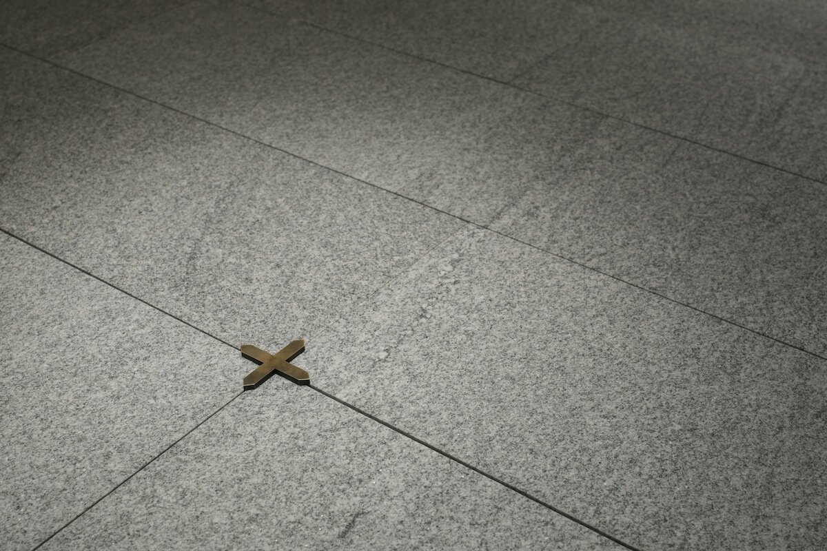
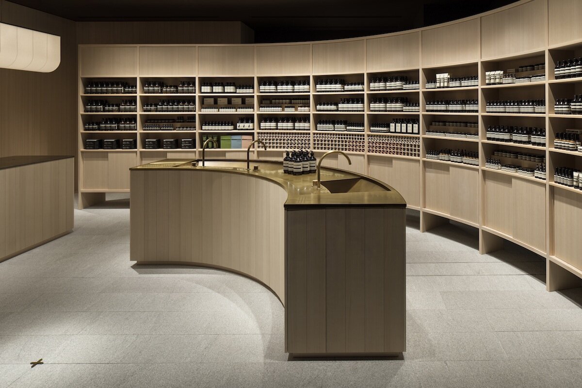
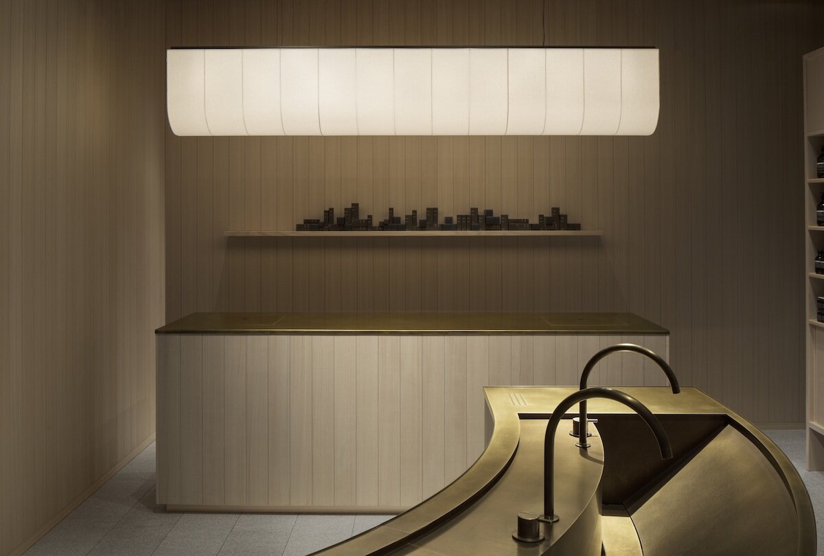
It was constructed based on the theme of “starting point” from the location of Nihonbashi, which is the centre of the city of Tokyo. For the floor, Mikage stones, a type of granite, were used, and for the wall and fit-out, Japanese cypress was utilised, the inspiration for this was drawn from Nihonbashi, which was built in 1603, namely the Nihonbashi bridge that was originally constructed with wood but later changed to stone construction.
Also, there is a brass-made symbol inspired by the starting milestone that represents the centre of transportation in Japan. It is unique that the designer decided to put such a symbol inside a store and centre it, it made a concentric circle layout.
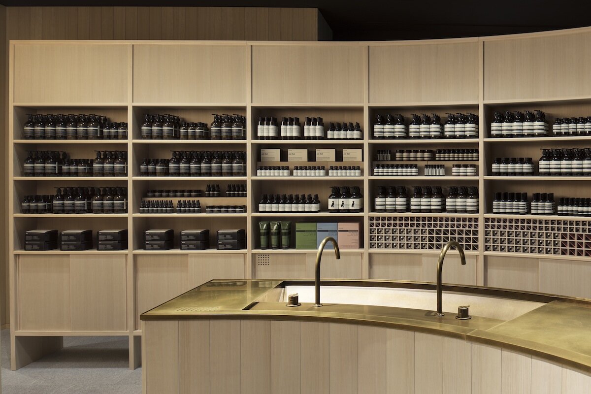
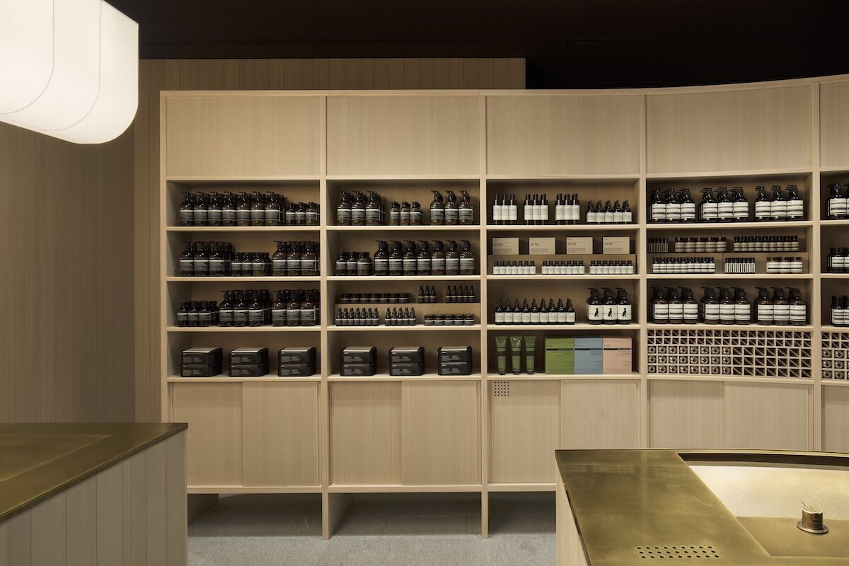
The designer, Futatsumata looked back that he considered the materiality and the combination of Japanese cypress and brass. The wooden texture with the beautiful grain of the cypress and the sophisticated design along with no extraneous noise embodies the style of Tokyo and Nihonbashi as well as the world view of Aesop.
DETAIL
Case-Real designed a brass-made symbol inspired by the starting milestone located in Nihonbashi.
A curve shape counter and wall shelf was placed around the symbol to create the concentric circle layout.
CREDIT + INFO
Name : AESOP Nihonbashi Takashimaya S.C.
Designer: Koichi Futatsumata, Yuki Onita / Case-Real
Construction: &S co.,ltd.
Lighting Plan: Tatsuki Nakamura / BRANCH lighting design
Location: Nihonbashi, Chuo-ku, Tokyo, Japan
Main use: Shop
Completion date: September, 2018
Floor area: 42.93 sqm
Material:
wall, shelf & counter/Japanese cypress 'Hinoki' veneer countertop/antique coloured brass, clear courting lighting/ custom-made shade with laminated 'Washi' paper (Warlon) floor/ framed granite 'Mikage'


